Rainbow Road: The Game Behind Cyber's Colour Theory by Ana Vijay
Show transcript [en]
so uh hi everyone pretty scary being out here to be honest but um just quickly before I get into the sort of talk content if everyone could scan that QR code or like visit the link it's just going to be a bit important for later on in my presentation um I'll put the QR code back up later if you miss it right now but I'll give you maybe about 10 seconds to just um get that going
okay so that seems to be pretty good um so a quick game before I get into my sort of content which is I'd like to play a game of quick associations so for each word that shows up on this screen this could be pretty dangerous I'll be honest but each word that shows up on the screen I'd like you all to shout out the first word that comes to mind in relation to each of them so first off okay okay so fast [Music] okay that last two those are pretty interesting but I'll demonstrate the importance of these quick associations in a bit but that's a little bit about me so hi I'm Anna I'm currently a second
year cyber security student at the University of Warwick and whilst I am president of our cyber Society I do have interests that aren't just a technical so I'm here giving a pretty sort of non-technical talk just to talk about one of my big interests outside of cyber which is Art and Design so I really love to draw and I thought that design is something that's not very often highlighted when it comes to cyber security and it's actually really important so basically my job is to hopefully tell you why and raise a bit of that awareness so a quick primer on the state of design currently in cyber security so a research group called daylight lab
recently created this thing called the cyber security imagery data set where they got two years worth of Google Images searches about cyber security and collated them into one big data set and analyzed it and they found that this color scheme these five colors were the top five colors used in all of those images and two three five five nine four and hex was the color of cyber security so that appeared in almost every single image in that data set so essentially blue is used to often symbolize this sort of peaceful kind of digital side of the field but what's interesting is we have a nice little blob of red here as well and it raises a few questions
because red is designed to highlight a sort of alarming risk or insecurity in a lot of these images and why are we trying to essentially raise fear in the images that we so often associate with our field so that's a big question to sort of think about which I'd like you to ponder on following on from these sort of common color tropes I'd like to also talk about some other visuals that we tend to get in the design language of cyber so we have the padlock this shows up almost everywhere you may have seen it on the previous slide plenty of padlocks all in all of those images and whilst it's a great obstruction of the sort of concept of
security it's not really a great abstraction of the concept of cyber security it does raise a few questions as to why we've used the padlock to essentially abstract the digital aspect and it doesn't really reinvent the wheel when it comes to things we also have images like this which have this sort of red versus blue kind of color scheme and a lovely hooded figure um I'd like to think if I was burning down a room I'd dress more stylishly than that um and speaking of stylish yeah we have we have whatever the Shady figure is doing over here um and so these sort of speak for themselves and how strangely Associated they are with cyber when I'd like to think like no one
in this room is currently in a top hat and a mask so but they're commonplace in overuse and how did this happen um there's one big thing which is the way the media presents cyber security so there's this sort of air of negativity going out in the world where most of the front page headlines when it comes to cyber is simply all about um good versus bad light versus dark some evil hackers are trying to destroy the Mainframe whatever that is um if any if there are any Marvel fans in the room you might have seen a few of their movie posters they often use this sort of blue and orange color scheme which represents this sort of good
versus evil Trope and I find that that kind of sort of movie aspect has seeped into the way that we use cyber security imagery and the graphics used by the media are just really similar to these and they don't show positivity and they rely on maintaining cyber as this sort of mystical art that no one can really access so coming back to my QR code I'd like to showcase the importance of those associations so if you haven't scanned it already just quickly take a few seconds to do that and um what I'm going to do is I have found a template online lovely little HTML template which is basically for um a typical sort of cyber security website
and I've gone and that template was previously blue and I've Hue adjusted the image to represent a couple of different colors and on your screen from this website you will see you have five colors and those represent the five colors of the Hue adjusted website and I'd like you to press one that you think represents the most sort of cyber security based website something that makes you feel secure if you saw that website you would trust it and I'm just curious to see what you know everyone thinks so here are those five hold up your phones wow okay so Okay so we've got some interesting responses here because not everyone actually picked blue so I could see a
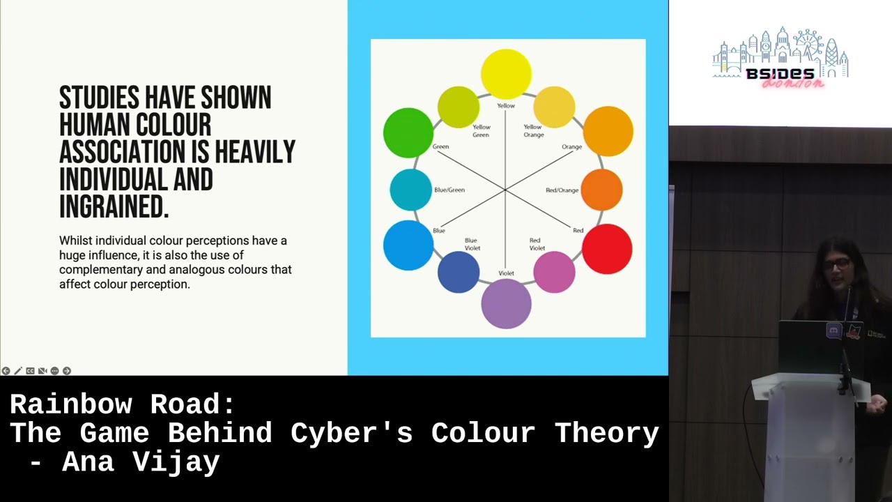
whole variety of colors and some people in this room might have remembered a few sort of months ago I actually did a survey in which I asked people to sort of do a similar kind of test with similar colors and I asked them to actually tell me why they picked that color and some people actually picked red and yellow and it's interesting because those people tended to associate red and yellow with passion Health Vitality those kinds of like positive connotations which actually helped represent to them a sort of secure healthy kind of website but again most people lean towards blue and sort of green and things and um essentially human color associations actually just heavily individual it is nothing really
to do with how sort of Cycles are perpetuated and actually the sort of associations that you've each individually formed are based on your own personal experiences so even though however if we put this aside and we take blue to be the sort of stereotypical cyber color a lot of you also picked green and purple which are actually analogous colors to Blue so what that essentially means is because they are sort of harmonious on that side of the color wheel they also represent like sort of um really sort of healthy kind of connotations with security but red orange and yellow are on the completely opposite end of the color wheel they're known as complementary colors and as a
result those are meant to symbolize this contrast this opposition to what the media has sort of chosen to represent and so why is blue such a constant if we understand that these associations are heavily personal its familiarity so it all comes down to the fact that because this sort of Perpetual cycle has ensued of people using blue and not really coming up with any new graphics to reinvent the wheel um the use is just so ubiquitous that no one feels that they can use anything else that Association is so deeply ingrained that no one has tried to see whether individual things can be brought out [Music] in fact security designs though have a very sort of big effect on the public So
currently the sort of stereotype is very unfriendly ominous kind of imagery of you know hackers and greenlit server rooms sitting in the dark not really you know doing anything good and um these designs can actually feel very daunting and I'd like you to all think of design as making a PowerPoint if the point isn't clear and visible in that design it would be really difficult for people to sort of understand and digest it and we need to keep these designs really accessible as well so we need to ensure that people are actually able to see the content that's within them and to help digest that sort of material but in fact the biggest point that I'd
like to make is most academics policy makers and cyber professionals actually disagree with the current state of cyber Graphics they feel it really misrepresents the field but they often know Alternatives instead and that's something interesting to mull over no one has actually tried to change the current status quo so in terms of changing that what can we do we have two big options so one is to opt for familiarity in design so we can take the existing sort of design language but sort of make little tweaks and add spins on it so currently with sort of blue elements and things we don't necessarily need to not use blue at all in any of our designs but we can
use blue and perhaps change the other design elements that surround it or we could turn the entire thing on its head stop using blue stop using padlocks stop using Shady hackers in server rooms and try and create an entirely new design language that we feel represents things better so in terms of some ideas for option one in terms of how you can make your designs more accessible to people um ignore the questionable spelling of fence on this diagram but it's the only one I could really find that was better than some other ones you don't have to be the best designer to actually Implement Clarity what you do have to use is use great analogies and take out
unnecessary acronyms make sure your audience knows what they're reading you can also take previous sort of design elements that have already been used like the padlock and add them alongside other Design Elements to make it more clearer as to what you're trying to represent instead of just using a padlock on its own and finally we need to really change the sort of General imagery that's going around in the media so these are actually two really recent news stories from BBC News and both of them have actually used um that sort of shady hacker in a server room surrounded by binary digits kind of image but the two at the bottom as you can see they are taken from real sort of
cyber security websites showcasing real people and how they actually work in the field and those are great images that we should be using more in such like media stories take out the negativity and put a more positive spin on it and show how real people and real individuals tend to work here and then obviously for option two there are some other ideas so there's a website called cybervisuals.org which is this Collective that is aiming to sort of turn cyber imagery on its head and here are some ideas that they have that I think are pretty great so they have this one which is designed to represent phishing and this one which showcases the sort of diversity in the hacking
Community Without Really resorting to sort of like too much blue usage you also have this one which obviously is a lot more blue and it's color scheming but it is a great way of sort of abstracting technical Concepts and representing how um how real people can sort of understand them and you have this one which is a great way of showcasing um location tracking without actually putting a massive emphasis on its negative connotations so as I said they don't have an overwhelming focus on blue and they get these Concepts across without resorting to sort of very very typical graphical stereotypes so in terms of the conclusions that we can draw from this in how we can start
to make our designs better designed for people so design with accessibility and sort of widespread information in mind change the formula so take a few aspects of the current sort of blue usage or the current design climate and make it your own or just rewrite it completely don't follow the wheel and instead choose to reinvent it break stereotypes showcase how you're all real people in this room with a hugely diverse set of backgrounds and a hugely diverse set of fields and showcase how not everything is just hackers and hoodies and represent new areas so create abstractions of just other aspects of security that you feel aren't currently represented I'm sure we've all seen the sort of typical sort
of network diagram nodes with crossed wires used to represent security but security is not just networking it's more than that and I think we should start to show that and finally always understand Association so I hope that this talk has sort of armed you with the power to understand the importance of color and design and whether it's for a personal project a internal company view or even a public-facing website things like design should really just not be taken lightly and associations really matter so if you take things slow and tweak your design language and learn from others you'll be armed to the tools to start to take steps in your design journey and make design more accessible
for everyone and yeah thank you if you have any questions
[Applause] oh thank you for your talk I'm really happy that someone's actually taking a look at trying to change the messaging around cyber security awareness and like identification of it I can't tell you the number of times the team wrenched displayed as an image for ransomware and it's really annoying me um what are you hoping to do with this in terms of like future work and raising awareness about this issue um So currently I'm sort of researching into how to like sort of make a framework to make things like this more widely accessible to create a set of guidelines and rules that people can actually follow to like essentially take the principles that I've said in this
and make it more widespread because I find it's just not really talked about in terms of a design context specifically any more questions [Music] then thank you very much yeah thank you
Related talks
 28:37
28:37 47:15
47:15 33:48
33:48 49:41
49:41 34:45
34:45 10:48
10:48