BSidesSLC 2025 - Good Models Gone Bad – Visualizing Data Poisoning with Gephi | Maria Khodak
Show transcript [en]
All right, we can get started. Um, so hey everyone, thanks for coming to my talk uh on good models gone bad visualizing data poisoning with networks. Uh, my name is Maria and today we'll talk about the intersection of network science and cyber security. So in this talk I wanted to ask what if we could visualize how training data gets poisoned with networks. As machine la machine learning models become increasingly important and integral to software applications they also face increased risk from adversarial attacks notably data poisoning. Um, after exper experimenting with data poisoning, I noticed that training data fed into machine learning models resembled graphical information that could be defined using a visually represented network. My presentation
will go further into that concept of data representation and how attacks can modify or poison data within networks. So, here's a quick overview of what I want to talk about today. want to give you some background on both data poisoning and network science before we get into how we can actually use network science for threat detection specifically for data poisoning. Um and then we'll look at two case studies that go further into applications of how we can poison networks. After that we'll conclude and I'll go into some more future work and refinement. So, as defined by a Wasp, data poisoning is an attack that occurs when an attacker manipulates training data to cause the machine learning model to
behave in an undesirable way. Data poisoning occurs by altering data by three methods. Addition, modification or deletion of data. Interestingly, addition can also mean the injection of data. But injection attacks, as we know, do not necessarily involve adding data. Use of injection attacks can often delete or modify data. And to demonstrate the addition of data, a privacy focused colleague once explained to me how he associated his name to the alpaca by changing his picture across social networks to those of alpacas. So my colleague started to post images tagged with his name or username to alpacas rather than his own face or likeness. So for example, he would tag himself in a LinkedIn post with a
picture of an alpaca rather than a human. So by associating his name or username to alpacas rather than his face, my colleague caused an unexpected outcome of the data, essentially manipulating his likeness. This story along with some experimentation with data poisoning led me to ask the question, how can I visualize the change between untouched data and manipulated data? So that question of visualizing change between untouched data and healthy data is another way of asking how do we visualize data poisoning and how do we do this with network science. Before applying network science to data poisoning, it's important to define some key terms in network science and also its significance as a tool. So various systems can be defined by
networks such as the worldwide web, um the nervous system and even flavor components of food. So some of the writing is a little bit small here but you can see that um based on the connections between the various nodes or ingredients in this case um they have certain flavor comp compounds that are similar. So we can see that garlic would go pretty well with a lot of ingredients. You can also tell that by its node size. So it's a bigger node so it has many connections. Um on the top right there's starch which I feel like starch goes with a lot of things. really sure why it's up there, but garlic goes with a lot of things as
we know. So, the node is bigger and it connects to more things. Um, but back to network science, behind every complex system is a network that defines interactions between its components. Mathematically, graphs are representations of such networks. Graphs consist of objects called nodes and edges that connect these nodes. Networks are powerful tools for prediction, but they're only as accurate and stable as their data sources. So, paths or a sequence of nodes connecting to one another by edges allow us to make predictions or implications about the underlying data. Analysis of networks also leads us to some interesting statistics such as edge multiplicity, that is multiple edges sharing the same nodes. Edge multiplicity represents the intensity of certain connections within
a network which can be visually shown with a thicker line stretching between nodes. Conversely, sparser lines mean less edges between nodes. For example, we can represent flight paths as edges on a map with nodes as being airports. Wellveraveled paths would appear to be thicker due to their high traffic, whereas unpopular routes would result in thinner lines. And we'll go more more into more examples. Um, so I chose networks as a visualization technique because not only they have predictive power, but graphs are also really easy to intuitively digest and look at. For example, if I pull up the flavor component slide again, um, you can kind of digest one more time how these flavor components are all interconnected with their flavor
compounds. So, to networks can reveal information about the network itself. For example, US military operations gathered intelligence on Saddam Hussein's clandestine terrorist network using paths and networks. So, as Saddam Hussein relied on extended family and social institutions for protection, the US military was able to compromise the network by mapping out a captured officials closest associates and progress their way to the center of the network. So in this case the nodes would be the individuals of the network and the edge would edges would represent the connections and the thickness of the lines would res would represent the edge multiplicity. Another example of edge multiplicity is this picture of Chinese companies with foreign listings. So in this picture the Chinese companies are
planted on the map as nodes. The edges represent the foreign listings and connections back to China. And the thickness of the edges represents the amount of connections between various cities. This is another example of the power that networks have in prediction and analysis of the environment of these networks. So for example, we can infer that US cities uh have a certain impact on Chinese cities and vice versa with the thickness of the lines. So with the bigger lines being between cities uh with high population densities such as New York and Beijing. So that would imply that those cities have the most connection shared between those large hubs. Um so to recap, networks help us understand complex systems such as the
brain, neural networks, and global financial networks. It's important to reiterate that the power to create predictions using networks is only as good as the accuracy and stability of the underlying data. If the data is inaccurate, the inaccurate data leads to false predictions and as such could lead to consequential damage. Networks help us represent important information from terrorist social networks to international flight paths and networks also visualize training data for machine learning. Um all this vital information should be protected as tampered networks and data can have cascading results. Training data can be obtained through attack vectors. For example, private data sets can be infiltrated through insider threats or sophisticated attacks. and public data sets or repositories are
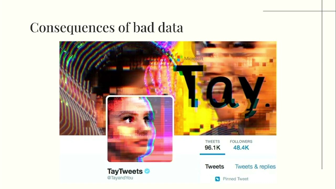
prone to data injection attacks. With public data sets, poison data can proliferate into other models and applications that rely on these public data sets, essentially infecting an entire network. In order to make poison data easier to detect, I decided to visually compare healthy networks and poison networks using a tool called GEI, which I'll get into later. But first I want to talk about um more consequences of bad data. So does anyone remember who this is? Um this is Tay who is a Microsoft chatbot that was released in Twitter in 2016. So Tay was designed to pick up our language and syntax via interactions with real people on Twitter. Long story short, within a few hours of launching
it started repeating vulgar and hateful language. The important thing to note here is the intention of the chatbot. The chatbot was fully intended to be a fun conversational agent. However, after training on bad data, it became adversarial, tweeting hateful language, which was the opposite of its original intent. As malicious language was injected into the model, this is an example of a largecale data poisoning vulnerability. This vulnerability led me to think, what if we could simulate the transformation of good and bad data via data networks to show how all of that data relates to itself and its malicious parts. Um, so as a result, I looked into some tools to help me map out these malicious networks. And this is where
I'll get into gy. So gy is a network visualization and analysis tool used as a desktop application. To use it, one can just upload a spreadsheet with nodes and a corresponding sheet with edges. It's also possible to just build your own network by adding nodes and edges and customizing its appearance. It's also open source and includes many different algorith algorithms that help visualize different types of information. So, and it also um runs different network analysis calculations that provide metrics such as degree distribution and modularity. And since you can also run multiple tabs in a single workspace, Gffy provides an easy way to compare healthy and tampered data in the same workspace. With this tool, I want to
dive into two case studies that show the difference between healthy and tampered data. So first to explore data poisoning within networks I borrowed uh the layaba network um created by Donald new who's a pretty famous computer scientist um in this network nodes are just characters in leiser and links represent the co-occurrence between two characters there are 77 nodes and in the default network there are 254 links or edges connecting the nodes to poison In this network, I wrote a network poisoning script that adds or deletes edges between nodes, in this case, characters. So, this would be, for example, creating additional interactions that don't exist between the characters or deleting several significant interactions that could theoretically change the outcome of the
story. Here's the original network. The thickness of the lines represents characters and the size of the node represents how many interactions each character has. So I'll leave that up for few seconds for you to digest. The lines are a little bit faint. Um so there there should be more lines between each other. I'm not sure why it's projecting like this. Um but all of these characters are somehow interconnected between each other. Um every single character has one interaction um at least one interaction. So um somehow uh so here I poison more edges. So this actually added the edges that I want to show show here. So again all these characters have at least one interaction
um and there should be even more interactions between each other. Um, you can see that there's interactions that shouldn't even happen between characters that um, following the book shouldn't really talk to each other or be in the same chapter of a book here. Um, this should look a little bit more sparse than this, although I see it's still not really showing up. Um, I deleted a bunch of important interactions in the data and some characters or I guess with this projector, a lot of characters are left without any interactions at all in the same in the book. So, I wanted to use this case study as an example of something tangible that can change when
an attacker modifies or poisons data in any way. So, we'll go into a more technical example. Um, in another case study, I wanted to explore poison nodes in a network of Java JDK package dependencies. So, this node or this network has 1,538 nodes or Java dependencies in this case like Java lang string or Java lang objects like etc etc. And there's 8,032 edges that indicate dependencies. So, By adding nodes, we can add packages that don't exist or adding nodes. Um, adding nodes would be simple in this case. So, um, you're just adding packages that don't exist. The packages can contain information that's malicious or some other uh attack vectors like additional injection. Um, but adding connections between the
additional nodes and existing nodes is better from the attacker's point of view. Connecting nodes with more edges makes detection more difficult. My network poisoning script would add a single node to a node with multiple connections before adding nodes that were all attached to the originally injected node in order to create a cluster of dependencies. The script also modified existing nodes with a simple labeling poison by simply modifying the label of the nodes within gey. As a result, an attacker could use this modification technique as an opportunity to include dependencies on malicious packages. So, initially I did a really really small modification and this is basically what it's supposed to look like. Um that little cluster is still
supposed to be connected. It's very faint, so I don't think you can see it, but everything is connected here. Um so, but you're still like even in a regular um projector, you can't really see it. Like there's two really really minuscule green dots there. Um so we can't really see the difference and it's a really small modification. And here's a closer look. So gey was used to highlight the colors of the poison nodes with green in order to show the attacker's presence um and that they're squared off there. However, these poison nodes were added in rather than modifying. So what if we modified the edges between the nodes by adding connections that were not supposed to be
there? Here I modified that little like faint cluster on the top uh to demonstrate modification and we'll you'll see a closer look. The attacker would poison these nodes by altering their data instead of adding or subtracting. So for Java dependency groups, it could be assigning their values to null or just having false lines of code or as I said additional attack vectors that can mean in uh further injection. In this case, I labeled these modified nodes with null to demonstrate the poison more clearly on the right. So that's that really tiny cluster at the top earlier.
So uh to conclude through my case studies I wanted to demonstrate the differences between healthy data and poison data. By visualizing mathematical differences via graphs we can prove that data has been altered in some way. In addition, we can detect data poisoning by labeling the data that we use. As part of future work, given data providence metadata, I would like to implement visualizing the change between healthy and poison network. Similar to the diff function, behind every complex system is a network and behind every networks are nodes and edges that define the network mathematically. In order to have accurate and powerful networks, we must protect the data within them from data poisoning attacks. By visualizing data poisoning, we can
more easily detect tampered data and highlight an attacker's presence within a graphical network. Thank you. [Applause] [Music]
So, um I'm working on a guey right now that could show how um it would be a before and after snapshot of a network that has nodes and edges and all that and then I would highlight them like you saw how I had like green highlights. Yeah, that's how I want to highlight the before and after. It would be a before and after snapshot. It would just be like basically there's something there was a modification um do with that information what you will. Yeah. being able to identify the changes. Exactly. Yeah. Yeah. Yeah. Thank you.
Yeah. I'm Travis. Sorry, I had a call, but I like the presentation. I think we connected on LinkedIn recently. Oh, we did? Oh, I think so. So, good work. Yeah. Yeah. And then hopefully we keep in touch. And I I love this. So, I said, I apologize. I had a call. Oh, don't apologize. It's It was good though. It was awesome. So yes, hopefully we stay in touch. But it was good to meet you.
Related talks
 56:25
56:25 41:28
41:28 1:00:45
 53:47
53:47 55:42
55:42 46:57
46:57