Poison in the Wires: Interactive Network Visualization of Data Attacks

Show original YouTube description
Show transcript [en]
Hello. Hi. How y'all feeling? Amazing. I feel like >> Are we recording? >> Okay. All right. Welcome to Bides Las Vegas. What's up? Y'all ready for amazing talk from Anya Vzna? Poison in the wires interactive network visualization of data tax. Thank you to our sponsors cuz without them we'd have no money. And thank you all for attending as well. Volunteers Adobe Aikido Drop Zone I AI. Y'all seen the um furry dude here yesterday. That was pretty cool. No phones. Please mute them. I know it's early. So wake up. If you have questions, they will be answered at the end. This is only 20 minute talk. Please don't be rude. And uh pay attention to the young lady from
Philadelphia. Go birds. Okay. And no pics either. Okay. Y'all going to be pretty later. All right. Without further ado, let's give our girl Anya a round of applause. Let's go.
Go birds. Um thanks for the intro. Um, welcome to my talk on data poisoning. So, I'll be visualizing data poisoning using networks. Um, I'm interested in researching the intersection of network science and cyber security. Uh, by network science, I don't mean analyzing TCP packets. So, if you were here for that, I'm sorry. You're in the wrong talk. Uh but my goal with this project uh was to see how could we visualize the data poisoning vulnerability uh in action if we visualize the graphical data that can be formulated from training data used to train LLMs. Uh machine learning models have become more increasingly integral to software applications. So they fe face increased risks from adversarial attacks as a
result. So um what if we could represent all of that training data as a graph and what if we could then compare healthy and clean data uh within the vulnerability. Um so here's a screenshot of what I will be demoing today. Um I won't go into too much detail just yet but I wanted to give you a preview so that you can keep in mind what the end result will look like after all the background that I will give. So, uh, how does machine learning work? Um, if like if you don't know how it works, there's a pretty this is a pretty simplified way of showing how it works. Um, machine learning is just a method of
teaching computers pattern recognition and making predictions from data without being explicitly programmed for each specific task as the goal. Um, essentially algorithms learn from examples to identify patterns. Um and then once they're trained, models can make predictions on new and unseen data. Uh there's three main types. Um supervised, so like learning with labeled examples, unsupervised learning, which is finding like hidden patterns, again pattern recognition, and reinforcement learning, so learning through kind of trial and reward. Um, a lot of these uh sort of uh the applications of machine learning include things like recommendation systems, image recognition, and language translation. So, I'll show you how data poisoning uh fits into this exact image in a in a second.
Um, but first, uh, so what is data poisoning and how does that relate? Uh, data poisoning is a pretty well-known machine learning vulner vulnerability as defined by OASP. Uh data poisoning is an attack that occurs when an attacker manipulates training data to cause the machine learning model to behave in an undesirable way. Uh data poisoning occurs through three methods. Addition, modification or deletion of data. Interestingly, addition can also kind of mean the injection of data. But injection attacks as we know do not always mean adding data. Um so like it can also mean to delete or to modify. So how does the data poisoning vulnerability fit into all of this? Um I changed my diagram a little bit and the
model reflects poison data. Uh poison data kind of goes into training data via some kind of attack vector which we'll get into. uh the machine learning algorithm processes this data and then the training model is compromised and what this all leads to is biased output from the model and ultimately the model doesn't fit the intended context of its stated purpose. Um so I'll give you a moment to look at that. But um moving forward I wanted to kind of give a real life example uh like an application of this that happened to a colleague of mine. Um my colleague is very concerned with privacy and uh he started to post images on social media tagged with his name or username and he
would tag himself in photos of like alpacas rather than his own face or likeness. So for example, he would tag himself in a LinkedIn post with a picture of an alpaca rather than a human. Uh so by associating his name or username to alpacas rather than his face my colleague kind of caused an unexpected outcome of the data essentially manipulating his likeness. Um so I can give you a even more well-known example that has come up recently in the news. So um how many of you remember who this is? Few. Um this is Tay a Microsoft chatbot that was released on Twitter in 2016. So, Tate was designed to pick up our language and syntax via interactions or
tweets with real people on Twitter. Long story short, within a few hours of launching, it started repeating vulgar and hateful language. Um, the important thing to note here is the intention. So, the intention of Tay was to be fun and conversational, kind of like a fun and conversational agent. Um however after training on bad data it became adversarial tweeting hateful language which was the opposite of its original intent as malicious language was sort of injected into the model from tweets. This is an example of like a large scale data poisoning vulnerability. But more recently um uh this is like a more recent example of data poisoning that blew up on Twitter or I I guess I
should say X now. So um now Grock started suddenly including racist language in its responses. So for those that don't know Grock is Twitter's AI chatbot so integrated fully into the platform. Grock provides several features such as being able to function as any other Twitter account responding when added and being able to post. Um it's also possible to chat with it just like chat GPT or cloud or anything else. Um, so earlier last month, uh, it kind of went rock kind of went crazy after getting a system update during which it called itself Mecca Hitler and similar to Tay started tweeting inflammatory content. Um, reportedly this was caused due to an update where the chatbot was
trained to not show away not shy away from making claims which are politically incorrect as long as they are well substantiated. But we all know how that turned out. Um, so after a while they removed this prompt and um, now it's sort of back to how it originally was. So um, now I want to kind of get into the network science aspect of this. So why use it as a tool for data poisoning? Networks are networks are like an applied sort of graph. So they're really powerful tools for prediction but are as only as accurate and stable as their data sources. So um they have a lot of predictive power and analysis of networks also kind of leads us into some
interesting statistics such as edge multiplicity which is multiple edges sharing similar nodes. Um, but I kind of um want to get into a a brief primer on network science. Again, graphs are kind of like a mathematical concept of networks and networks are applied graphs. So, I kind of use them interchangeably. Um, but I'll be talking about the graphical definition uh more often or like the network um I will be using nodes and edges. So, a lot of it is interchangeable. So networks help us represent like a lot of important information. So you can kind of think of like flight paths can be represented in networks. Um social networks, our networks, um things like that. But I also uh kind of saw this as
a way to visualize training data for machine learning. Um, and all of this kind of needs to be protected since tampered dip networks and data can have cascading results as we just saw with like examples of Tay and Grock. Um, training data can be obtained through various attack vectors. So for example, private data sets can be infiltrated through insider threats or sophisticated attacks. And public data sets or repositories are prone to data injection attacks. uh with public data sets, poison data can proliferate into other models and applications that rely on these public data sets. Ultimately, the goal with data visualization is comparing the before and after uh results of poison and clean networks to help determine the presence of data
poisoning. So, GEI, which kind of inspired um all of my research, is a network visualization and analysis tool which is used as a desktop application. Um, you just kind of upload a spreadsheet or CSV file or any kind of CSV file with nodes and edges and you can build your own network and customize its appearance. It's open source and completely free. So, I think it's an amazing tool and inspired the tool that I made for this talk. Um, it kind of gave me an opportunity to um, uh, compare healthy and tampered data in the same workspace. So my goal with the tool that I made which is called graph leak was that I wanted to build a a very simplified gffy
as something one could just like run in a browser and easily drop in network files without the learning curve of gffy. Uh I will always advocate for gey usage but to me it's important that visualization applications are intuitive especially when it is for a vulnerability application. Um with graph leak one can simply upload poison analyze and compare graphs side by side. Uh you have full control over which nodes or edges you would like to poison. So uh there's another big aspect of graph leak which is statistical analysis. And so why is that important? Um we can kind of give use statistical analysis as a rough estimate of risks. So I have a few risk ratings here. Um
10% is the rough amount of poison nodes or poison data points needed to alter data in a machine learning model. So it's not just chosen arbitrarily. This was like a real statistic. Um but less than 10% is not that very noticeable. So it is less of a risk. Um here's a quick rundown of all the features of graph leak. So um you can import CSV data just like GV uh multiple tabs to compare multiple graphs that there's also a comparison feature um that we'll get into as well uh which you which you saw in the preview um and I have a few algorithms that I'll get into and uh there's again the comparison mode. So here's like a quick overview of GEI
or this is a picture of GY sorry graph leak I have a console console on the bottom left that kind of shows what's happening. So uh you might might also be wondering in my presentation am I just poisoning arbitrary nodes that I've decided should be poisoned. Um the context really matters when it comes to training data. So all the data that I represent in these graphs is all potential training data. So when I add two data or delete data, I'm altering the fi final result of the graph. So again um I wanted to get into algorithms very quickly. So on the left you see a force directed graph. Um in the middle is a circle graph and on the
right is a grid style graph. They all kind of have different usages, but I'll be using the force directed graphs or force directed graph most of the time. Um, force directed graph is like a very great basic graph because it shows uh it is really good at showing social networks and relationships. Um, circle graphs are great when like relationships are generally equal and grid graphs are really good for like physical or spatial relationships. So like um floor plans or architectural diagrams. But I'll just get into the demo really quickly. So I have a few instances of graph lake with uh different graphs that I've already uploaded and I'll show you how uh it kind of works. So um on the left I
have like the statistics. There's eight nodes, 11 edges. Um I can also kind of change the graph around. So I can change this into a circle. Um I can change this into a grid. So uh what the nodes represent if you can see is various like network um but this time it's actually like a physical security network um rather than a graphical network. Um so I can select one and delete this and it becomes a completely separate graph. Um then I have the original graph here. So if I hit compare um can kind of see the various statistics of the graph and just deleting one node co caused um caused several edges to be deleted as well. So
the risk of this is uh kind of jumps to a medium um since it's beyond that 10% threshold. Um I'll also show this in this uh just simple social network of seven people. So I can also add node. So if I want to add myself,
I can also do that. But I'm all the way over here. So I probably want like an edge to connect myself. So I'll connect myself to Eve. And that is how I joined this social network. Then again I'll hit compare. So the risk of me now being in the social network is low. Uh so not really poisoned. Um but that's just a quick comparison. Then here is like a much a slightly bigger graph. Um personally I would display a graph like this using grid because I think it like looks more neat like this. So, it's a little bit you can kind of see the connections a little bit easier in this case. Um, but I'll go through
this uh quickly. So, I can kind of delete several several things. I can maybe delete a node and kind of switch this around. So, when you delete a node, you kind of also delete any connected edges. So the edge amount sh uh goes down quite significantly versus graph one. Then again I'm comparing. So all right but I'll go back to um my talk. So
So what did the data show us? I know that was pretty fast. So if you want to see this again, feel free to come talk to me after the talk. Um, visualizing mathematical differences can kind of show us how data has been tampered in a graphical format and labeling these data points can also kind of tell us how this changed statistically speaking. Um, graph leak was heavily inspired by the concept of data providence. So you can kind of think of data providence as uh the concept of a history of a particular data set. um what like what has changed between set P and set Q and kind of what's the change uh you can kind of
think of this as a diff function or anything you see in GitHub. Um so I wanted to kind of illustrate how we can track these sorts of changes in our databases to detect um data poisoning uh for threat detection. And finally like the risk analysis is something that we can use to compare um and understand how much of our model has changed. So for future features that I wanted to implement in graph lake I wanted to do more statistical analysis since there's a lot to learn from the numbers of nodes and edges. Um and also um I wanted to kind of implement um one of my favorite concepts in graph theory which is cycles. So what do cycles and
directions tell us about graphs and data as a whole? And I wanted to integrate graph leak into a training model to truly show how an LLM can change over time from poisoning beyond a theoretical model. Um to quickly recap, we know that private and public data sets can be infiltrated um through various attack vectors like insider threats etc. Um but I wanted to importantly reiterate that our LLM data is trained on private but more frequently d public data sets. So for this purpose data has to be healthy. Um so I have a few solutions. Private data sets should be ultimately private and access control should be monitored and public data sets can also be controlled
uh via uh sanitization or rate limiting. Um and again data provenence is something that can be easily tracked. Um but ultimately uh LLMs have become like a quite a common integration in software applications. So being able to visualize these vulnerabilities um that affect training data and effectively the output will help us understand how to safeguard models for safer software security. Thank you. >> Thank you Anya. Any questions? Got room for one, maybe two. Raise your hand. Speak now. Forever. Hold your peace. Keep it up. Don't say nothing yet. using this, how do you tell? So, you're looking at new data comes in and therefore it's one of these nodes. >> Yeah. >> And it's linked. How do you know that
that was necessarily bad data that came in versus just new data that it's supposed to be training on? So, yeah, new data that's not poisoned versus new data that is poison. >> So, this is like where context matters um a lot. So, uh, if you think about like the example of Tay, sometimes like you can't tell if somebody is trying to be conversational and kind of like like normal or if they're saying something actually malicious and the context kind of matters. So, you do need like a set of rules or guard rails around what is the like around the input itself before um, and that's how kind you can kind of tell what's being poisoned and what's
not being poisoned. But it's a very like it's kind of like a very kind of opaque vulnerability in terms of like what is the correct input and like what should be input and what should be output. So it's a very like contextual thing. >> All right. Thanks everybody. Thank you Anna. Give it up for her.
Related talks
 37:29
37:29 35:09
35:09 37:19
37:19 46:35
46:35 35:10
35:10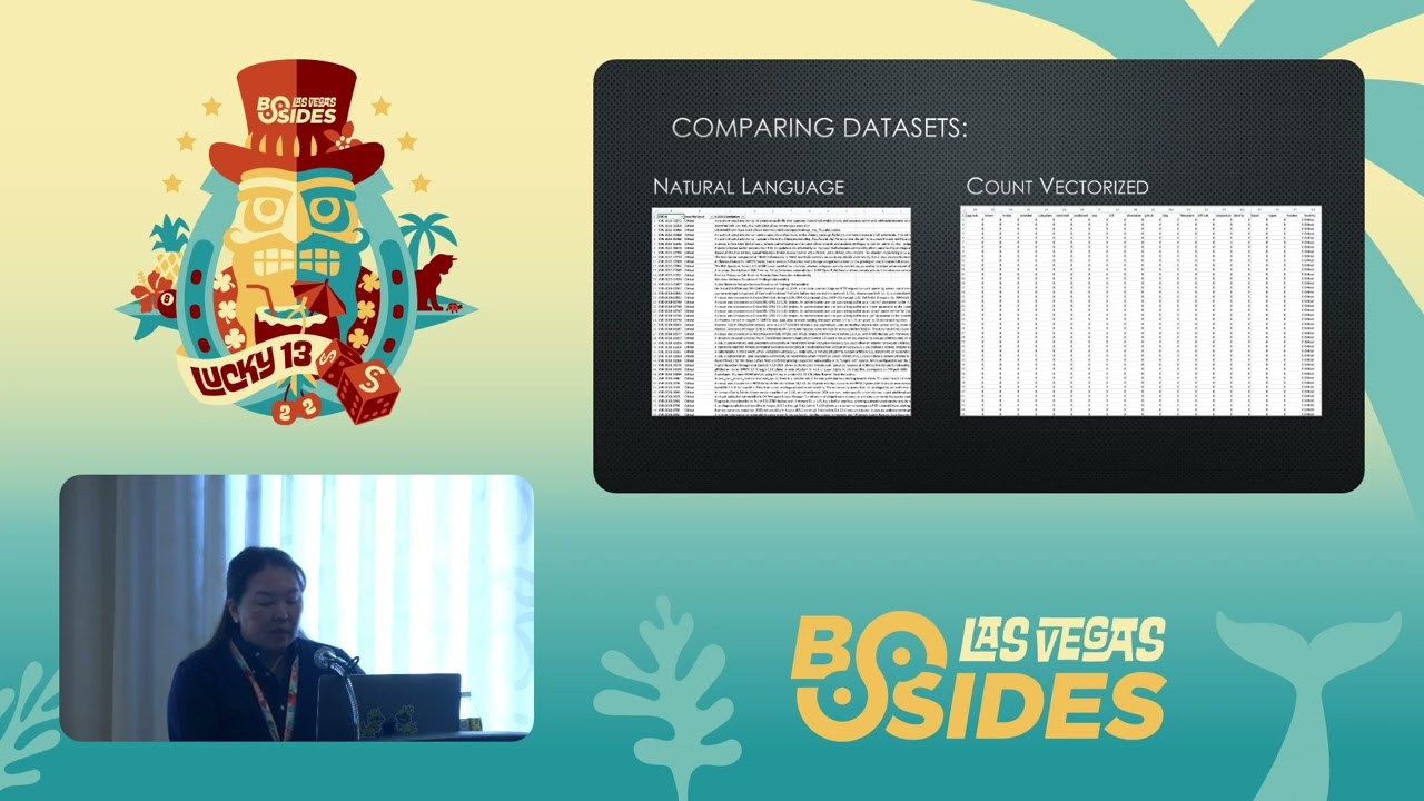 47:58
47:58