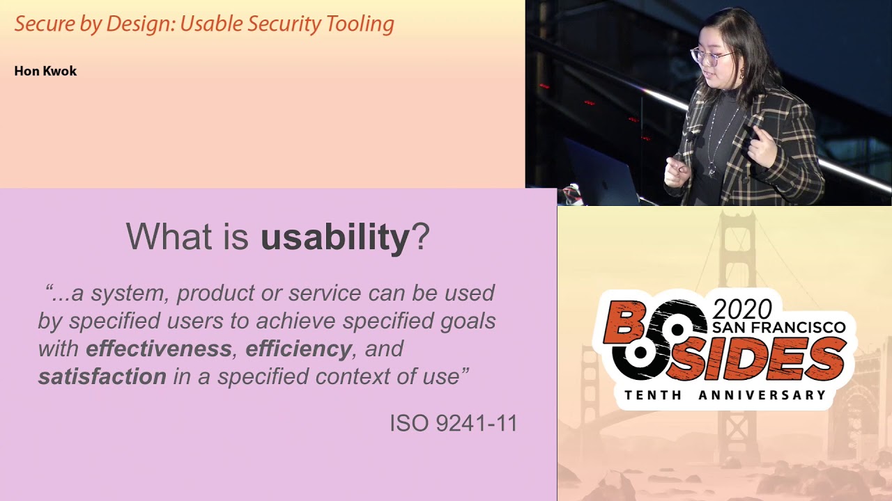
Secure by Design: Usable Security Tooling
Show transcript [en]
is secured by design usable security toy right sorry I'm trying to figure out how to hit the next slide okay cool a little bit about myself my name is Hancock I started working in tech as a software engineer as sumo logic building observability pipelines a couple years ago and about half a year ago I moved into InfoSec where now I work as a security engineer at Cruz I built human centric security experiences on security I'm the security products team and I'll elaborate a little bit bit more on what I do next outside of work I occasionally write long-form thoughts on my blog on des and I'm also on Twitter and can be reached there if you'd like to say hi okay so I
joined the world of security about half a year ago and like any new job I walked around the office shook hands and did introductions and most people were a little curious about what my background and what I did specifically so I say I did a lot of usability and front-end work previously and that caught some people's attention a co-worker of mine asked if I could take a look at something he's been working on and maybe help he showed me this tool that he built for the OPSEC team that collected data from reoccurring scans on internal resources it was built API first and then eventually they decided that they want to use their interface to make it
easier for reasons like discover building discoverability and learn ability and they hacked together a UI unfortunately this UI had a lot of difficulty gaining adoption and some people just outright avoided it someone described it to me as an embarrassment so unfortunately the product didn't really represent the value of the work done and he wanted to fix that so let me show you some screenshots of the redacted UI all right this is the home page of the application there's four buttons records repos home file ticket and a bunch of mysterious dspace as well so say we click on one of the buttons alright we clicked on the repose button this is a page with a table of a list of all repos we have and
if you clicked on records you would see nearly the same UI not shown in this screenshot is that this table itself has thousands of rows to it so you can scroll a lot so let's let's look on a table row all right so clicking on a table row takes you to a resource specific page and the output of any scans done previously these three pages cover a majority of the application so let's take up that all in I'm sure some of you all have thoughts on the UI and UX of this experience but let's do an exercise on what we've just seen from there we can elaborate on why these points can be especially problematic
it's in the context of security tooling and don't worry about not being a usability expert as people that touch computers we're all qualified to form opinions on how we interact with technology all right back to the home page ok view all around 10 seconds to form some opinions on this
all right so I'm sure a lot of you are thinking about this already but why is there so much white space it is like something not loading correctly do I have the right permissions to view this in the first place what's going on so why not put some information there if you're using this app for the first time this does not lend well to understanding what the application does and that can be really dangerous from a security perspective because it makes the application intimidating from the get-go all right here's some here are all the screenshots I showed earlier and let's take maybe 20 seconds to form some additional opinions and the usability of these
so some things you can take a look at is the general layout of the overall application the URLs the whitespace etc etc if it like makes sense to navigate give you another 10 seconds all right so why is the home button in the rightmost part of the navigation this is not a common design pattern and most websites that use a horizontal navigation part has a home page as the first button as a left mouse button and why is this bad so security is not always the easiest thing to learn and having non standard UI practices changes the context from learning security to learning to use this application and learning to use security this adds a lot of unnecessary
brain cycles to something that is completely unrelated to the original intent of using this application when you have enough of these seemingly small quirks they really add up and make the cognitive load of using your application ineffective and slow here's another one looking at these URLs they have the same URLs for different pages so one of the URLs is for the list of all resources and the other one is resource specific and they're the exact same so this suggests that this application does not support deep linking and that implies that users have to navigate through the entire UI again to get to a specific state if you see something interesting on a specific resource and want to show
a co-worker this co-worker would have to navigate to the same page as opposed to you just sending them a link this might includes growing through hundreds of rows on the table like that is slow inefficient and that just makes it difficult to use again and it also makes collaboration unnecessarily difficult alright so I redesigned and rewrote the entire front end I fixed all the things noted previously there's homepage now there's also a navigation bar that makes sense and deep linking also exists but some of the other things that usability improvements that came to be is that the table is a lot more data dense previously information in the table created very tall rows and I made
it very difficult to perform search and scan operations so previously in the viewport they were about two rows per a window and now you have a lot more and this is also blown up so yeah and then it's also easier to digest date/time previously you had a lot of information you didn't need and sometimes you just want human friendly text and as people that use you eyes we are humans and we should be nice to ourselves if you wanted that information you can hover over that text and see that information and lastly as the unspoken requirement for all security tooling we have dark theme all right so like most security teams when you find issues and
vulnerabilities you reach out to people in engineering organizations for mediations and fixes so this happens quite often and in some of these interactions the developers got a little curious about this application that all these security engineers were using so they asked what is this tool that I don't have access to can I get access to it and how do I get access so let's stop we have a mental shift from security folks doing security to engineering and security people doing security this human friendly UI empowers people to do and secure things by themselves we're decreasing friction and makes are we are decreasing friction to security and it makes all our lives much easier if you
want to build constructive relationships having user-friendly tools it helps motive motivate engineers to champion security tasks this question represents a shift they shift from reactivity to proactivity around security by enabling your people and let's remember why we build security products in the first place we build and maintain these services and tools to enable the rest of the organization to maintain its security posture and culture so what is usability in short it can be broken down into effectiveness efficiency and satisfaction notice how nowhere in this definition does it say usability means aesthetics it doesn't oftentimes usability gets pigeon-holed into just visual design and that's just not true things like command-line tools can benefit from usability thinking get the version
control system had a recent update where it broke down get checkout and to get switch and get restored why because having one command do two different things is confusing and unnecessary so would you ever build a security tool that is not effective not efficient and not satisfactory sounds really dumb right so usability should be the top priority for any sort of security decision okay UI before API so Dan is a large finger in the front-end community for his work around react and redux he also clarified in this tweet that he uses UI and UX interchangeably and there's also grateful a blog post if you look it up but as a takeaway from this let's talk about it more abstractly
so api's are an abstraction on how a person might do something on a computer and at the same time api's are four machines turns out api is also create constraints these constraints enable people to do things they also prevent people from doing things and lastly they enforce people to follow a particular interaction pattern so let's hold up aren't API is just abstractions for how a human might interact with the computer and an AI yeah um api's are abstractions for how humans interact with computers but why should we let an abstraction for a machine dictate how we as humans do things in an ideal world we need to be thinking about the user first also in an ideal world
usability considerations exist at the start of any security decision so hopefully I've sold some of y'all and prioritizing usability and your security tooling so what are some actionable things that we can do to get the ball rolling so if you have designers go talk to them come best friends with them they're really cool people if your product is internal your designers already interact with your engineers a lot already and if your product is external your designer is almost a hundred percent already have a deep understanding of your organization's customers you can find out what's in place for user research and maybe even find people to champion your cause second point is inventory what work already exists do you have a
component library a design system a cruise we had a UI kit that a lot of you a lot of engineers were building with already but the security team wasn't utilizing it using known resources means you're making new experiences feel familiar people know what interaction patterns exist in their current tooling so why not use those patterns in your security tooling by benefiting from these known design patterns and makes your application less intimidating easier to learn and my favorite last work for me so for feedback and evaluation of your existing tools here's what you shouldn't do and it should be a combination of both so if you're including others in your research you should do user research and that means
gathering others doing surveys doing interviews getting an idea of how people interact with your application seeing if anything's confusing if there's any workflows that you never thought of in the first place the other thing is a heuristics evaluation a heuristics evaluation is a usability inspection method used to identify any design issues associated with your user interface I said Nielsen and parentheses because Nielsen heuristics are ten very well-known and general principles for interaction design I have three of the ten listed below so for example recognition rather than recall in the image that I have on my slide you can see the fonts are displayed in a font in the form of that particular font so when
you choose it you already have an idea of what it looks like so let's put this in a security tool in context say you're giving someone permissions to access something that requires you to input their email and you now need to know their entire email before they have access to something a usability plus that you can add to your form would be autocomplete instead of having someone recall and type out the entirety of that email now a couple keystrokes and hopefully you can recognize and identify the right person for those access permissions if you're doing a heuristics evaluation definitely take a look at Nielsen's heuristics there are ten which can be a lot but focusing on a couple can really
help you get started all right so if you learn nothing else from this talk remember this effective security is secured by design security has a lot of tough and important problems and unusable solutions gets us nowhere let's think of poor design as an inherent flaw or vulnerability to any sort of solution if you have an unusable security tool and no one wants to use it and it doesn't really help get the job done why bother why have them build an unusable product I mean no one starts off writing something and going like I am going to build an unusable product no one does that that's pretty silly so why do we have unusable products well if you
don't prioritize usability from the get-go very easily becomes unusable so effective security is really secured by design and there's a lot of amazing security products out there but that but the work that interfaces with us the humans it doesn't really always add up your user interfaces should represent the value of your work as the world discovers how important security is let's make sure it's effective efficient and satisfactory thank you all so much for coming to my talk my name is Hana and I'll be around if you have any questions since I finished pretty early this is also my first conference talk I've ever given and I wanted to give thanks to a bunch of people that helped
me through the process I'm sure I'm forgetting a bunch of people here vana James Brian Dylan nathaniel nemesis sarah and so on a lot of people helped by posting tips on Twitter and whatnot and I'm sure I'm forgetting so many of you but thank you so much for coming [Applause]
Related talks
 34:12
34:12 28:06
28:06 28:29
28:29 29:24
29:24 32:13
32:13 30:17
30:17