BSidesBoulder 2023 - Ryan Thompson - Ecosystem of Insights Building Operation Dashboards That Enable
Show original YouTube description
Show transcript [en]
make sure I have the right one open here before
we all right folks we're going to start the uh the last Talk of the day uh so please welcome Ryan Thompson he's going to be speaking about building efficient operations dashboards thank you so much I want to thank anyone who's still here it's the end of the day uh I'm not talking about Chad gbt or large language models we're talking about dashboards and if you've made it into this room um God bless you right dashboards are not the sexiest thing but I'm going to try to give some tips on build holding operational dashboards and hopefully some takeaways you can take back to your teams so with that said let's talk a little bit about me if you notice that's
a picture of me um I'm a security researcher at crowd strike and I've held various roles over the years but in every single role uh there has been some instance of Cabana one of those roles to be fair was working at elastic so naturally you're going to get some Cabana there as well um so just so you know there's going to be a lot of screenshots of Cabana a few of Splunk but I'm trying to make this advice high level and agnostic enough that it can be used across multiple Sims so there's going to be a slight bias towards Cabana with that said what are we going to talk about more importantly we're not going to talk about log ingestion
parsing uh individual analysis of logs hey this Sim's really got a really cool module um we're not going to get into those details so just getting that out of the way uh that's a great conversation for beers afterwards we can talk about that we can argue about you know you know what naming schema you should be using for your parsers which to be fair I don't have strong opinions about but we can chat having said that what I will be talking about is guidance on Planning and Building dashboards so we're not going to get super super in the weeds if you came here for a hey I click here I D select this drop down
this isn't quite the talk we're going to be a little bit more high level we're going to talk about some some guiding principles so with that said here's the agenda we're going to look at dashboards at a high level what what are our goals here we're going to be talking about some pillars of dashboard's Excellence that's a little cheesy but these are some guiding principles that are going to follow us through the rest of the the conversation we're actually going to talk about building some of those dashboards what steps do you need to take who should be building them some quality and life improvements and we'll wrap it up with a mini rant session about some dashboard SS so let's go
ahead and get started so first of all quick question how many of you have Cabana or use Cabana in your current role Let's see we got some hands up um how many of you have another Sim of maybe that's up here maybe that's not we got another hand raised from the same company right so everyone has these Sims some vendor has come out and said you got a lot of logs I've got a solution for you and whether or not that solution is right or not you need to be pulling these in they are right about that um so you've got this pile of logs so what happens next what you've got a search bar your engineers
have done a hopefully a good job of parsing these ingesting all this information um and now you throw that to your analyst your analysts have this empty search bar they don't know the fields that have been parsed they don't know the syntax um especially if you have a high turnover in a sock um you're likely what's going to happen is there going to be one or two people who really take to this they dive into it and become your experts I know this because I've been that expert at a few companies and they're the go-to and they become a bottleneck right this is what happens um whether it's elastic or whether it's Splunk right you've got this search bar
here Splunk is is even more uh unforgiving in my opinion you have to know some syntax to get started at least cabanding punch that search button and get some results back so this is not a great place to be um for a company or for an analyst and so of course I'm I'm proposing this question what's next if I'm giving a presentation I'm asking a question clearly I've got the answer right so the answer is going to be dashboards we're going to lower that that bar I want to talk about types of dashboards real quick and specifically which ones we're going to focus on so they're what I consider exhibit dashboards these are the ones that you
see in stock images of cyber security right there's like things going across a map there's PW Maps it's hanging at the front of a sock and and the you know either your your customers come in on a sock tour or your management comes in they strug yeah this looks really good we got pie charts and and all this right that's not what we're talking about today the other type of dashboard would be a monitoring dashboard so hey I want to know when things are on fire I want this dashboard to light up red and I I think these are definitely more valuable than the first type also not what we're talking about though what we're talking
about is operational so I have questions of my data either an alert has gone off or there's an incident I need to go ask questions of it and this is used uh mainly for uh investigation uh deeper into your data now could you do that with a raw search sure but there's a high barrier to entry to that so the the whole purpose of this is to lower the barrier to entry of asking questions of the data that's what that's where our goal is here through all of this through all of the different widgets I talk about and some of the techniques uh that's what we're doing so with that said let's dive into some of these
pillars these are guiding foundations and and it goes beyond what I think I cover here uh but I think they're really important to consider as you're building these out and structuring these so first of all we have consistency interconnectivity and manageability those are the three pillars and we'll talk about those a little bit first up is consistency if you go to a major website or you open a major application think about Microsoft Word or Amazon's homepage you know that if you want to go to the homepage of Amazon that little smile button is always going to be in the top left if you want to view your cart it's always going to be in the top right no
matter where you navigate there is some level of consistency to where you can build some muscle memory so that's going to be vital um that's going to be uh something that's going to connect all of your dashboards together speaking of that interconnectivity um quite frankly no sim out there that I've used at least has a great navigation pain for uh navigating between your dashboards you you go up to the hamburger menu you find dashboards you click and then oh damn this is the worst part right you've got everyone who's named all their dashboards over over time and there's like copy copy copy copy of different dashboards we've all seen it um I've seen it every
company I've worked at and so let's figure how we can remove that friction of pivoting between between dashboards and and realistically it's going to be it's going to feel more cohesive at the end of this as it's a set of data and and we'll talk about that more last one I don't have any screenshots for but this is just a good principle in general manageability anytime you can create and save an element and then reuse that element across multiple dashboards that is going to save your bacon when you need to make an update that means you update it in one place and it spreads out across all of your dashboards instead of having to go to each IND individual one and so
this is going to be huge we'll talk about a little bit on on how you can do this All right so let's get into building these dashboards once again we're not going to do a Click by click it will be slightly Cabana leaning but these are still the steps that need to happen no matter where you're building it at so first up we're not going to build anything we're going to go explore our data this requires somebody who not only knows the Sim to some degree um but also knows the source of that data so if you're building bu AWS dashboards you can't really choose somebody who knows Splunk well but doesn't know anything about AWS you need a subject matter
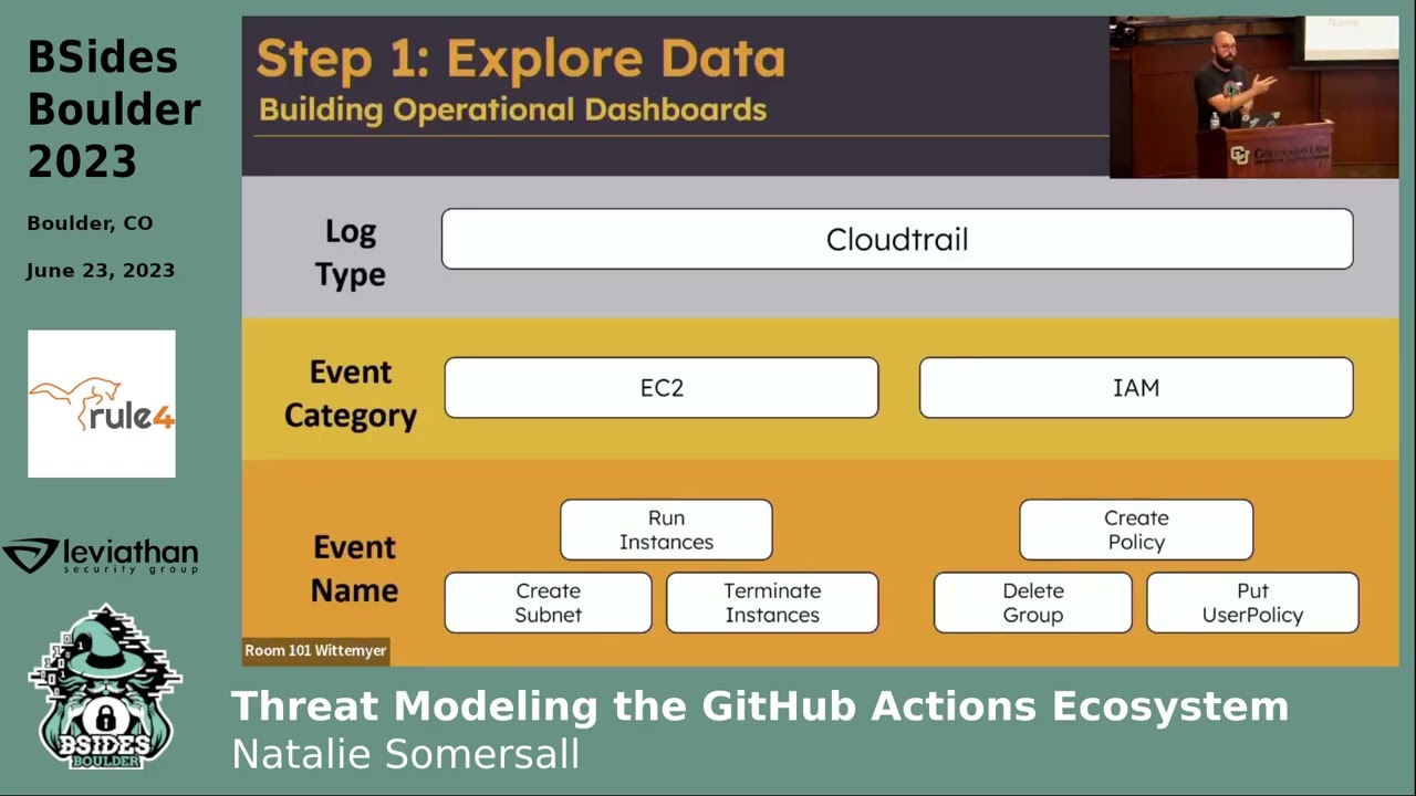
expert whether you hire one or whether you have one in pocket this needs to be the person this is not an entry-level task and so we need to sift through those raw logs understand how they're pared well how our Engineers have laid things out and you'll notice in this raw log here uh I don't know if you guys can read that in the back um but this is the field user type and in this individual field uh the value is I user and that's great for this log but you also need to be aggregating and saying what are all the possible values for this this individual field this is going to tell you so much about your data and so take
that time aggregate on individual Fields learn what is available before you even start building anything at all what you're going to find is that most of these logs have a tiered structure or a hierarchical uh structure to them and so up top you have log type so in this case we're talking about cloud trail underneath that you're going to notice that they're broken up into event categories or I think cloud trail calls them event sources and so in this case they're broken up by Individual Services you have ec2 you have IM am then underneath that you have event names right so figure out that structure for your logs whether it's GitHub OCTA Windows AWS whatever it is learn that
structure this might be a good way to build out your dashboards that's how I generally do it but it's not the only way what another thing you'll notice is that there's going to be some fields that go across all logs right so for AWS it would be something like Source IP address it's going to be uh event name right these are going to exist everywhere this will come back into play later as you get down into the more specific logs for run instance there's obviously going to be an instance type right whereas maybe in create policy there probably won't be that field so we'll talk about what we do with those specific Fields versus the more generic
ones I'll touch on this briefly Windows has a very similar structure uh in this case youve got the windows event log broken down by security system there's application there's a few different others and then they break down into individual event names so understand that for your logs next up we're going to want to build our navigation bar this is the piece I feel like most dashboards are missing and this is going to help with that cohesiveness across your different dashboards so question is that's great Ryan you'd say build a dashboard navigation bar how do I do that most Sims out there have a markdown widget or markdown visualization option and the Syntax for link is super easy brackets
text right whatever text you want to display followed by the URL that's it and so you can build this navigation bar out remember build it once and reuse that element so if you ever need to add to it you can add it in one place and it propagates throughout your dashboards but be careful because most of our environments most of our Sims are controlled by it and and sometimes they like to move to New domains whether that's cost savings whether it's consolidation whether it's just you know uh moving to a new host for stability reasons whatever it may be do not use your full domain whether that's an IP address whether it's a domain name
because that will come to bite you what's going to happen is they're going to update that domain or update the IP address if it's running locally and all your links will break so make sure you figure out how to uh cut off that domain and start grabbing from somewhere else so for elastic I've had a lot of Lu grabbing after the pound sign uh and then for Splunk just after the port right use those as your links it'll automatically navigate and it'll update as you change IPS or domains so it's going to help you a lot this navigation bar pretty straightforward you're going to build these out to link to individual dashboards so I have overview IM am
signin compute and storage and all those link to their individual dashboards so pretty straightforward nothing crazy so far if you have more than one data type you may want to build uh what I call a global nav bar so this one is specifically for AWS but maybe you have multiple multiple data types maybe you have AWS Azure 0365 gcp whatever it may be build that Global nav bar along the top have those linked to your overview dashboards for each of your services and what ends up happening is you end up putting two nav bars on every type of dashboard so for an AWS dashboard you need your Global dashboard there and you need your AWS dashboard
versure the kind of the same thing and this will make a lot of sense once you see the navigation actually work up here in the top right you'll notice that I'm clicking through different AWS services and now I'm going to Pivot over to gcp and it feels very cohesive so I can put a lot of different links in a very small small area and so really really handy now that we're on this slide let's talk about the header in general this is that consistency consistency piece that I talked about um first thing that I I feel like a lot of people Overlook besides the Navar is the title widget up here when I land on this I need to know
what it is and sometimes I need additional context so maybe I filtered in a certain way maybe I want to have information on how to ingest new logs whatever it may be you can put some small instructions up there in the top left also I'd like to have just a general count of logs so I know what I'm working with maybe a histogram of when these logs are coming in some very generic stuff remember this is up towards that higher hierarchy we need just general uh kind of generic fields that exist across all of our logs it cool thing about it it doesn't matter how you design it these are the same five widgets reorganized in
different ways figure out what makes sense for you the reason I suggest that we do this early is because you'll likely want to build it and then clone it right and then maybe replace those with the specific services that you want um but figure that out soon it's going to take some time you're going to be dragging some things you're going to be making making sure that things are even if you change it later down the road it's a lot of work but have it consistent it helps a lot so few tips on this first of all design it for a 1920 x 1080 screen if you've got a 49 in Monitor and you're spreading out your caban and you're
saying yeah this looks great when somebody opens that up on their laptop they're going to hate you it's going to be awful and so design it for standard screen size the recommended elements I have up here I'd have some type of title paint there let them know where they're at provide details maybe a count of overall records whatever makes sense for your organization or your data so next up step four this is that manageability piece and this is a really important piece um when you build a widget It generally asks what is your data source and most people say cool I want that raw data give me that AWS index pattern give me um all of the
windows logs whatever it may be and then in each visualization people end up putting filters in there and they say oh well this is uh specifically uh user logins and they'll go and they'll they'll adjust that visualization they'll create another one and they'll put those same filters on and create another visualization put those same filters on anyone who's managed anything at scale knows this is going to be a huge problem right as you if you decide that you your definition of this type of activity is changed you need to go change each and every filter I'm going to tell you right now you're going to miss one and the worst part is nobody's going to notice no is
going to Noti this for a long time if ever uh because when you start talking about dashboards things are abstracted you're not looking at Raw logs anymore and so you will miss that a better way to do that is to build and save a search with the filters built in so filter that centrally and then reuse that data source over and over and over again Cabana allows you to do that first uh mistake if you wanted to choose an index pattern you absolutely could but I would definitely recommend building those individual ual searches out and using those as your data source right because it's for this data table it's asking what source do you want to use
props the Splunk Splunk does it right uh if you want to build a data source it says great choose what search you want to use it doesn't even allow you to to choose an index or database it says you better create a search first and then we'll use that once again if you need to update that definition you do it in one place and it propagates through everything super super handy all right now we get to build out dashboards this is I was going to say the fun part it's it's not super fun but this is where you get to actually add um some value to these right so now you've got maybe four or five different
dashboards you've got your header along the top that's got some generic information now we can move further down that hierarchy and say great I want to build out some visualizations just looking for VM launches just for these run instances or just user logins whatever it may be and so you can build these specific to the those types you'll notice that my dashboard isn't very flashy I'm a sucker for for data tables I think if you're you're trying to ask questions of your data you need to bring your data forward visualizations can be useful I'd use them sparingly and I'd usually use them for time series things so changes over time amounts of data over time and I'd be careful about how
we use these I think bar charts are great if you just want to look at a total count and it's a pretty simple amount perfect for that line charts fantastic at comparing values to one another area charts are a little tougher think of who you're building this for odds are you're building it for people who aren't as experienced with data visualization or data analysis and it's really easy to misinterpret area charts they look really pretty they're great for things like net flow um but if you're not very trained in this you could very easily see this purple up here and decide oh man that purple is spiking like crazy right when in fact it's actually the red that's causing it
to move up because it's it's stacked on top of each other so be careful with that um net flow things like that would be good bites in bites out may work for that but use that sparingly markdown is going to come back again and again use these markdown visualizations to break up your dashboards so if you're building some visualizations out about run instances build a divider visually distinguish it from other sections it's going to make it flow a lot better it's going to make people understand instead of just having a sea of data tables there's some visual break in in the noise so those are the foundations for for building these out but let's talk
about taking it to that next level how do we make these truly easy to use and uh useful for our users first up is hyperlinks uh anytime somebody is copying and pasting a value out of your dashboard and having to paste it in somewhere else let's see if we can reduce that those amount of clicks right so in this case we have Source IP or Source host that has an IP address if we need to do a reputation check for that what we should do is instead of leaving that and leaving that up to the analyst we should go and edit that field most Sims allow you to do this instead of just having a value up there you can
say great my type is going to be URI or link and you put it in a template you say great I want to use tless intelligence.com and at the very end uh instead of having an IP address I'm going to have the value of this field and so what ends up happening is you get a hyperlink and you click it it and it takes you WR to talis's website with that IP brought up reduce that barrier reduce the friction to having those analyst do the right thing they're having to copy and paste all day that's going to increase burnout number of clicks is a whole another thing but uh just reduce that friction it's not just IP addresses
though that's the first one up there but there's also things like Windows ofen ID if you create a link that takes you right to Ultimate Windows security and pulls up that log right there the odds of your analyst clicking that and learning that quicker it's going to be much much higher but I think the most important one that I've seen is generally speaking we're pulling this information in from somewhere um a lot of the time we have internal ticketing systems that we're pulling this data in from or we have internal uh Data Systems that we're pulling it in from and uh Cabana probably isn't our only place to find information about this or your sim
right and so if you're pulling in service tickets go and create that link your internal link to that internal service ticket um I've built a handful of these for uh crowd strike and so we've got internal system systems all over the place and if I can make it a one click to go from Cabana that data analysis to the actual system that it comes from that's another huge win so don't sleep on that next up is documentation uh in my opinion wikis are where documentation goes to die it just gets buried under everyone's good idea of of what documentation looks like it's buried under dead links it's awful um and so why don't we build that using
markdown widgets once again I want that documentation to be as close as possible to the analyst when they're going through this and so you're pivoting you're going through and you're saying man you know I I really wish that I could build a better search what are the fields for this environment well I've got a help button up here I click that and it takes me to a slightly different structure here right I've got it built more like a Wiki with my links on the right hand side um but I've got all my documentation right there so once again removing that friction is huge last last but not least uh including raw data in your dashboards is
huge so uh as it typically stands you have your dashboards and then you have a raw Log search those are separate entities and so if you're looking on your dashboard and you decide I want to dive into this deeper you need to somehow either pin that filter or copy that filter and go over to your raw logs and search again and not every uh Sim solution is going to offer what I'm about to show but once again Cabana does and I know there's others out there that does once you save that search in your raw logs you can actually include it as a widget in the bottom so I'm going to filter on something here run instances
I'm going to scroll down and right in my dashboard I can go look at the raw logs once again removing that step now I can apply other filters that I haven't called out in my aggregations it's ridiculously valuable and so anytime you can combine that raw data with your dashboard it's it's a big win all right I get to rant a little bit here this is the fun part some dashboard sins that I found I kind of alluded to this at the beginning but inconsistent aiming conventions odds are this is what your Cabana dashboard looks like uh your your list of dashboards looks like it's oh hey Robert made this hacker dashboard and everyone's just copied it and put
their name on there and it's it's complete show let's be honest um what we want to do is we want to provide some consistent naming convention um some of the Sims allow you to create a different space inside of that Sim so you can have a fresh environment with no dashboards right you can build out your set there or once again we have a nav bar so most people aren't coming to this what we want though especially for visualizations you're going to have a lot some consistent naming convention so you can find them easily and so what I usually do is I usually do Platform followed by the Dashboard that it's on followed by some level of consistent
naming convention followed by in Brackets the type of visualization itself it's a lot of work uh if you decide to do this halfway through you got to go back and update them all it's worth it in the long run so now if I'm building out a new dashboard I can say great I'm going to search for ec2 table and then I have all of my ec2 tables it's worth the time put it in all right last in here this is one that I was super guilty of One dashboard to rule them all this idea that hot damn I can bring all my information together I can put it in one place and I can just step back and say
are we breached um it doesn't quite work like that you need to have different dashboards for different uh different environments and so the problem with it is is in this case I have multiple different uh data sources down along the bottom when I go and put a filter in what's going to happen is I'm going to blank out the majority of my visualizations what's even worse if you do a negative search it'll give you results that you don't expect uh that's a longer conversation about that but just trust me if you do a negative search on on one or negative filter on one data source and you have others you're going to get some results that
are going to be a little bit wonky all right actually I lied we have one more one more sin probably the most fun one pie charts pie charts are awful uh they're they're they're just the worst and and we'll go into why and more importantly if the pie chart was the only option I would say go ahead and use it I'm going to make the argument that you can probably find better ways to visualize that data so first up is the pie chart that has more than three or four four elements I don't know about you but I can't tell what any of these are down in this small yellow section right sure I can Mouse over them and
it's going to highlight things it's just it's not a good it's not a good visualization to show a ton of different data types and so over on the right hand side we have a data table which you know has a special place in my heart uh not only do I have the all the IP addresses clearly listed with their percentages but I also have the actual count and so once again this is operational we need to be able to filter on those outliers data table is going to allow you to do that much better you may be saying but Ryan what if you only have a few still not worth it don't ever use byy charts
um at first glance I don't know about you but it's hard for me to tell which one's bigger the blue or the green the whole purpose of this visualization is to reduce that ambiguity to make it very clear what's happening I'm going to argue that a bar chart does that way better even with just a few different values uh and then of course you got the trusty data table uh holding strong for me down there so I would argue that pie charts are never the answer uh I'm I'm going on a tour just just a rant about pie charts get them out of there they're awful um so with that said we talked about kind of those pillars right we
want to have things that are consistent we want them to be interconnected and we want them to be manageable and scalable that's a huge piece we talked about the steps of building the dashboard we're going to start by exploring that data building out the Navar and the header uh designing smart data filters and then finally building the dashboards themselves quality of life improvements make those hyperlinks super easy for your analyst to get from one thing to another documentation build it right into your tool include that raw data close to the the dashboards then finally dashboard sends the most fun part name your things consistently split up your data sources and avoid pie charts so with that said um I I do have an example
of some of these they don't follow all the steps uh that I did up here there are some sins that that I included in my own this was built uh in the middle of a Sands course and so I built this spefic specifically to uh work with soft elk and so if you want to go take a look at what this looks like I've got a link to it there um it's not not Flawless it's not perfect uh I'm merely human so uh with that said does anybody have any questions uh I think we need a microphone is this it right here
yes so um the documentation piece I wanted to ask you a little more about um I guess what level of documentation would you expect there and is that your single source of Truth are you pulling documentation from the wiki that's the sin um you know would you would you have that be static or uh have that be maybe pulling from an API that from Confluence or something how how would you generally yeah um typically these markdown uh widgets aren't built in a way to to enable that I'm sure you could do it on the back end because every widget you saw here lives in some hideous Json file uh on the elastic server right so I'm sure you
could connect those two um typically I would just recommend if you're you know if you think about it right for a cabana instance or a Splunk instance whatever it may be all the engineering and parsing that is happening is specific to that instance you're not using it anywhere else so I wouldn't put it in a Wiki I wouldn't put it in Confluence I would manage it directly within the tool itself to just talking the documentation for using the tool correct yeah not documentation across your entire org that definitely needs to live somewhere else but um and specifically right you take Cabana for instance I'm not going to document how to use Cabana elastic already done that so I'm going to talk
specifically about my instance I'm going to give example queries I'm going to give frequently asked questions hey why is this time time stamp weird hey here's the engineering reason behind that here are the field names to use for this instance so yeah not all documentation definitely don't want to don't want to say move everything into Cabana but the things that make sense for that instance that's a great question though thanks for the
clarification um would you uh would you say that the decision to create a a dashboard yeah um are you starting with the data a question about the data something else like what's the process of saying No this should be a dashboard versus this should be in a different dashboard I guess yeah I mean it's going to depend for everyone right um the way that I typically do it is I do it I try to build it along the same lines as the hierarchy so if there's if they have a category log or a category field that's typically what I use for for my my different dashboards that doesn't have to be the case you could build one for
root activity or you could build one for a specific event ID if you wanted to you can get as granular as you want and so it depends on your use case um typically what I'm building for is um somebody who wants to ask additional questions or really if if we really break it down they're just pivot tables a lot of these right you want to say great for this user what events happened or for this event what users did it and so it really depends on your organization I typically do it by that category log um it's going to vary though yeah any other questions all right with that said thank you guys so much for your time and
sticking around appreciate [Applause] it
thanks
Related talks
 45:10
45:10 30:34
30:34 24:38
24:38 43:49
43:49 29:07
29:07 1:20:35