BSidesLV Live Stream

Show transcript [en]
♪♪ ♪♪ ♪♪
♪♪ ♪♪ ♪♪ ♪ ♪ ♪ ♪ ♪ ♪ ♪
♪ ♪ ♪ ♪ ♪ ♪ ♪ ♪ ♪ ♪ ♪ ♪ ♪ ♪ ♪ ♪ ♪ ♪ ♪ ♪ ♪ ♪ ♪ ♪ ♪ ♪ ♪ ♪ ♪ ♪
♪ ♪ ♪ ♪ ♪ ♪ ♪ so
♪ ♪ ♪ ♪ ♪ ♪ ♪ ♪
♪ ♪ ♪ ♪ ♪ ♪ ♪ ♪ ♪ ♪ ♪ ♪ ♪ ♪ ♪ ♪ ♪ ♪ ♪ ♪ ♪ ♪ ♪
♪ ♪ ♪ ♪ ♪ ♪ ♪ ♪ ♪ ♪ ♪ ♪ ♪ ♪ ♪ ♪ ♪ ♪ ♪ ♪ ♪
Just to remind everybody to silence your phones since we are streaming and going to YouTube. Also need to thank our sponsors, Verisprite, Provodi, Tenable, Amazon, Source of Knowledge. And if you want to follow our speaker, please check out PeerList. With that, I'm going to introduce Joshua Sachs. Thanks. Okay, so it sounds like this is working. So, hi, I'm Josh Sachs. So my day job is I'm Chief Data Scientist at Sophos, and the talk I'm giving today is entitled "The New Cat and Mouse Game: Attacking and Defending Machine Learning-Based Software." So I'll start by just introducing where I come from, my team. So that's me on the upper left. These are all the people who I work with. So
our group's a mix of machine learning scientists and also engineers who help build prototypes. And our role within Sophos is we build machine learning models that go into our firewall products, into our sandbox product, into our endpoint security products, that kind of thing. We are hiring, so if you're interested, let me know. Okay, I'll start with an outline of the talk. So I'm going to start by discussing why I think machine learning security matters a lot. So I'm going to talk about the increasing role of machine learning in the technology landscape. Let me go on to sort of set up my discussion of machine learning security by just giving a brief overview of how I
see what machine learning is, just in case there are machine learning sort of neophytes in the room to make sure everybody's on the same page. Then I'm going to talk about machine learning attack and defense, go into a little bit of the academic literature on attacking and defending machine learning models, and then finally I'm going to give a case study where I show how I can attack a machine learning model that we actually built and are using at Sophos, and talk a little bit about defense also. Okay, so let's get into it. So this quote is a play on the common sort of tech aphorism, "Software is eating the world," which maybe some of you
guys have heard. So this is the idea that since like the '80s and '90s, you're seeing software pop up in unexpected places, and it's sort of ubiquitous throughout our society, whether it's in the fast food industry or in hospitals, places where software wasn't a key factor, now it is. And so we care a lot about software. wherever it pops up in software security as security experts. So I think we're gonna be seeing machine learning popping up everywhere in a similar way over the next couple decades. So one way of framing this is that we've had a series of industrial revolutions over the last couple of centuries, each of which was driven by a new technology.
So steam power in the 18th century, mass production driven by electricity in the 19th and early 20th centuries, then the IT revolution that our generation has sort of lived through. And a lot of people, a lot of economists and technologists are saying, and I tend to agree with them, that we're going to be seeing over the next few decades a big shift in the way that we live our lives and run the economy based on machine learning and artificial intelligence, whether it's the transportation industry, right, with trucking and self-driving trucks and cars, whether it's education, right, and new education platforms that rely on machine learning, et cetera. So machine learning is going to be more
important, and thus machine learning security is going to be more important. So our community tends to see cybersecurity risks everywhere, everywhere software exists, right? And I think we're gonna be seeing, I think increasingly we're gonna need to sort of learn more about machine learning and think about the cybersecurity risks that pertain to machine learning as well. Okay, so before talking about machine learning security, I just wanna back up and give some machine learning basics. How many of you guys would say you're pretty fluent in the way, say, like neural networks or support vector machines work? Okay, that's what I was hoping. So a lot of people aren't, so hopefully this will be helpful to you
guys. Okay, so to try to illustrate some of the basic ideas behind machine learning, I'm going to walk through a toy example. Since this is a security audience and we're all security people, I'm going to walk through a use case where we build a machine learning system that detects malware. So to get into this example, so imagine I want to build a malware detector that just uses three attributes of software binaries to detect whether or not the malware is, a binary is malicious or not. So let's say these three attributes are how compressed a file is, how big the file is, and the number of printable strings in the file. So if I sort of,
let's say I have a data set of files and I extract these attributes from the files, I can plot them in this three-dimensional space, right? And suppose my malware is all sort of in this area of the three-dimensional space and my benignware is all in this area of the three-dimensional space, right? So the red dots here are malware and the blue dots here are benignware. Then I can pose the machine learning problem as a sort of... as a mathematical problem of identifying a plane that separates the blue dots from the red dots. So we can pose it as a mathematical problem, then the problem is to solve it. So in the image I just showed
you, there's a plane that separates the examples. In the real world, usually we need to find a much more complicated function, right? So like these lines in this image separate the green dots, let's call those benign where, and the red dots, let's call those malware, right? And the mathematical problem is to find a function that sort of defines all of these lines here. Let's call those lines decision boundaries, right? Because we're making a decision if you're on this side of the boundary, right, you're benign where, if you're on that side of the boundary, you're malware. Is everybody with me so far? Okay, so there's this sort of geometric intuition to how machine learning works. Obviously,
so this is a two-dimensional case where you have two features. This is the three-dimensional case. In real-world machine learning systems, you've got like thousands of dimensions, right, so you can't visualize them. But it's the same geometric ideas that drive it. So how do we create a decision boundary? I'm gonna show if technology cooperates here. Eh, maybe I won't show a video.
Let's see if this works. There we go. Okay, so here's a video in which we watch a neural network, which is shown on the right, learn as part of a training process a good decision boundary for different data sets. So what you're seeing is in each of these animations, the neural network starts out by not having a good decision boundary separating the green from the blue dots, and then as the training process goes on, it sort of learns how to separate the green from the red. How does this learning process work? I think a good intuitive way of understanding it is through this knob metaphor. So imagine these knobs on the left, if you sort
of tweak them, they change this decision boundary in the image, right? So sort of like an Etch-A-Sketch, but with like a million knobs, right? So you're sort of moving the knobs and the decision boundary changes position. So the problem is to turn the knobs into just the right position so that the green dots are, you know, the benignware is separated from the malware. So how do we know how to turn the knob? So in modern-- so in neural networks, which are currently an important sub-area of machine learning, the way that we learn-- the way that we do it is through some simple calculus, basically, and this iterative process called stochastic gradient descent. So the basic idea is that we can use some calculus to determine for all of the
knobs what direction we should turn them in and to what degree. But the calculus isn't perfect, right? So we can't just solve the problem by doing that. We'd have to take sort of a little step, and then we look to see how good the decision boundary is, and then we take another little step by running the calculus again. This process is called, so figuring out what direction to turn the knobs into what the degree is called back, we'd use an algorithm called back propagation to do that. And then actually in the iterative process by which we'd sort of turn and check and turn and check is called stochastic gradient descent. There's a lot more depth
in what I'm giving here, but this is just an intuitive description of how it works. So the two simple ideas that I just described, the idea of a decision boundary in this geometrical space and the process by which we learn the decision boundary through this sort of knob tweaking and learning process, are really the foundations under which the complex and modern neural networks that are used at like the Facebooks and Googles of the world work. So you get these really complex neural network architectures like the one shown in this image. This is a famous neural net called AlexNet. It's a computer vision neural network. It involves dozens of layers of neurons, thousands of neurons, but
the whole system really is, what it amounts to is it identifies a decision boundary between the different types of images and it's tuned through this sort of knob tuning process. Okay, so I'm going to move on. That's sort of my brief spiel about how machine learning works. I'm going to move on to talking about machine learning security now. and specifically subverting machine learning classifiers. So subversion of machine learning systems is, in the current state of the art, it's quite possible to subvert machine learning systems and it's relatively easy. So to sort of dramatize that, I want to walk through an example of the way an attacker can subvert a computer vision system. So look at
these images here and we're going to talk about a computer vision system and the way in which we can trick it into thinking this school bus is a different kind of artifact. So imagine I'm an attacker and my goal is to get a computer vision system to confuse the school bus for an ostrich, so a bird. So the way I do that at a high level is I compute a delta to all these pixels. So for each pixel, a small change that I'm going to change to its magnitude. So the delta is pictured here. So this is what I'm going to add to all the pixel values in this image in order to get a
new image that's going to confuse the computer vision system. And what I have here on the right is the new image that results from taking this image, adding this specially crafted delta, and then and then getting this new image. And it turns out that there's really no visual difference to the human eye between these two images, but the one on the left is classified with high confidence by the computer vision system as a school bus, and the one on the right is classified with high confidence as an ostrich. So this is interesting. I mean, so this is a toy example. In a real world case, you could smuggle porn onto Facebook or wherever you're violating
somebody's terms of service by using a delta like this. And computer vision systems would miss it. You can make your way through spam filters that look at images by subverting them in this way. So there are real world consequences to being able to subvert computer vision systems in this way. So let's go back to the decision boundary idea and sort of think about how this attack works in a more mathematical sense. So suppose we have this decision boundary and it separates sort of the world of images between sort of the school bus territory and the ostrich territory, right? So if you think about it this way, so all of these red dots, right, are images
of school buses that our machine learning system has correctly sort of placed in the red zone, right? So it gets those images right and all of these green dots are examples of ostracist, right? And the machine learning system has sort of learned to discriminate between the two based on this decision boundary. So the goal of the attack, right, is to take an image of a school bus and sort of shove it somehow over into this green zone without changing the way it's perceived by the human eye, right? Everybody following? And so how do we do that? So it turns out we can use the same kind of mathematical ideas that we use in the training
process for the machine learning system. in order to craft a delta, like what I showed, in order to shove the example over the decision boundary. To do the basic attack shown in the school bus example, you need access to the model code and all of the model parameters. Basically, you need access to the model. And so in the real world, you can't always do that, right? So if I'm attacking like Facebook, or if I'm attacking like the Gmail spam filter, right, I don't actually, unless I've hacked into Google servers, I don't have access to the model. So that's an issue for an attacker in the real world. There's a way around the problem of having
to have access to the model though, which is what's what we can call a proxy attack. So basically if I have access to, let's say I don't have access to Google's spam filter, but I can send millions of emails through the spam filter and see what gets classified as spam and what doesn't. Then I can actually build a model that attempts to replicate the results of Google's spam filter, my own machine learning model, and then I can do this attack, I can do this school bus attack against my own model. And it turns out that at attacking my own model, which has been trained to mimic the Google model, actually will reliably get through, at
least in experiments it's been shown that it can reliably get through the Google model. So this is sort of called a proxy attack. So I've been talking a lot about images and the way we can subvert computer vision systems. And I haven't been talking a lot about programs, right, like malware versus benignware programs. And this is because it's harder to subvert systems that classify malware versus benignware. And the issue is that, so with images, images gracefully degrade, right? I can change every pixel value in an image and shove it over the decision boundary and it'll look visually similar to the original image. With a program, I can't go and change every byte value, right? It
just won't run. And so a malware author who wants to subvert a machine learning based malware detector has two problems, right? They need to get through the machine learning system, they also have to have their program work, and it's much harder to accomplish that task, right? So it makes it trickier to get, it's still very possible, but it makes it trickier to get programs through machine learning based detectors. I'm not going to talk too much about the academic literature on attacking and defending machine learning models, but I just want to give you guys a sense of the back and forth and... the back and forth that's going on in the academic literature about how to
attack and defend machine learning systems. So for example, so the school bus attack is sort of based on ideas that come from Ian Goodfellow, who's sort of a superstar in the machine learning security space. He came up with a method that uses model gradients, so it requires access to the model to subvert machine learning classifiers. Somebody else came up with a defense called distillation that people were excited about and appeared to work. And then somebody else came out with a paper, "Defensive distillation is not robust to ever see." You know, so that actually shows that that doesn't work. You know, you can tweak the gradient-based method in a small way and you can get past
it, right? So we're seeing a lot of, there's a lot of interest in this area right now amongst computer scientists and you're seeing a lot of back and forth and it's basically defending against these kinds of attacks is an unsolved problem, basically. And like many things in the security field, right, I think attackers have the advantage right now. Okay, so the last thing I'm going to go through is a case study where, so the background, a case study where I attack and defend the security machine learning model that we have in our group at Sophos. The background to this is we've started a project within our data science group where we're going through and attacking
our machine learning models, so the models we actually have out in deployment and models that we plan to deploy, just as a kind of red team exercise, and then we're working on figuring out defenses, because we want to be prepared for potential attacks that happen in the wild. So the target is a model that I've presented before at conferences. So it's the exposed neural network. This is a neural network that we use to detect malicious file paths, registry keys, and URLs. So it's part of a larger defensive system that we have at NetSophos. Here's some examples of the kind of URLs that the system detects. So if you look through these URLs, the first one
is a URL that points to a Trojan SVC host that he exceed. The second one is a phishing URL that attempts to steal people's Apple login credentials. And the third is a PayPal phishing link. If you guys look, so these look suspicious, yeah? If you guys look, okay, so they obviously look suspicious. So they look suspicious to the human eye, so our idea was that a machine learning system should also be able to detect that they're suspicious, right? And it turns out, I'm not gonna show accuracy results, but it works well enough that we're, it's a model that we use internally and so forth. So I wanna demonstrate how, if I'm an attacker, I can
get past this model. So, first I'm going to show some naive attacks against it. So, my goal as an attacker in this case is to craft a phishing URL that will trick my mom or my grandpa into clicking on it, but which also gets past the classifier. So, I can't just randomize too much about the URL. It needs to look like a convincing phishing URL, but it also needs to get past my neural network. So I'm going to start this demonstration by just making up a phishing URL. So this actually isn't a real phishing URL. I just made it up-- wellsfargo/customersupport.webhosting.pl. It looks suspicious to the neural network. It gives it a 97% probability of
being malicious. So here's a naive attack against this neural network that actually doesn't work. So I take my URL and I append some random suffixes. And the hope is that it'll make the score lower. But it doesn't, right? Actually the score stays about the same or even gets a little bit higher. So a random suffix doesn't work. Now let's try some, instead of random suffixes, some sort of benign words like Disneyland, walrus, and jacaranda, right? So I have the same URL, I just tack these words onto the end. Again, it doesn't work. Fortunately for me as the researcher who created the neural network, the neural network is resilient to this kind of attack as well.
Now let's try it so that so then so the more sophisticated approach that I tried was I created a genetic algorithm that systematically attacks systematically sort of searches the space of possible suffixes and Sort of iterates over thousands of examples and try and sort of evolves Suffixes that do well at lessening the score and after after about 50 generations of evolution, so after having tried 50,000 examples, right, I can get the score down to 43% and 57% with these suffixes, right? They don't look that different from the random suffixes, but they were evolved through this genetic process. And if I take the evolution even further, so I double the number, so I get up to
100,000 sort of examples that I've tried, I can get the score down to 8%, right? So basically, at this point, the neural network thinks the URL is benign, even though it looks like a phishing URL, right? I mean, this still looks suspicious, right? So I would say that attack was successful. Just to give some insight into the genetic algorithm, obviously I can't cover this in the 25-minute talk, but the basic idea with genetic algorithms is that I'm modeling my suffixes as individuals in the population, and I go through a series of generations. So I start out by creating 1,000 random suffixes. I look at the ones that minimize the score. as much as possible and
I mate them so I combine sort of their character sequences and then I do another generation where I try them again and through this evolutionary process I get good suffixes. In the animation you're seeing individuals in the population and just to sort of carry the example further, the idea is that every generation, the ones that survive are the ones that get higher up on this hill. And let's think of the hill as my ability to minimize the score that my URL classifier spits out. So I also explored some defenses to my attack. The best defense I've come up with thus far is is pretty unsophisticated. Basically, if I retrain my model on a different subset
of my training data, the attack no longer works. So we have a lot of URL training data at Sophos. So currently, we train our URL model on about 100 million URL examples. About half of those are malicious and half of those are benign. So it's not so hard for me to like I can subset 50 million of those and I can have multiple, well I can have multiple, if I wanted to just train on 10 million, each I could have 10 different models and they're somewhat resilient to this genetic algorithm attack. So basically my score goes all the way back up if I train on a different subset of the data. The problem with this
approach is that I'm not training all my models on all of the data. So the model performance is gonna suffer as a result. So I don't think my solution is perfect but it's the solution I've come up with thus far. So, I just want to end with some -- I have two minutes left, so I want to end with some common sense wisdom on defending against adversarial attacks. So, I'd say, I think it's important to attack your own models and see where their weak spots are and fix them. Don't give attackers access to your model, if possible. That makes it easier for them. Don't even give attackers the ability to query your model with thousands
of examples. Like, so don't give them black box access. That also makes it easier with the proxy attack that I showed earlier and the genetic algorithm attack I just showed. Use layered defenses, you know, defense in depth, you know, helps, right? No system is perfect. And if for those who are machine learning researchers and computer scientists out there, I'd say this is a really interesting area to work in right now. It's a hot area and it's a high impact area, I would say. So do research in this area. So that's it. Thanks a lot. And I don't know if there's time for questions and comments. Okay, yeah. The slide where the score was changing, right? So how does an attacker get access to the score?
Yeah, so I'm assuming the attacker doesn't have the model codes or the model software but can query the model. So say, for example, we release the model as a web service within Sophos, maybe like a paid web service for our customers, and the attacker could get access to that. They could upload 100,000 URLs and get the scores. They would need to be able to really brute force the system and get scores back for all of their URLs before they could get through it. What about back-end booting? Yeah, you'd have to be able to query the model a lot. So that's one limitation that attacker has in this case. But practically, is there a difference between being able
to query the model for legitimate reasons, like I buy a license and I can query the model, versus I buy a license and I query the model maliciously? Sorry, can you... Like, if I bought the software, I could be buying it to defend my network, or I could be buying it because I want access to the model so that I can attack the model itself. Yeah. Is there a way to provide the model... Or how do you provide the model without... For positive use versus without allowing the negative use? That's a good question. I'm not... I'd have to think about it. That's a good question. Yeah. And... You said that training on different sets of your data helped defend
it. Did you look at bagging using, you know, a bagging type approach using multiple models and did that work? Yeah, so in this case we're not doing bagging. So the hand wavy wisdom about that in a neural network context is you can sort of get the same effects as bagging using a technique called dropout, which adds noise to your neural network. So it's just not something we've-- I mean, so we baseline all of our models with a bagging approach called random forests, right? And this outperforms random forests. So yeah. Yeah, go ahead, yeah. So for your genetic algorithm, for each iteration, are the URLs fairly similar, like just a few characters different, or are they
drastically different overall? So you mean when they mate? Yeah, exactly. Are they very different? Yeah. You know, I don't know. It was kind of a quick, it was, I probably spent two days on it. I never actually inspected, like, what the, like, I never introspected into the algorithm to see how similar they looked. I will say that the successful algorithm If you watch the leader boards as the solutions evolved, you'd get a lot of regularity. It would wind up finding these character sub-sequences that just stuck around generation after generation. So I would say probably there was a lot of similarity between the parents and the children. - Cool, so that might be a good way
to go for the defending that Gabe was asking. If you get a lot of queries that are very similar, then maybe. - The lines, yes. - Yeah, exactly. - Yeah, mm-hmm. Yeah, so you're saying if there's some global minima that the optimizer is finding that we could just whitelist, basically just whitelist away or something or train on, that would help defend against this attack, right? Or you could just watch the queries. If the person makes similar queries over time, then you could treat it as an anomaly. That makes sense. Yeah, that's a really good idea. Yeah. So are you using a web reputation service or are you using this as a replacement for it? So
they would be-- I mean, I don't-- so yeah, I don't want to speak to like Sophos' product plans. I will say that right now, I mean, Sophos, you know, has a reputation service. The role of this neural network is-- there's a separation of concerns, right? So the reputation service is for stuff we already know about. This URL model is for stuff that we don't know about yet, right? Stuff that is not on a blacklist. Because it's not detecting based on the hash rate, it's detecting based on the semantics of the URL. Does that make sense? So I think it's complementary to a reputation service. You definitely want to block stuff that you know is bad,
and you also want to block stuff that you don't know about yet. And that's what the neural network is for the latter problem. Yeah. Yeah. Yeah. When you showed the slides where some of the URLs got caught and the others did not get caught, what was happening in the back end in the neural network that caused that difference? It seemed that they would have been the same. Yeah, that's the million dollar question. Yeah. So you know, I mean, these neural networks are like kind of famously black boxes. It's hard to know why they do what they do. We try our best to-- so we've got some work, like Rich here is doing some work on
explaining why they make decisions when they do. But right now, I would say I don't know. It's a mystery. Yeah. Yeah. Thanks. What are the features that you train the model on? Or did the neural network derive the features on its own? Yeah, so in this case, the neural network, you could say, derives the features. We feed in basically just like the integer ASCII kind of-- I mean, they're using Unicode. But basically, we just feed in the characters, and then it discovers what useful-- What kind of neural network is this? So it's a convolutional neural network. We could talk about it more. We also have a paper about it. I'll give you the link, but
we can talk more about it afterwards. Thank you. All right. We are out of time. If there are any more questions, please feel free to follow on peer list, folks. And thank you very much. Thank you.
I don't talk very loud. So before we get started, just a reminder, silence your phones, please. We are recording. And if you have any questions, I'll run the mic over to you. And I'd just like to thank all of the sponsors, the volunteers, and the folks who work on the conference. If you have any desire to follow our speaker, please check out PeerList. And without further ado, I'd like to introduce Lauren. Hi, so I'm Loren Gordon. We're going to be talking about a software project that was using simple machine learning to mine fairly complex data, SSCM, inventory data, and missed vulnerability data. I'm going to start off with a quick overview of the network where this, the production network where
this was living and working, and then dive right into the challenges. The one takeaway that I think you should remember from this is the same thing we heard yesterday. Know your data. Get intimate with the data, and that makes the machine learning work really much better. So we're going to talk a fair amount, Part of the presentation is going to be talking about these complex data structures, what they are, the meaning and the significance of them, and also the dirty unstructured data that I had to deal with. And then finally, we're going to talk a little bit about people issues. Always interesting. I'm a technical security architect at Ubisoft. I've worked at a number of
other places, major world-class telco, etc. I just have a passion for everything that's technical security. Love it. Everything that I say is my personal opinion. It has nothing to do with my company, of course. Now the network is a worldwide network. There's about maybe 11,000 members right now, team members. They're spread across 18 countries, 26 studios, and it's Windows-centric. The interesting part about this network is that the company encourages creativity, so the developers in the individual studios have their own environment, their own software. And the local IT has a lot of autonomy. This poses an interesting challenge to patch management because then the question becomes, find the panda. Software's moving in, software's moving out, vulnerabilities are being
published every day. And where's the vulnerable non-Microsoft software and host today? Great idea. I saw it at the time anyway. Microsoft SCCM has reliable inventory data. We already have an agent. We don't need to install another one. NIST NVD data has update vulnerability data. Maybe not exactly all the vulnerabilities, but a good significant list of vulnerabilities. And put the two together. We already have the data. Let's do some good patch management with it. This avoids expensive licensing because we were using free public software. The vulnerability data became a GSM data flat file feed that was fed into a back-end big data mining application, so this was part of a larger project. And someone told me, this is impossible to do. You can't take the chaotic registry data and actually
match it with the formalized structured NIST NVD data. I sort of liked it when someone says that because that gives me a challenge. So let's talk about the complex data structures very quickly if possible. Microsoft System Center Configuration Manager is the application that people love to hate. It's indispensable for the management of enterprise scale Windows networks. It has a backend MS SQL database that is very very complex. There's 1600 tables in the thing, 6200 views. And everything is running in little distributed components running with WMI tightly integrated into it. There's a quick list which you can't see of all of the components, about 50 odd components. They're DLLs mostly running either as mostly in threads and there's also some services. They communicate between themselves with flat files
that move from disk based inbox, outbox or and they also use in core queues. Now WMI as I said is tightly integrated into SSCM. Everything is architected using WMI. Client side, the client talks to the managed host using WMI. You talk, the server side talks to the client with WMI. The server exposes the WMI interface so the key objects are available through WMI. The console application for SSCM is the WMI management application. SSCM populates its database using Six discovery methods. There's four that are the target Active Directory. One is SSCM talking to the client and the last one is SSCM going out into the network. The Active Directory is the one that really interests us most. There's
the four methods of looking at forests, looking at groups in Active Directory, users and hosts. The heartbeat discovery is the only one that's mandatory. An SSCM is talking to the client, "Hello, are you there? Are you installed? Is everything working well?" It pulls in a little bit of data at that point. This runs every seven days by default. The network discovery is disabled by default and that pulls in all kinds of data when the SSCM is out in the network pulling in from DHCP servers, SNMP services, things like that. The thing to understand is that this is true of any data data mining thing, garbage in, garbage out. If the Active Directory has data that's
extraneous or not reliable, if that's pulled into SSCM, not good. Can't rely on it. So the important thing that I found was to make friends with your SSCM administrator There's six discovery methods. Which methods are enabled in your specific production environment? And what is the polling interval? Is it going and getting every month or every day? Is the data reliable? His career depends on knowing which data is good and which data is reliable. So he's a really good person to talk to. Also, hands-on exploring. I spent many wonderful hours with Microsoft SQL Studio looking inside this database and looking at the different views. Active directory can be used also to augment the inventory data. We
do do this in the tool that we're going to be releasing at the end of the presentation. Also, Google is your friend. And Safari Technical Library has a number of good books on SSCM, and there are things, one book especially has good SSCM internals. To get at the SSCM data, the best approach is to query the SQL database directly, not using WMI. This is simpler, more direct, and probably the performance is better. Also, I learned that you have to go after the views and not worry about the tables. The views are more stable, they're better documentation, the community works with the views, and the permissions are already in place. Also, if you go off the table, you can maybe lock the
production database and you're not going to make friends with the ops people if you do that. Microsoft also has done some heavy lifting. They have some stored procedures that they distribute and then that populates other data into the views. So the views are the way to go. We can see the WMI influence in the SSCM views. The WMI class name becomes the SSCM view name. It's truncated at 30 characters, but you can still see the actual views. The property names are the column names in the SQL views. The column names have a zero appended afterwards to avoid conflicts with reserved words. The inventory data that SCCM gets from its inventory discovery has V_GS and the discovery data is V_R for the scalar
properties and V_RA for the arrays. There are also views that have metadata about the other views. For instance, schema views list all the views and which ones, how much, how many there are. One of the important views is the views that give us the software. And the one that turned out to be the useful one out of all of the 6,000 was, there's actually two, there's VGS, Add Remove Programs, and Add Remove Programs 64. Be careful because there's another set of data that WMI pulls in. This view is populated from the uninstall keys that go into the registry. There's another set of data that comes from programs that are installed with the Windows installer. So that's a subset
of all of the installed software. We're looking to do patch management, vulnerability information. So this gives us a much more complete view of all the software. There's also collections. Which view do we use to find the host? V_VR_System is the one to use probably in most situations. It populates from all the different discovery methods and there's about 60 columns in that view. Very very useful. The VGS system, as I was Hitting these different things. I was wondering whether I should use the one or the other they both have software information the system information It only runs when the hardware inventory runs So that means the agent has to be there has to be installed has to be active and it's less accurate for those reasons and also the It
only will pull the discovery only pulls in about ten fields So basically it's a no-brainer via VR systems the one to use then this data is That preceding section was fairly hard to find all that information. I have some references at the end. I'm going to put these slides on the internet for your reference. This data is fairly well known. It's formalized, structured, format. The stable version is XML. They also have a beta G-Sum version now. There are two main NIST data sets we want to look at. The first is the CPE, which is a list of all the vendors and products. It's one file that lists all of those. And also the CVE, which is there's one CV file for
each year and has a list of all the vulnerabilities. So here, let's take a quick look at the CPE file. It starts out with a header with the version and date. And then here's a typical item. The first thing that you see on the top is the title. It's a human readable description of what the product and the vendor. And then the CP item is the one that's interesting because it has all the structured formalized data. We'll go through it very quickly. First is the dictionary version and then the The part what NIST calls the part number. The A's is for application, O is for OS, and H is for hardware. We only are interested
in the A's. Then the vendor, excuse me, the product and the versioning. And if the vendor has this kind of versioning, the updates, the service packs, the minor versions. This particular item was for a WordPress plugin. I specifically chose this one so that you can see that the installed software, the target software is also mentioned in the description. Now the NVD, is the list of vulnerabilities. There are three separate, in a typical NVD entry, there are three separate parts. There's the CVE, which is the basic vulnerability information, the CVSS, which has the impact information, and the CWE, which has the augmented vulnerability description. Let's take a look at the first This is a typical CVE entry,
NVD entry. First piece is the CVE and we see the CVE ID which specifically identifies this vulnerability. It's been all tagged and named by NIST and MITRE. And then the CPE entry so that the vulnerability entry is pointing back to the vendor product information from the CPE file. The second section is the CVSS, which has the vulnerability impact. We see that this particular vulnerability has a network access of medium complexity, and if it fires, it's going to completely compromise integrity. The last section is the CWE, which has HTTP references to the vulnerability findings, and also a description of the vulnerability in human language so that we can understand what it is, what it does, how it works.
The CVE data is available as the daily feed I mentioned. We pull in in the tool the XML because it's a stable format. It's available as a compressed gzip or zip and there's a meta file that they give too. The meta file has the SHA-256 hash and also the file size so that you can take a look at pull down this little meta file and find out whether you should pull down the full feed or not. Okay, all of that was data so we can understand the complexity of the data. Now, how do we get the vulnerability data out of SSCM and match it to the formalized NIST vendor and vulnerability software data? First of all, wise choice of tools is important. And secondly,
a divide and conquer approach was the key to success. The tools, known as the usual suspects, Python, Pandas, scikit-learn, Docker, Ansible, The basic approach was keep it native, first of all. I used Windows to talk to Windows, SSCM and Active Directory and that simplified things. And then Linux for the more Linux friendly things like Docker, Pandas, Paths, and so I could learn. Also, we only looked at third party vulnerability software. In our particular environment, that's what really interested because I have a whole bunch of it. And the Microsoft vulnerability left Microsoft to manage that stuff. The divide and conquer approach was basically match the vendors first of all and then match the software because each vendor has his software, list of software. So the software, each vendor in the
registry will have a set of installed software. In the CPE data file it's the same thing. There's a vendor and he has a list of software. So we get the vendors right and if we can do that fairly accurately then the software becomes fairly easy to match. So it becomes two separate simple machine learning classification problems, essentially. And the data is small. It's not a big data problem at all. It fits in one PC. It can run in one PC. So the data can be manually labeled. This is a match. This isn't a match. This is a match. Very tedious, but really useful. And the features were extracted using Fuzzy Daddy matching and string length. So here's some sample vendor data.
We can see the registry data from SSCM is all over the map. There's capital different cases, words that make, that don't help us like LLC, all kinds of different variations of names. The CTE data from NIST is very, very formalized, structured, and terse. And the challenge is first of all to match these two data sources together. Also in the registry data, the vendor can have up to maybe five or six different names. For instance, Oracle has six different... in the production data I pulled just before coming to the... Besides, there is about six different ways of naming Oracle in the registry data. So the basic approach is standard machine learning, tokenization, throw away the stop words, and then pull out the features. Tokenization had
to be careful about separators to split the thing properly into tokens. We're also dealing with different languages as Unicode. And we had to watch which exact separators we use to get the proper tokens. The stop words are words that don't add anything to the matching. Things like project, software, limited. So you basically, when you find them, you throw them away. Lievenstein or edit distance, this is the basis of fuzzy matching, is the number of single character transformations, add, remove, or change to get from one string to another. And there's a very nice package called FuzzyWuzzy which calculates simple ratios, whether the two strings are simply a match or whether one is a subset of another. It takes a look, it breaks the strings into tokens and takes a
look at sets of tokens to see how well the matching is. So we use all of these ratios in the tool and that gives a very nice feature set. Also use the string length of the different names. Observations, as we're labeling the data, realize that, as I was mentioning, matching the vendors accurately is crucial. If we match vendor A to vendor B, the software is just not going to match. Also the dataset is set size is small, there's only about 10,000 vendors all together. So it's something we can actually go into the vendor dataset and start manually labeling at least the vendors that we think are important and a lot of them. And this really helps to drive the accuracy up
because of course you use the manually labeled data as well as the machine learning classified data together to do the final vendor matching.
Which algorithm do we use? Well, we use simple k-folds cross-validation, obviously. This is splitting the training data into k sets, and then you use k-1 sets to train the algorithm, and then validate the algorithm's performance against the labeled data, which is the set that wasn't in the training set. And you rinse, repeat, then repeat that for different algorithms. This gives you an idea of estimator accuracy. No surprise, random force classifier was the best, one of the best, and this is essentially a randomized force of the decision trees and the estimator is the average of all the separate trees. To tune the algorithm, again, a randomized grid search with cross-validation is what we did, very, very simple. The randomized search is basically defining different parameter values or sets and
then doing a search, a randomized search, and then using cross-force validation for that. The software matching came out to about 98%, which is about what you would expect from randomized classifies forest. And that was the machine learning piece. The interesting thing that we found though is that there's also, there's a ton of dirty data and that the data wrangling was the other aspect that surprised me as not being a data scientist. Active directory had about 8,000 extraneous hosts. SSCM doesn't manage everything. Laptops disappear from the network. The versioning and CPE varies wildly from vendor to vendor. Java was the worst example. And Unicode also was a challenge. So I spent lots of hands-on time with the data. use defensive
coding, obviously validate all the input, tries, missing data, initialize the missing data or get rid of it, otherwise causes problems, and get rid of the extraneous data as fast as we could. The Microsoft data that we're not looking at, the deprecated NVD entries, et cetera. Then we discovered also that heuristics was really useful to speed up the matching and make it more accurate. For instance, if a CPA vendor was only one or two characters long, we throw it away. If the first word of the CPE vendor string would have to be in the tokenized W registry string, and then that means it was probably a match. If it wasn't in there, it was probably not
a match. For products, we have release information on both sides, so we had to see at least a partial match between the release information. So by cheating a bit, that speeded up everything and also made it much more accurate. When all else failed, code around the obstacle, the Java versioning, we just had to do code to do that. The people issues, just talk about that briefly. Surprising if, I wasn't expecting this. Took my great idea to the ops team. The ops team were kind enough to meet with me. We had a conference, an onsite meeting, and the most important person was the ops architect, was over six time zones over, was the end of his day. He speaks French and the meeting was in English, so
you can imagine what happened. And he's the man in the wall, of course. He's on a conference call, so it's, "Oh, I'd like to see you." And everybody else is having a grand old time. So it was disastrous. I talked technology instead of presenting from an ops point of view. The SSCM architect sort of didn't connect and everything sort of died and then the VP came to town. He heard the presentation, he loved it, blessed it, wanted his dashboard for yesterday being a typical VP and it had to cost nothing and take no resources. The office people rapidly became concerned with all of this because they're going to have visibility at class C level. They started making noises about SCCM production database performance. And this was totally understandable.
Instead of doing direct production access they suggested I use a secondary non production DB that they use for reporting and query. This is a nice little sighting they were going to shut me off on. It turned out that this data underwent arbitrary ETL black box transformations. The data from the production went into the database and made nice reports. So I eventually decided Convinced them that that was not the best idea to get around the people solutions have people it's not easy First of all we operate in pirate mode the grad project typical grad project so running under the radar Docker using docker moving from you bump to the center west the window is running on
laptop scrap PCs anything we get our hands on make deals sell your grandmother the highest bidder anything to get Get that precious production access and then deliver quietly. We're telling the VP, "Oh, it's not ready yet." Slow it down, down sell it. The status, the new technology, we're not sure about the reliability of it, whatever. And then give it same time target ops training so that the ops people, they're dump truck people and we have to help them to understand that this new fangled airplane is not a dump truck and how to use it and give them ways to use the new technology and have control over it. Some motherhood lessons learned. And that is about
my time and also the presentation. There's my contact information. The tool is on Docker Hub and also on GitHub, Vunmind. You can get me on peer list, lorgor77 and I'll be happy to chat with anyone as long as people want to chat with me after the presentation. So I guess that's it. Thank you very much.
♪♪ ♪♪ ♪♪ ♪♪ ♪♪ ♪♪ so
Peer list and welcome Rob Brandon, John Seymour, building the Benign Dataset. So greetings everybody. So who we are I'm Rob Brandon. I'm a security researcher with Booz Allen Hamilton Dark Labs and I just graduated from the University of Maryland Baltimore County a couple months ago where I've been working with a John Seymour for the last few years on this topic. Yep, and I'm John Seymour. I wear two hats right now. I'm a senior data scientist at Xerox, which is a social media security startup, and I'm also a PhD candidate at the University of Maryland, Baltimore County. Just finished my proposal. All right, so this is just a quick overview of what we're going to be talking about today.
So kind of the two key takeaways from this and the one minute kind of overview is Negative examples in machine learning are just as important as the positive examples, you know, which aren't what you're trying to detect. So when you're doing machine learning, it's as important that you teach the classifier what's not what it's looking for as much as you teach it what it is looking for. And in order to do any kind of reproducible machine learning, we need large, representative, and diverse data sets of the benign data. And for the most part, those data sets don't exist today.
So kind of some of the motivation and just a quick overview of how machine learning works. You know, I like to think of machine learning algorithms as being a lot like little children. You know, they're very eager to please authority figures such as teachers. You know, and for a machine learning algorithm, its authority figure is going to be its loss function. You know, it really, really wants to make that loss function happy. But they don't have understanding of the context for why they're doing their tasks. You know, a machine learning algorithm that's classifying hot dogs versus not hot dogs, it really has no idea why you're trying to teach it about hot dogs. All it
knows is you really, really want it to classify these things as this and everything else as this. So in order to do that task, it's going to build some kind of internal model of the world, which is basically its concept of reality. And that model is going to be constrained by the data that you give it to learn. The only thing it knows is what you tell it. It doesn't have any kind of outside understanding of human motivation or the world in general outside of what you show it. So given some kind of a task when you are telling the machine how to do what it's doing, it can come up with some really amazing
creative ways to model the data to represent the world in order to accomplish the task. On the other hand, sometimes it can also fail very spectacularly. And usually that's going to be because the data that was given doesn't really match the data that you're wanting it to work with. In this case, the training data doesn't match the real-world problem data. So kind of a real-world example of the type of area this might show up in. So a lot of people might like to have a bowl of M&Ms on their desk. And people being the type of entities they are, you know, every once in a while somebody might come along and throw a few Skittles in
with their M&Ms. You know, just kind of surprise them a little bit. So somebody might want to create a machine to go through their candy and kind of say, "Okay, I want to dump my bowl of candy in here, and I want to end up with a pile of Skittles on one hand and a pile of M&Ms on the other." So the way that the machine is going to be trained is you're going to hand it a bowl of Skittles. You're going to say, "Okay, take one out and put it in a pile, and I'm going to tell you whether you put it in the right pile or not." So you might have a pile
for Skittles and a pile of M&Ms. Now say your bowl has nothing but green Skittles and all the M&M colors other than green. So it's going to pick something out. You know, if it's a Skittle, you're going to say, "Put it in that pile." If it's an M&M, you're going to put it in that pile. So fairly quickly, your algorithm is going to say, okay, anything that's green is a Skittle. Anything that's not green goes in the non-Skittle pile. And it's going to work great on the data that you've shown it. You know, it's going to be happy. It's going to say, hey, I know everything about the world. Skittles are green. M&Ms are not
green. And then you hand it a real bowl where you've got all colors of Skittles and all balls of M&Ms. And it's going to look at it and say, you know, I have no idea how to handle this problem. And that's why the dataset problem is so crucial in machine learning. All right, cool. So we'll go ahead and talk through some of our favorite types of-- favorite pitfalls in dataset creation. And I'm going to go through each of these in a little bit of depth. So the first is selection bias. Everybody here has probably heard the textbook example of a study where they're studying coffee consumption and they interview everybody from a college that's right
down the road. So nobody can really think of any reason why a college person might drink coffee differently than an average person. So we actually see this in a lot of different ways in information security. For example, if you're running a honeypot and during that entire WannaCry stuff, you're probably going to get a lot of samples that are WannaCry. That's not going to be representative of the actual entire malware problem as a whole. There's also something called capture bias, where basically you pre-format your instances in such a way that actually changes the actual problem a little bit. And so an example of this, if you go to Google and you search for coffee mug, say you're trying to create an image classifier to determine whether a picture is of
a coffee mug or something else, Basically, almost every single coffee mug you'll get on Google Image Search is centered in the picture with the handle on the right side. And so when you build a classifier, it's going to pick up on these things. And so things with the handle on the left side, it might not actually determine as a coffee mug. And so this can actually be also seen in information security, right? If you, I don't know, neuter your malware before you actually run your data science problem on it. Or if you, for example, run it through some sort of, you know, IDA Pro or something where your analysts are actually making comments inside of
the malware itself, right? If your model's actually using this extra information and making assumptions about the real world, they might not actually translate into the real world. The type of bias that we're most concerned about right now, and actually is sort of a special case of the selection bias that we were talking about earlier, is negative set bias. So what we see in information security is a lot of effort being put into finding interesting things, like for example, malware or bad network traffic. And then when people are going, "Okay, we actually need two classes in order to create a binary classifier, we're going to, I don't know, just grab some Windows executables or use Alexa top 10,000 or whatever." And we're actually going to argue a lot of
these simple, very simple approaches are actually not so beneficial, right? They're not representative of benign software in general or benign URLs. And we actually have a case study in a minute where we'll talk about that. And then the final type of bias that we're really interested in here is called category bias or label bias, right? So oftentimes, labelers disagree on what the actual definition or what's interesting, right? Here in the tweet, like, frozen water, is it liquid? Is it solid? We don't know. Science doesn't know. So, like... This happens all the time as well, right? Like if you're creating a benign dataset, everybody has to agree that every single sample in that dataset is actually completely benign. And furthermore, or in some other contexts,
like in malware families, for example, a lot of antivirus vendors actually don't agree on what family a particular sample exists from. And so what we've been finding is like most prior work actually uses datasets that are like scraped together based on their own network or industrial proprietary datasets that can't be shared with the research community or they sample from larger datasets like VirusTotal but they don't actually say how they sampled from these datasets. And all of these actually contribute to a much larger problem of reproducibility, right? It's really hard to test for these, you know, simple pitfalls if you don't have access to the dataset. You can't actually reproduce the results in the literature. An example that actually was a positive one for me, basically,
there's a 2012 paper in Black Hat USA, as well as Infosec Southwest, that claimed basically we found seven features that classify malware with 98% accuracy. And so first off, I actually, I do want to say this was a good paper because it did explicitly say, here's our malware samples, here's where we got them, you can download them. Here's our benign samples, here's where we got them, you can download them. Here's the features we used, here's some analysis on why those features we think make sense. But, their benign set, they actually only used Windows PE files from a clean Windows install. So basically, what ended up happening was this model was actually capturing on the fact that there's debug information. So when the actual program
crashes, Microsoft has decided it might be useful to have some information about why it crashed. But that's not actually representative of all benign programs, right? Lots of programs don't actually have debug information, don't have debug tables. And so what we did was we went out and grabbed some other benign samples from places like Cygwin and package managers and SourceForge. And basically this model completely failed on these new instances. It got 0.5% accuracy and it just, I think it actually broke on several of the samples. Right. So we need to actually focus some on our benign data sets. And actually the earliest sort of conference presentation that I saw that like basically talked specifically about data sets and information security and some things that
we actually need, CSET 2009, actually gave some guidelines on, you know, what we'd actually like out of the nine data set, right? We need data sets that adapt over time, right? If you just have your like 2012 state of malware and in 2020 everybody's still using that, then it's not going to be useful anymore because the landscape has changed. We also want something that other researchers can actually use. It's no fair if I'm just this big bad AV company and I have my own proprietary dataset that I report results from, but no one else can actually reproduce my results because they don't have the amount of data or they don't have the type of data
that we have. This is actually compounded, especially in the benign software case, because benign software people are writing to make money. So they don't necessarily like people just trading around benign software all willy-nilly without paying anyone anything. There's a lot of licensing issues involved. So that's another consideration that we have to solve in this sort of sense. But finally, going back to all the types of bias that we were talking about a few minutes ago, we'd like something that's sort of representative of benign software in general. And that's kind of a moving target and hard. But we're trying to sort of make progress toward that end. So I'm just going to talk a little bit
about some of the common sources of bias that we find in executable software. So just within, you know, compiled C binaries, there's a lot of potential sources of bias that aren't necessarily accounted for in a lot of the data sets or research that's out there. So one example is programmers. Everybody writes code differently. If you give two people a problem to solve, like if you tell two people to go write a quicksort, they're going to write it differently. Another area of bias is the compiler. Different compilers, given the same source code, will output different binary code. So, for example, say you want to zero out the EAX register, one compiler might do a move of zero into EAX, another one might XOR EAX with itself. So that's
a case where you're going to have two things doing the same things. It's another source where you can introduce bias inadvertently if your data set only includes code from one compiler and say your malware's code has totally different compilers. You end up with basically a classifier to classify compilers rather than benign versus malicious. And another area is optimization settings. Depending on the optimization setting, the same source code can be totally different even within the same compiler. For example, it might decide, well, this recursive function you've got I can go ahead and implement that as just a loop. You know, or it might say, hey, this function is used in multiple places, but it's a really simple function. I'm just going to inline it, and now you don't have the
overhead of a function call. And that code's going to look totally different than the non-optimized code. And that's just the stuff that goes into the code section of the binary. If you look at the binary as a whole, it gets even harder. You have stuff introduced by the linker. For example, the Visual Studio will introduce something called a rich header, whereas other compilers won't. GCC has totally different resource and data sections as opposed to Visual Studio. And then Borland has something even totally different. So you're going to get a lot of artifacts that you aren't necessarily going to know are there just based off of the different tools that you use.
So as one small attempt to start trying to solve this, I'm releasing a dataset that I'm calling the Multiple Architecture Machine Language Dataset. Right now it's only 32-bit PE and ELF files. The original intent of this wasn't so much for malware versus non-malware. It was mainly for doing code analysis, so building models of x86 code rather than models of full executables. But it's still a good start. So it contains files from Windows 10, Arch Linux, and finally this was actually one of the best uses of React OS I've seen. Because React OS is fairly unique in that it gives you build scripts for Visual Studio, Clang, GCC, so you can take the same code and build it with multiple compilers and optimization settings and get some good ground truth
on how each of those things actually affects the code and affects your model. So unfortunately I'm not releasing the Windows 10 executables. I did email Microsoft. They never got back to me and said it was okay to release. So this is the dataset minus the Windows binaries. But really this is just a start for the problem. Like I said, there's still a significant amount of bias if you're trying to use these full executables for a malware versus non-malware classifier. You know, you've still built with a limited set of compilers. You're still going to have, for example, some of the debug information is going to point back to the same user that it was built with.
So you're really going to want to supplement your data set with some other sources if you're going to use this for InfoSec type problems. John's going to talk a little more about some of the other sources of data. So we're looking to extend this and we've been working pretty hard at it. And so other than the above, some places that we've been lucky to grab some more benign samples. So there's actually a lot of good Windows package managers, like Chocolaty and OneGet. We've already been using things like utilities like SIGWIN and PuTTY. Nineite.com, of course, a lot of people used to download a lot of software and keep it up to date as well. Unfortunately,
we can't necessarily just release things again because of that licensing information. But we're gonna try to make it easy so people can go, "Okay, I want to download a benign dataset. Where can I grab stuff?" And then the final thing is actually there's this list of hashes of basically old software that NIST has actually created called the NSRL. And there's a lot of places where you can go to download old applications. So also another place that you can go to grab benign data is actually try to grab all the data sources from that list. And unfortunately they don't make the actual software available to download. So it is kind of like a roundabout way. But
we've been working on that front as well. So that's basically our presentation. Ultimately, this is a hard problem, and no two people are going to be able to solve it. So really, this is going to take a community effort to get behind and really start looking at how do we build a good reproducible data set, and how do we store it and maintain it, and that augmented, because software is a moving target. The code that's written today is not going to look like the code that's written next year or five years from now. So, are there any questions? - Questions for the Mexican people. - Yes, how are you handling packed or, you know, packers that are
used like, Zip or non-zip or even harder ones like Armorolo. So the question of packing is one that I've thought a good bit about. Right now we're not doing anything with packing because the intent of MAML was to deal with code and functions rather than with malware versus non-malware. My personal opinion is if I was building an actual malware versus non-malware classifier, I would want to take the benign set and pack it with packers that I thought would be used for in benign software so that the model isn't picking up just on packing. On the other hand, there are some packers that are really only used for malware. But that's really also a, I think, really interesting and unexplored question
that's going to require building that benign data set in order to look at what's the prevalence of various packers in malicious versus benign software. So the data sources you used were mostly Unix or Linux based and Windows based, right? Or did you use any Mac data sources or any of like the Mac package managers? So we haven't. That's something that's on the list of things to look at at some point in the future. But most of what we were interested in was just proving the concept in general. Absolutely. Cool. Okay. Thank you very much. Thank you.
So be sure you silence your phones. If you have any questions, let me pass the mic to you so you can be on the recording. And before we get started, thanks to our sponsors. I always forget, Amazon. Anybody yell out the other ones? I don't know. All right. And if you'd like to follow Sarah, be sure you check out PeerList. And Sarah Mitchell, welcome.
All right, so I'm Sarah Mitchell and I'm here today to present what was my master's thesis research and it was applying system dynamics to CNO modeling. But before I begin, I want to give a quick thank you to a few people who I couldn't have done this without. The first is Jared Ettinger, who was my thesis advisor. Andy Moore at CERT-CC in Pittsburgh. He does a lot of stuff with SD and insider threat research and was really happy to help me apply it to larger CNO modeling. And Dina Schick, who's here today. Couldn't have done it without her feedback and without her input. And everybody here today, it's actually great that people showed up. So
just to give you guys kind of a rundown on how I approached my research, the idea was really Jared's. He kind of threw it out in class one day of, what if we could do this? And so I went up to him and said, hey, can I do this as my thesis? And he was like, yeah, sure. That's awesome. And so we kind of broke it down into fourths over the course of the semester. I did a lot of SD specific research. I did a lot of research specifically on the adversary I chose, which happened to be APT1. And then I did a lot of model development. And then I wrote my paper, which I
am willing to share with anybody who would like a PDF copy. So basically what the research looked like was a ton of textbooks. SD is a very formalized modeling system. There are a ton of textbooks. They're very awful and very dry, but necessary to read to spin yourself up on a topic. And then I split that with China and Operation Aurora Research, researching everything from white papers published by the likes of Northrop Grumman to online articles from threat intelligence organizations like Mandiant and FireEye. I iterated through over 10 model drafts. I think I'm on like 20 now, I think is the version number. And really one of the big things I learned is feedback is
a gift. If you're not getting different perspectives on your research, you're really not learning and growing. And even if it's, you know, hey, I don't like this or hey, I don't agree with what you did, it's a good thing to have that perspective and get the involvement of others. So why did I pick modeling? Why CNO modeling? Conceptualization and information security is something that is often overlooked or poorly done in my opinion. There's a lot of complex models out there. Just about the only one that I can think of that's not complex is the cyber kill chain. But even that it only really takes into consideration the more technical side of things in only one
perspective. It doesn't offer the entire CNO from start to finish model. And I really wanted to make something that was simple and easily consumable by somebody like my mom. Like I wanted my mom to be able to understand. I want you guys as moms to be able to understand what's going on. It shouldn't be so complex and technical that it's unapproachable. Additionally, I really wanted to focus on why. Why do actors act in certain ways? How do they act in certain ways? How is this a reflection of their overall strategy, intelligence, policy, management, and decision-making process? This really comes out in SDE in what is known as feedback loops. It's the idea of everybody's iterating
through some process and trying to iterate through as fast as possible. That leads us into why system dynamics? Really, everything is a system. Everything can be modeled as a system at some level, whether it's an ecosystem, whether it's a computer network operation, it really doesn't matter. And SD really focuses in on that rates and optimization through the idea of feedback loops. And these rates and optimization are how you can start to begin to extrapolate out the why. If you see what people are allocating and how much of it they're allocating and what the timeframe is, you can kind of use that to infer and extrapolate out their larger strategy, which is their why. Because at
the end of the day, we're not fighting computers on a bits and bytes levels, we're fighting humans. There are human motivating factors. And that's really why I wanted to focus on the policies and management and the decision making processes available to different adversaries and targets organizations. And this insight comes from events. So an event in terms of SD can be a CNO. It can be a large CNO campaign. It can be one part of a CNO campaign. You can model it at different levels and at different scales and rapidly expand and contract. So, case study Operation Aurora, I know this is an old topic, but I wanted to pick something that was very well documented.
I didn't want to have to struggle with, alright, well how do I get information? I wanted to pick something that was, everyone pretty much agreed upon, everyone understood what was going on. So, just to give you guys a recap, because it's been a while, Google, Adobe, and 30 other companies were compromised by what is attributed with high confidence as APT1. And as a result, Google left China for a time, especially their R&D side, because as a result of this CNO, Chinese dissidents were targeted via Gmail and Google services, and also source code management was targeted. There's a common software management and source code management software utilized by all the companies that were compromised, and the
theory is, or at least my theory is, that they were they were trying to get access to current copies of source code as kind of a cheat sheet for vulnerability analysis or be able to insert their own back doors into future versions of source code without even having to get access to it. They could just put their own in instead of waiting for developers to make mistakes. So this basically happened over six steps. So the first one is a phishing email. It's always a phishing email. Then it was a malicious JavaScript payload, which had downloaded from IE and it contained a zero day. And then from there, the binary executed, a backdoor was established, and basically spread throughout the network and exfiltrated
data. And this picture is from McAfee. So now I want to get into how all of this applies with the model that I developed. But before I begin, I want to state some assumptions. This is a very young model, even though there are 20 different versions. It doesn't account for the balancing of profit and cost centers. It's really designed to be consumed at this stage with security at its forefront. And I don't know how many of you are familiar with the software Vensim. It's a modeling tool for system dynamics. It's not very pretty. So I didn't use it for my slides, but it did allow for some great things like unit validation and things like that to make sure that I had everything was made sense from a baseline
units perspective in terms of mathematics. And like I said, feedback is a gift. I think bsides is using PeerList to get feedback. Definitely reach out to me there. And my Twitter handle I'll have at the end. I would love to hear your comments and get your feedback. So this is the key. So we have this idea of a sink or a source, and that's basically where the information enters the purview of the model. So this is where it starts or where it leaves the purview of the model that I'm trying, of the information I'm trying to model. Then you have these level equations. So in terms of this model, that's kind of like your TTP.
They're your bag of tricks, your things that you can do and use. Generic rates are conversions of auxiliary rates into different things. So an auxiliary rate you can think of as a subcategory of a generic rate. So you'll see that the larger generic rate is resources, and the subcategories of that, for example, would be people, time, and money. And then this rate down here, this symbol, is when you are converting one thing's state to another. It's the same thing, but you're just converting its state. So you'll see that's what happens between clean and compromised machines. So we want to look at APT1 or really any adversary. They have some sort of policy and management structure.
They allocate resources here indicated by the positive. These resources then are allocated into training, hiring people, money, and infrastructure. Hiring people can also be a less formal recruiting people to your cause if you're not quite of a formal organization. These resources are then converted into capabilities and we have, these are kind of similar to the CKC, a little different. You have information gathering or recon, you have social engineering attacks, zero-day attacks, non-zero-day attacks. So what I mean by non-zero-day attacks really is These are attacks that are known, they've been seen before, they're defensible if you configure your foster correctly. And then we have what is middle infrastructure, which is coined by Dino Schick, and it's really this idea of a hot point. I compromise host A, use host
A to pivot to point B. So then we can see the APT1 action. So they use all of these things to go to try to convert clean machines to compromise machines. And information, it's hard to tell with all the lines, flows back and forth between information gathering and the middle infrastructure is also a positive. Everything else is a negative. And the reason it's a negative is because you're giving away your TTP by acting and doing these things. You're establishing a pattern or procedure for what you're doing. And you see down here that we have this other sink a kinetic or geopolitical action. So think in APT1's case of Operation Aurora, this is them spying on
Google, Chinese dissident via Google. This is outside the purview of cyber you're doing, you're using computers as a means to an end for something geopolitical or very much kinetic. So the large feedback loop here is APT1 is allocating resources, they're developing capabilities, they're using their capabilities, they're getting middle infrastructure and information back. They're reallocating their resources, they're redeveloping and reallocating capabilities and doing it all again. So it's this larger circle here that we see which would be considered their feedback loop. That's what they're trying to optimize. They're trying to do that as fast as possible. So switching gears a little bit, we're going to look at the other half of the model, which is their target. And you'll see it looks very similar. Target has the same things. They
have a policy and management body. They have resources. They have the same resources that they can use to allocate. However, in the case of the target, they're going to develop hardening capabilities rather than offensive capabilities. And these offensive capabilities are going to have an impact on clean machines and compromise machines. and from the compromised machines, the attacks, hopefully you're getting detection information, which can then inform hardening. So we have a little smaller sub-feedback loop of this is your short-term information impacting your hardening. So think we're seeing data exfil over whatever port that we shouldn't be seeing. So we're going to write a firewall rule to block that right now. This is short-term. It's not strategy.
It's more at the tactical level. And then you see this other feedback loop in here, which involves threat intelligence. So this is only for mature organizations. I understand that not every organization at every state is going to be able to consume some sort of threat intelligence, but if they are mature enough to do that, they can use this to inform their detection capabilities and their hardening capabilities and then the detection and threat intelligence in the long run as a strategy will re-impact the policy and management. So that's kind of the idea that if somebody comes to you like an ISAC and says, "Hey, you're a bank and actor X is attacking banks." How do you
readjust your strategy and policy at the highest levels to help combat that and reallocate your resources accordingly? So that's really this detection loops here that we really can focus on. We see that all of these things are going in here and so if you get, you know, if you're seeing scans, you know, you can use that to readjust your hardening or inform your threat intelligence. You can use that and reallocate that information and sort of iterate through that process at as high of a level or as low of a level as you want. And so the final model looks like this. I know it's hard to fit all in one slide, but basically the red box is the feedback loop of the adversary and the blue box is the
feedback loop of the target or the defenders. And you can see that they interact right here at this middle point of the thing that they're all trying to impact is clean machines and compromise machines. Obviously the target wants to keep their clean machines clean and the adversary wants to compromise the clean machines. So Just to summarize, the purpose of this model is really to focus on resources and allocation to inform what strategy and policy are. By focusing on the optimization and using that, we can infer and extrapolate out the why. Why are humans acting different ways? Why are they using this capability versus another capability? Different things like that. And that all comes from understanding the policy, the procedures, and the strategy, not necessarily the bites and
bits technical. Those are really just a means to an end. It doesn't matter what tool you use to scan, why are you scanning? Well, because I'm going to attack that. Well, why are you going to attack that? You kind of get that idea of the larger system that's being used. And I really think that that allows us to see this nexus of intelligence, strategy, and policy really coming together at the highest levels to then inform the lowest levels of technology. And just some notes on my future work. Right now this is a retrospective look. I'm not a mathematician, I'm very bad at math. I would love to find a data scientist to work with to
apply a mathematics simulation and be able to model and predict attacks. So, for example, you can put in all of the information regarding the resources and allocation and information about policy and management structures and then model Operation Aurora and watch it go through using something like BenSim. And then I would like to also test against other information sources. Given that I only had a semester for the research, I would love to take another CNO and see if the information still holds and analyze it at the level at which I analyzed Operation Aurora. Part of that is all to make this consumable. Right now this model I understand is very academic and it's more of a
thought exercise, but I would love for an organization to be able to take this and say, "Okay, I now understand that I'm here in the model, and this is where I am in my feedback loop, and this is where I need to get, and this is the amount of time it's taken me to hit all of these steps, so how do I move through that faster?" And one of my thoughts with this at the bigger picture, almost like nation-state level, is you can determine minimum operating levels. So if you know that you need this many hired and trained people to attack, your adversary needs this many people at this skill set to attack you, for
lack of a better example, you could do something like what the United States government did with the Iranians in blocking them from being able to go into nuclear physicist programs. You could do something similar, pick an adversary at the nation state level and deny them access to what they need, starving them such that they can't perform their actions at at least the highest level. So instead of having qualified people who can actually develop and find zero days and exploits for them, maybe they can only use Metasploit now because that's all the capability they have in terms of training and resources. So they're still going to attack you and they still want to attack you, but
maybe you can defend yourself better because you now know what to expect or you can expect something that's hopefully a lot more defensible for your organization. So that's all I have. That's my Twitter handle. Please reach out to me there. I'll be checking PeerList as well. And I welcome any feedback right now. Is that two underscores? What? Is that two underscores? Yeah, two underscores. Somebody took one underscore. Is there a link to the Google region? Right now, it's not published anywhere. I do have it out on a Google Drive. And if you reach out to me via Twitter, I'd be happy to share that link with you.
So, Sarah, thank you. This is really interesting. I'm going to ask you to speculate for a little bit. Based on the components of your model and how you might adapt it, what are some of the insights that we might be able to glean that come from going through a simulation that you think aren't immediately evident from the assumptions you made going into the simulation? I think that one of the most obvious things is by seeing what capabilities are thrown at you, you can make and speculate and sort of derive intelligence as to the level of your adversary. Are we talking script kiddies? Are we talking cyber criminals? Or are we talking nation states acting for
cyber espionage reasons trying to impact critical infrastructure for very geopolitical reasons? And from that, I think that by seeing what's being thrown at you, you can sort of determine the maturity and the sophistication of your adversary and make your decisions based on that as well. That's fascinating. There's some researchers that I should connect to that are trying to look at the code itself to make such implications. I think that macro plus micro would be really helpful. Yeah, thank you. What opportunities do you think there are to... for the model to work with subject matter experts and subject matter experts to complement the model to produce a improved combined, say, view of the situation? That's a
great question. I think there's a lot of room for that. I'm not a subject matter expert. anything I'm just starting my career so the idea of being able to actually work with and connect with other people and make this a much bigger much more well-informed research project that would be awesome I think that would be a great place I think it would definitely add the credibility required to make this more consumable okay thank you Sarah and please remember to follow on on peer list thank you very much
♪♪ ♪♪ ♪♪ ♪ ♪ ♪ ♪ ♪ ♪ ♪ ♪♪♪ ♪♪♪
Las Vegas, the data track. Before we get started, just reminding everyone to please silence your phones, and we are recording them back. If you have any questions, please wait for me to bring the mic over to you. And I'd like to thank the sponsors, Amazon, Verisprite, Tenable, Source of Knowledge, and ProVidi. And with that, welcome Phil Roth. Thanks. Yeah, thanks a lot. Like you just said, I'm Phil Roth. I'm a data scientist at Endgame. And I'm going to talk about just the role that data visualization can play when you're building machine learning models. An alternative title might just be screenshots of this internal visualization tool I built to test malware score, along with a lot of lessons I learned building it.
That'll hopefully help you guys out. At the end, I'll also kind of go through some resources for some data visualization tools that I think I really enjoy using and maybe you will too. So like I said, I'm Phil Roth. My background is in physics. I used kind of a machine learning algorithm getting my PhD in physics. I moved on to make images out of radar data, but then I definitely wanted to get back to machine learning and so that's why I came here to Endgame. All right, so let me talk about the two products that I work on, one external and one internal. MalwareScore is a machine learning first solution built for detecting and preventing malware. It's a model that operates on Windows executable files. It's based
on static features, and it just tries to classify whether these executables are, if it thinks they're benign or malicious. It's very lightweight, it executes very quickly, it's deployed to the customer machines, and it's also available at VirusTotal. We're proud of those scores and you can go get them publicly at VirusTotal and dig around them in the scores and see how they work. So Bitinspector is an internal tool for communicating progress, soliciting feedback, and identifying errors related to malware scoring. It was kind of like a tool that I built while building malware score to help me. There are two, okay, so these are the tools I used to build it. I'm a Python guy, so I kind of built this web front end in Flask. It kind of uses a
little bit of D3 on the back just to get some of the visualizations that I couldn't get in pure Python plotting. And then it also generates some static plots in Matplotlib and Seaborn. It also connects to multiple internal endgame data and processing resources. And that was kind of also one of the advantages that I didn't expect when building it is that the code for this web frontend is in Python and it uses a bunch of stuff. So that code is now available to all the endgame employees. And so when someone comes to me and says, "How do I grab the data for this sample?" Or, "How do I upload this sample to our processing pipeline?"
Well, Bitinspector does all those things and the code is there so I can just refer to them to, well, this is how Bitinspector does it. So you can go ahead and grab that code and do that on your own. So yeah, that was one of the unexpected advantages of building this. There are two main pages in Bitinspector. There's a little bit more, but the main interfaces are showing all the information it has about one Windows executable file. And that's kind of some screenshots of that are shown here. You have the hash and a link to the virus total. And then you also have all the different versions of malware score and how those versions all
scored the file. And then on the right, you kind of have a visualization that I'll go into later, but shows some of the features that malware score is based on. And this is again a great resource if somebody, one of our domain experts, has a file and wants to know how our model scores it and how it scored it in the past. Then the other kind of way to look at Bitinspector is a model page and it shows all kinds of information about one version of malware score. There's some static files that are all available there for other people in the company to download and use and then lots of plots about the performance of
that model. And I'll get into what those plots are. Well, right away, I'll get into those plots. Whenever you're talking about visualizations to evaluate machine learning models, there's kind of two basic ones that you definitely need to be using and that are in Bit Inspector here. And that's the rock curve. The rock curve and the area under the rock curve is really the main way that we at Endgame use to kind of compare models to each other. And it's a great way to know how well you're doing. I'm not going to go through it in detail here, but I just wanted to show it as a resource and then also include maybe the code that
we use to generate our rock curves here. And I'll make these slides publicly available if this can help anybody out here. And then also the confusion matrix that's kind of shown on BitInspector. And that's just a table where the columns represent the predicted class and the rows represent the actual class. And then we kind of show this for all the data and also for different subsets of data. But when the actual labeled class matches up with what is predicted, that's going to be on this diagonal here and that's when you're doing a good job. And then the other diagonal is going to be when you're doing a bad job. And just by looking at the
numbers in that confusion matrix, you can calculate some true positive rates and some false positive rates over the whole data and then in certain subsets. And then just as a resource, that's kind of the Python code that we use to generate those static plots. All right, so with those kind of basics laid out, let's kind of get into what I view as the role of data visualization or how it's helped me as I build a machine learning model. And the first idea is feature experimentation. If you're visualizing your features about all the samples and all the data that you kind of train on, it's very helpful. When you're paging through all your training set and
you're looking at these pages that kind of show the features, it kind of gives you a sense for what is in your data, what a sample might be, and why a model might be scoring it one way or another. I'm not going to get into too much detail about what these features are. They've been talked about before. I'm just going to refer to a link there that kind of describes what the sliding window byte entropy is. But I will say that just visualizing that byte entropy this way, it really allowed us to kind of really quickly get a grasp for what might be in the file. High entropy is kind of show up high on
the y-axis there and empty data shows up very low on the y-axis there. And so just at a glance, it kind of gives you an idea of what the sample is that you're dealing with and then might give you a sense for how it's being scored. Yeah, so not only getting a sense for what the features look like for all the data in your training, you can also use data visualization to get a very quick sense of how your model is performing. And like I said, the way we do that is using a rocker where we can compare models to each other, but then also showing the scores for different samples throughout time. Another great way to use data visualization is to find problems
and red team your model. This has been invaluable to us at Endgame. I mean, it's kind of a big scary step when you've built a model and you think it's doing well and you want to move forward and you want to go ahead and deploy it on customer boxes. I mean, you really need to build confidence in what you're doing and that you want to build confidence in the model and that it's going to do what you want it to do. And I found, and we at Endgame have found, the best way to do that is to kind of open up the model to the rest of the company and kind of say, hey, beat
this model. Show us where it's lacking and show us where it's going wrong. And so we made an interface in this Bit Inspector in order to do that. You know, domain experts can come in here and if they know about a hash that's usually classified wrong by other AV vendors, they can plug it in there or upload the file itself. And that's a great way to obtain more data and make sure that everything that we know about is in our databases and in our data pipeline. And then on the sample page where it shows all the scores through time, there's also an interface for clicking, you know, if you're submitting a bug, if a sample
is scored maliciously and you know it's benign, then you want to report it and give it to us and keep all those bug, and then we keep all those bug reports in our own little database and feed those scores back into our training data. This is kind of a little bit like active learning and active learning is more about building a model to suggest to domain experts which samples they should label and which would best help the model. So we're not doing that step yet. We definitely want to get to that level. But right now we're just kind of soliciting feedback and asking our domain experts to read Tmr models. The thing that's gonna come
from that whole process is problems like subsets of data, subsets of samples that we're getting wrong. And so once you find those things, you wanna change your labels, you wanna change your model parameters, you wanna work on that and start getting that sub-sample correct. What data visualization can do then, or what we do in BitInspector is to then track that solution over time as we train more and more models. We want to make sure that all the problems we fix stay fixed and we don't break them at some point. And breaking out all our samples into different subgroups and then plotting our confusion matrices and histograms of their malware score, that really helps us be
confident that once we've solved the problem, it stays solved. So, I'm going to get into how Bit Inspector evolved and how different people in the company started using it. But before I talk about that, I just want to talk about what you do when you're spending time improving your visualizations. And in my mind, the things that you're improving are the explainability, the trustworthiness, and the beauty of your visualizations. So what do I mean by those three things? First, explainability is kind of like, can this visualization be understood on its own? If the creator of the visualization is not in the room when the person is looking at it, can the viewer still understand the point that it's trying to get across and all the data that is
in it? There are some basic things that you can do to increase the explainability, like label your axes, show the units, and make sure it's titled, and make sure everybody knows what is going on there. And those are things you definitely should be doing. But I just wanted to highlight some extra steps you can take to increase the explainability of your visualizations. And almost stress them, because I don't do them enough. And that's adding annotations. and also adding explanations in readable prose that allows people to just read and figure out what you're trying to get across. A great example of annotations especially is this XKCD comic that you can get right there. It's a visualization
of the temperature of the Earth over a long, long period of time, and I just love this visualization for all the annotations it shows, and it just gives you a great sense for what Randall Munroe is trying to show you. All right, so what do I mean by trustworthiness? That just means, can you trust the source of this visualization? It's very easy to generate maybe a chart in Excel or something or make a plot in Python and stick with the defaults. But that's not really going to make the viewer trust that you know what you're doing. In order to get that kind of trust, you want to add some styling. This is especially true for media outlets. You want to make consistent styling and make it look
like you know what you're doing. And I just thought The Economist does a great job at that. Lastly, beauty. I'm not really going to try and define that. A lot of people might have different opinions on what data visualizations look the best. This is one of my favorites from a site, pudding.cool, that just shows the number of unique words used in different rappers and their lyrics. Yeah, I really like it. I think it looks really cool. It definitely takes a lot of time to generate something that's really catchy like this. And that's one of the ways that you can spend time improving your visualization. All right, so let's get into who I was building Bitinspector for in this long journey of building Malware Score up. The first
audience is definitely myself. When I was building Bitinspector, really I just wanted to convince myself that I was doing something useful. And at that level, you don't really need to be adding, you know, you don't really need to be spending a lot of time on your visualizations. You can, you know, leave the explainability low and all those other things because you know exactly what you're after. You have a question in your head and you're trying to answer it by generating visualization. and you're gonna immediately get that feedback. And so you can pretty much leave the defaults on. So you wanna convince yourself that you're doing something useful, so I'm just gonna use this as an
excuse since I have a background in physics for dropping a quote from a famous physicist. But you wanna convince yourself that you are actually the easiest person to fool. And one of the ways that you can fool yourself is by continuing in this model building process. You're trying something, you're looking at the results, and if something looks wrong, then you think about it and you fix it and you try something new. And you're always going through this process, the scientific process, this model building process. But at some point something might look right and you're gonna break out of this process and you're gonna say, I'm done, everything's great. But there's still many things that could
be wrong and you could be fooling yourself. There could be two things wrong that are just like canceling each other out and making like just one of the metrics that you're following look right. And that's how you can fool yourself. And the important thing to do is to look at good results and then sit back and say, well, how could these still be wrong and what else can I test? All right, so you've built a model, you have some visualizations, you have some metrics that are convincing yourself that you're doing things right. The next audience is kind of the rest of your team. And here the purpose is to communicate what you've done and get feedback on what you didn't consider. At Endgame, we have a bunch of
data scientists. They have a lot of different backgrounds. They've trained different models on all kinds of different data sets. And it's those various backgrounds that are going to-- and those varied backgrounds that are going to give you new ways of looking at the problem. And you're going to get valuable feedback by doing that. But you need to put a little bit more work into your visualizations in this case and definitely add context, like where the sources of data are, what the model parameters that you went into the model training, what they were, because your data science team is going to be very interested in those things. Pretty much everything is the same for our domain
experts, but in this case, the context that you're adding is going to be a little bit different. For me, it's like PE header information, hashes, links to virus total, those sorts of things. And once you've added that and opened these visualizations up to the rest of the company, then you're going to get valuable feedback from your data science team and your domain experts. All right, so you've done all this. Now, malware score is an important part of your product. It's getting thrown out to the public. But now it's important that managers and executives look at it and figure out what the progress is and what this current state of the art is and where the problems are. And this is the point where it's really important to ramp up
the explainability of your plots. People who are looking at it are not going to have that background in machine learning to know what everything means. And at various times, Mark or Jamie have come over and sat down next to me and been like, "What is this plot? What does this mean?" And I'm happy to give it to them and explain it to them, but I kind of see that as a failure on my own to make the visualization truly stand on its own. audience is the public. We have a technical blog. I like it. It's great. We put a lot of work into trying to explain where we're coming from and the techniques we use
to build machine learning models. And not only, you know, you want the explainability of the plots at that point to be very high, but then now this is the time when you want to ramp up how the visualizations look and how nice they look. All right, so that's just some general thoughts. Now let's get into kind of a tour of some of the tools and resources that I use and that hopefully you can use and that you might find useful. This Tim Hopper, a data scientist that I definitely respect, made a web page called PythonPlot.com that kind of compares the plotting syntax of various Python plotting packages to each other. So there's some certain tasks,
and then he accomplishes those tasks in a variety of Python plotting packages. And those are listed there. It's a common complaint in Python that the plotting tools aren't that great. They're pretty verbose. they're not as great as maybe some other statistical languages. And I think this is one step in trying to improve that and maybe get the Python plotting community just behind one package. Jupyter notebooks, I use these all the time. They're great for exploratory data analysis and it's just, You can look at a plot and then change something about how the data is gathered, regenerate that plot right in the notebooks there. Yeah, so I use notebooks all the time, maybe not as much as I should, just because typing in them, I don't have all my nerdy
Emacs key bindings, and so I get frustrated at typing in these little boxes, but they are great for just keeping the data reading code right there, and so that you can keep re-running it with new ideas. Kibana is something that we at Endgame, well we've known about it for a while but we're really getting into it most very recently. Kibana allows for rapidly building and constantly updating dashboards. Well, building these dashboards that constantly update themselves. There is some extra work that goes into building a Kibana dashboard. Mostly you need to translate your data from wherever it is into Elasticsearch because these these plots are kind of based on elastic search queries that are then just displayed and constantly updated. Shout out to Daniel Grant who
made all of our recent Kibana dashboards which are again getting us more and more confident in malware score. And I just wanted to highlight this thing that Daniel told me recently and it just shows another, it kind of opened to me another role of data visualization. publicizing what you've done to the rest of the company. And sometimes that's really important. Sometimes you've made something or accomplished something and it's really hard to express. But once you've made a data visualization that looks awesome, then everybody's going to be going there and saying, yeah, now I start believing in this. D3, I mentioned that as something that Bit Inspector is built on. A lot of data scientists maybe
have a background in R or Python. And so JavaScript is definitely something else to learn. It takes a while to ramp up on that. So the cost is high in making D3 visualizations. But the payoff is the customization possibilities. You can really do anything you can imagine in D3. And so if you have the time, if you have the inclination, I think it's definitely worth learning. But just realize that you're not going to be able to do exploratory data analysis. You're going to need to put a lot more work in your visualizations to make them look exactly like you want. Yellowbrick is something that I should probably get more into. It's this project made by
District Data Labs in DC. And what it is-- The idea is to have pre-baked model evaluation visualizations that adhere to the Scikit-learn API. And you can kind of see the example of one of them here. You have your training data. If you're using Scikit-learn, you already have your training data in this kind of form where you have lots of feature vectors and labels. And you're feeding those into Scikit-learn anyway. So it's great to just use Yellowbrick to automatically generate visualizations that are going to tell you more about your model. Two weeks ago or so, Google released Facets, which I was really excited about. It's early. I don't totally understand it. I want to work with it some more. But right now, I think this is really
it's the best option for truly responsive exploratory data analysis. I've always been a little bit skeptical of getting anything done very responsibly, like changing something and getting the plot in it, and keeping up with the speed of you thinking of ideas and exploring the data. But I think this Facets project is really getting to the point where you can explore your data just interactively. And I do have time, so I guess that means I'm going to try a demo of Facets. But things could go totally wrong. And yeah, no guarantees. All right, so this is a notebook that's kind of shipped with the Facets project. It's based on an open source data set. Right here,
that data set is kind of read from the internet and then converted to JSON here. Right here is kind of all the magic. You have this-- your data in a JSON string right here and then you just feed it into this code and that kind of generates this interactive visualization. So this is some example data that Google kind of, you know, it doesn't ship with the project but ships the code to read that data. Alright, so I'm going to... So then what I did was kind of took some of my data and tried to explore it. So I wrote some code to kind of take some of the samples that we have and feed them
into PE file. And then I can generate some section sizes and some file sizes and a bunch of other information, like things that definitely are features in our model. And so I read that data into the notebook here and then I just kind of take this magic after facets is installed in your environment and everything. Then I fed this in here and the resolution isn't great, but let's start clicking around. So you can see you can change what the colors represent. For us right here, right now, it's the label and that means this red is malicious data and this yellow is benign data. And then the cool thing is you can break that data out
based on different features that you fed it. So I'm going to do file size here and oh, that doesn't look good. All right. It looks like the resolution isn't going to let me do great things. But yeah. So I guess that looks a little better. I think what it's doing is the display here, each dot can also represent something in your data set. So if it is an image, that dot can be the image that you're looking at. But that's not helping us here. So let's get rid of that. It's still, it's not great. So, I don't know, this is, so you can start fooling with this and breaking your data out. I think it's gonna be very useful for me in taking
malicious and benign data and just breaking it out and automatically generating histograms and seeing what might be a great feature. Let me try one more thing. Yes. So like, The overlay ratio, you know, a PE header kind of defines how large your file is, but a lot of times there's some extra data on the end, and the ratio of how much extra data there is to the actual size of the PE file is one of our features. So we, I kind of broke it out based on that and the file size, and, you know, I was just fooling with this maybe a week ago, and kind of found, you know, a group of data, and
it looks like exactly malicious data there. that has a certain file size and a certain overlay ratio. So this tool really allows you to kind of break out and see those groups. And there might be something special about that group. I'm not sure there is. I mean, it's big enough that it's probably, there's probably a lot of things in there. But I think the next step is to kind of dive into there and see if there's anything interesting or special about those malicious files. And then I'll start looking at that. All right, that went okay. Yeah, so that's it. Thanks a lot and I'll just open it up to questions now. I have a quick question for you. So let's say
you have a bit of polymorphic code. Is that going to change the malware score you assign to the code? And if so, do you want that change reflected in the visualizations you produce as a result? Malware score is totally based on static features. So if there is something unpacked or unzipped in running, we're not going to look at that. We're just going to see the data as it is on disk. So no, it's not going to change the score. But we're ramping up our dynamic analysis. We want to maybe get some of that involved in a bigger model. Right now, we were focused kind of on models that can be shipped to endpoints and evaluated
very quickly. So we haven't built deeper inspection models based on dynamic analysis like you described. All right, thanks. All right, thank you, Phil. And everybody, remember to follow him on PeerList. Thank you. ♪♪ ♪♪ ♪♪
♪♪ ♪♪ ♪♪ ♪ ♪ ♪ ♪ ♪ ♪ ♪
♪ ♪ ♪ ♪ ♪ ♪ ♪ ♪
♪ ♪ ♪ ♪ ♪ ♪ ♪ ♪ ♪ ♪ ♪ ♪ ♪ ♪ ♪ ♪ so
♪♪ ♪♪ ♪♪ ♪ ♪ ♪ ♪ ♪ ♪ ♪ ♪ ♪ ♪ ♪ ♪ ♪ ♪
♪ ♪ ♪ ♪ ♪ ♪ ♪
♪ ♪ ♪ ♪ ♪ ♪ ♪ ♪ ♪♪ ♪♪ ♪♪ ♪
♪ ♪ ♪ ♪ ♪ ♪ ♪
♪♪ ♪♪ ♪♪ ♪ ♪ ♪ ♪ ♪ ♪ ♪
♪ ♪ ♪ ♪ ♪ ♪ ♪
♪ ♪♪ ♪♪ ♪♪ Here's ground truth. This talk is data visualization and security, still home of the Whopper. This talk is given by Matthew Park. Got a few announcements to begin with. If you pre-purchased a B-Sides Las Vegas t-shirt, please pick them up. You can get them in the chill room near the information booth. This talk is being streamlined live. Please make sure your cell phones are on silent. If you have a question, please use the audience microphone so our YouTube audience can hear your question. Raise your hand and I'll bring it over to you. I would like to thank our sponsors, especially Verisprite, Proactivity, Tenable, Amazon, and Source of Knowledge. It is their support, along with other
sponsors, donors, and volunteers that make this event possible. If you have feedback about this talk for this speaker, you can leave it on the schedule site, sche.org. If you would like to continue conversation after the presentation, follow the author on PeerList. With that, let's get this started. Please welcome Matthew Park.
Hey guys, thanks for coming out. My name is Matthew Park. I am a user experience lead over at Endgame. Real quick, Endgame, they just, it's a EDR and EPP platform. The context of this is we're building an attack timeline visualization, which I'll be talking about during this talk today. So this is something we're currently prototyping within the product. And what our company does is they build endpoint protection across enterprise-wide kind of stuff. What my team does in general is... What we do and what we care about are kind of building thoughtful and practical workflows, like visualizations, and general experiences for cyber security analysts. So we really care what the users do 100% of the time. That image to the left is not supposed to make sense.
It's a joke defining what UI and UX is. But I got a lot to go through, so let's just start it out. How do you make the downloads that are now available?
All right, I had to do that. I would be totally remiss if I didn't actually put a video of actual war games in there. For you guys that aren't familiar with what war games are, it's a film back in 1983. Basically, the Americans created this thing called the Whopper that kind of go through these wartime simulations during the latter portion of the Cold War. And it's supposed to have us have the leg up in the nuclear arms race. At this point of the movie, the Whopper can no longer tell between reality and fiction, and it's trying to brute force its way into NORAD and getting the codes. Matthew Broderick is yelling at it, trying to get it to understand the futility of war by this tic-tac-toe
simulation. It's very surreal. I highly recommend watching it, but it's kind of ridiculous. But I'm going to segue into that by saying it's ridiculous for something totally unrelated to it. For those of you who've seen the movie, SOC analysts and the actual generals make the majority of their main decisions and driving components, primarily based on all the Whopper visualization. I can honestly count maybe between two fingers the amount of times a SOC analyst has a Unix shell open versus when they're mouth agape in front of all these types of visualizations out there. And you can actually see, like in a typical SOC, obviously you have visualizations up on the board, but in their individual monitors over there, they actually have just the
same things just kind of strewn about around the SOC floor. And I kind of came to this conclusion after watching this movie for the fifth time leading up to this talk that the only way that this kind of makes sense to me is I guess that this visualization was pretty practical for the 1983 version of NORAD out there. The designs are like pretty minimal, simplistic, relatively easy to understand. I guess it had the SOC analyst mindset of a NORAD analyst. Which is kind of contradictory to what this talk is about, or what it was framed as. Still home of the Whopper? Not exactly, because visualizations that we, as we know it today, don't really have the main, like, driving decision force that the Whopper had in this movie. Analysts
generally don't, like, dictate their workflows based on what they're gonna be seeing in, like, some sort of pew-pew map. So it was really, never home of the whopper whatsoever. Spin, plot twist. As we know, analysts today kind of are more comfortable sifting through like a stream of events through like typical heavy list views and they're more comfortable doing that and they form these patterns around how they're taking the metadata from those individual list views and what they generally view visualizations as, of what I've found, it's kind of bogging them down and being a little bit more time consuming and generally useless. So I took this quote from this guy named Rafael Marti. He wrote a book called
Applied Security Visualizations, which is pretty good. And he talks about the general problems plaguing security visualizations today. He says they're either the work of designers with no background in security whatsoever, or they're the work of security professionals who don't really understand data visualizations. One is generally pretty beautiful, but not practical in getting work done. And the other is relatively effective, but it's kind of not intuitive. It requires the average analyst to do a lot more work in actually piecing together the story. And generally as an industry, we kind of lean towards the latter of these visualizations because either easy to build, you can just take them straight out of like a D3 library. And it's kind of a disappointment because we tend to lean on stuff that's kind of
familiar to what we've done previously rather than make a focused effort towards usability in general. which leads me into attack timelines. This is the outline of the talk right here. Whopper, right there. So this is a talk around attack timelines in general. It's actually disguised as a usability talk around attack timelines. Surprise. So at the end of this talk, I'll be kind of discussing and showing a couple concepts around some prototypes that we're currently putting together through Endgame. But... These kind of designs aren't really the key takeaway I want this group to leave with. It's more around, my hope is as I discuss the approach of how we came to this conclusion of what we should be doing for our attack timelines, you guys can take these key principles
back and broaden your own perspectives about how you should be approaching your own set of visualizations, whether or not it's attack timelines or anything else in particular. I firmly believe in order to introduce any sort of visualization in general that's functional and can be usable to whoever, the people that build it first need to understand, do the proper research into design structures and understand their user base to make their correct decisions. Going into it, surprise, I am a user experience designer, so we went through a very user-centric approach to discover what exactly is needed for attack timelines. And we kind of split this into three individual stages. The first being discovery. Coming from endgame, we had certain biases coming into what the attack timeline
should be because people within our organization have worked previously with them. So we wanted to confirm whether or not those were actual things that were currently out in the wild. We had an opportunity to test a large amount of participants through actual SOC organizations as well as our own internal. So we ran a couple of user research testing to capture the organizational workflows from them as well as creating a new persona paradigm around specifically around alert triage and attack timelines. The next phase is concepting. So through all the data that we collected, we eventually came up with a couple design requirements that gave us the guidelines to form what the version of the ATT&CK timeline was. And we revisited some tried and true old
basic foundations of what design patterns should be around. And then the last phase, which is prototyping user testing, this is something we're currently in. I'm not going to be demoing like an actual working thing, rather explaining and showing some designs that we've been going and actually are currently building with our dev teams now. The hope, again, is to take that back out into the wild and test it among the users that we previously researched with or whoever wants to get their hands on it. Getting straight into the discovery phase, I'm gonna walk through each one of these things. Us as an organization, we wanted to define exactly what an attack timeline is, to have a
basic understanding or a consensus of what everyone thought, what we were trying to accomplish, and I'll just read this straight off as we wrote this down. So the goal of an attack timeline, or an alert triage visualization, however you wanna put it, is to allow an analyst to quickly assess the relative severity of an alert so they can dismiss, remediate, or escalate to another analyst. It really serves as a means to communicate a story of an attack, because it's generally just a story like a lot of visualizations, and should be used as a platform for data manipulation and general exploration. Like I said before, coming from an organization that had prior experience, this kind of
stuff, we also had a couple other biases going into it. So we found that large groups of users, generally like tier one users, generally lack domain experience in the security field as well as platform experience on a lot of other security platform products, which made a lot of the visualizations that were currently up just in the ecosphere of security products kind of difficult to navigate because some of them are kind of overly complicated. They return a lot of information back to the user and they really provide no context of where they should be going or how they should be remediating it up or down the chain. So that's one. The one is the lack of
time and this is just a general problem among SOCs in general. I repeated that twice. They have like five to 10 minutes to make a decision on an alert. So typically they're looking at streams of like hundreds or thousands of different types of data. So without context, without knowing what they should be looking for, they have to make a split decision whether or not they're gonna be sending it up the chain or they're gonna be archiving this as something that's nothing they really need to be looking at. The last one was kind of our own thing towards end game. We wanted to build something that was kind of a bit more of a differentiator. We
wanted to build something that kind of enhanced the analyst workflow, something that they'd actually use and not be useless eye candy. So the list of different things that we added to that were showing response actions, being able to gather on large amounts of data and make like different types of investigations off of it. building some context to alerts already taken, or to actions already taken on particular alerts, if an IP changed, if you killed a process, if you suspended a process, and general collaboration and commenting, kind of. Something that we found, and I'll get into this a little bit more, is as people are communicating up and down the chain within a SOC, it's very difficult for them to kind of show what they're actually
working on as well as communicate whether or not alerts are actually bad. So knowing these biases, we came into the study where we got like three participant groups and we wanted to be able to capture different types of team dynamics among the workers' roles within the security organizations. We wanted to form our own unique personas off of all of them as well as kind of see how they work through alert triage in general. We've done this multiple times on multiple features but this one was kind of segmented directly off of alert triage and attack timelines. I'll walk through this really quickly, but the first one was traditional stock team. So we got 20 people to participate, asked them a set of general
broad questions around alert triage and attack timelines to give us kind of a bucket of responses so we can see where they should be going, where we should be going with the feature. The next one was a version of our own A/B testing. So we had an actual livestock team that was participating in a red versus blue exercise. So we mimicked the exact same thing, or tried to mimic the exact same thing internally. And that included general side-by-side monitoring with other researchers at Endgame, data scientists, product people. We had some user interviews that kind of hit on the same questions that we asked user group A. And we had a larger retrospective at the end where like a two hour session where these
people got to air their grievances on where they felt attack timeline should be going, how they were dealing with alert triage, what they wish was there within the product at that point in time. So that was how we collected all this data back and it was a lot. This is a wall of text, but this is the basic four types of personas that we came out of this group. And I'll go through this really quickly as well. So a tier one analyst, again, has generally no experience within the domain or a security platform in general. They're more comfortable working through the UI. They are the first line of defense within a software organization. They look
at the alerts coming in and they have to make a split decision whether or not to send this up to a tier three or a forensic hunter or to just throw it down into a queue that doesn't really matter. The tier threes take this and they actually have the authority or the power to make actionable responses on top of this. These guys are, both of these guys don't really use the UI too much. They're more comfortable working in the command line. They just want to rip the APIs out and work directly off of that. So they generally regard visualizations as kind of tiresome and a little bit overbearing. The last one is a SOC manager.
The SOC manager sets the tempo, schedules. They really care more about collaboration and reporting purposes. They want high to low level visibility of what's going on day to day within individual alerts or trends at a whole. This was the spectrum of different users we were trying to cater towards when we were building the ATT&CK timeline. We boiled down to a couple perspectives of what we found. throughout the entire group. So in general, the first two were more variables and representation of time. When we were opening the attack time visualization, there was a general consensus that there was a lot of data streaming through and whatever we were going to build and whatever people currently had previous, that had previous experience
working in attack timelines, they generally thought that we couldn't stream the amount of data that an individual sensor could provide back to the platform. So that was a worry among a lot of different types of analysts. There's that representation of time. A quote I got from one of these guys is, "Time is kind of a relatively abstract concept, so it's not inherently visible in general." And we force this not inherently visible perspective in a very linear plane. So when visualizations come out, they're either forced in a linear perspective or it's just removed completely. It's just based off connection patterns. So analysts like to know, obviously, when an event first started to when it triggered, but they would generally like to know
the connection patterns of time between those two events, which is currently lacking in a couple attack time visualizations out there. The next two was lack of expertise and lack of time. These were our two biases coming into it. And we kind of got these confirmed. This is more on the tier one perspective. They wanted more context of why they should be remediating alert through a type of visualization. They wanted the platform to point them in one way or another. And they felt forced to make these uninformed decisions under a stressful amount of time. So they're hoping that whatever we built would help them through both of these scenarios. The next one were kind of new ones that we surfaced out. These were from a tier three perspective. So
the first one is increased working memory. So, they wanted to build a better way to enhance detection and recognition with lower end users. A large portion of their day, since there's no real great onboarding process or way to teach the lower end guys what they should be looking for, they're mentoring these guys and they're spending a substantial portion of their day showing them what they should be looking for and when that's done over and over again. They're not necessarily telling these guys how they should be looking into alerts. They're just kind of saying what key metadata points they should be looking at, like MD5 hashes or whatever file path. So it's not really teaching them in any one way or another. So they're hoping that whatever
platform we put together, whatever feature we put together in the platform would allow them to kind of break that apart. And the last one is facilitate discovery and search. So if this was being built in this scenario, a lot of the tier ones would be flooding up a whole slew of alerts back up to the tier three. So they wanted a way to help them without moving to different types of products or the command line or anywhere else that could focus in on key areas that they thought were suspicious or anomalous within their environment. So based on kind of these six things that we boiled down from all of our user interviews, we boiled those
down into two different design requirements which we are trying to accomplish during the entirety of our prototyping phase right now. So the first is the visualization, the ATT&CK timeline should be really used as a tool to enhance the typical analyst workflow by providing obviously a high to low level visibility and context on granular data just in general. So if created correctly and purposefully, it would be able to shine when mapping large quantities of data at scale over time. The next one is something I didn't get into in the last slide, but this was more for the SOC managers and kind of for the tier ones a little bit. The visualization should be used as a tool for collaboration reporting. Clear visualization representations in general
don't require really anyone to be like a high level security domain expert. Really anyone can understand trends or content distribution in general. What we found or what we were studying into where humans are generally just very naturally visible people and they tend to process data at a faster at a glance rate which which, if, again, done correctly, opens the accessibility of an attack timeline visualization to a larger array of users, which are SOC managers and tier ones who don't have that typical domain experience to it. The next phase, which is the concept phase, so we had a whole slew of different design principles that we were kind of looking into. One was around perception. I chose the one that I
liked the most and it's around this guy named Ben Schneiderman. It's his information seeking mantra and I'll go through this quickly. Basically, he found that the most powerful visualizations share the same similar traits. This might be just a duh kind of thing for the rest of you, but it's worth noting and thinking about as you're building a certain type of visualization. The first one is you want to build an overview first. It's the first thing the user will see and it'll guide them through other parts of the product for further exploration. The overview, when carefully planned, highlight important parts of a story. It should be giving lesser weight to not so critical parts as well. This is also the one that's going to be the most
visual, so you should be opening whatever overview, dashboard, whatever to the most critical amount of user testing. The next one is zoom and filter. So once you have all your data presented on an overview section, you want to give that user, obviously, the ability to focus on particular areas of interest. This involves like zooming and filtering down on data, which is like zooming, scrolling, panning, drill down legends, range lectures, what have you. This is particularly very important for complex visualizations because the zoom and filter functionality will be, should be designed in a way where users can't get lost throughout the visualizations. Attack timelines in general are pretty expansive node beasts, so if you leave it up to like
a Google map kind of like find and select and zoom, generally if you open too many nodes, it'll be hard to navigate back to where you came from. And the last one is design on detail. Being able to give the minutiae of detail back to the user. So this is for the tier three case. Getting as close to the raw data as possible. This third level would be less visible, but it's more text heavy and kind of focused on accurate information rather than trends. And I'm running against the clock, so I'm gonna go through our actual prototyping phases a little bit quickly. So this was our first iterations of what we wanted the attack timeline
to be. These were two examples of many, many ones we put together. It was kind of the wrong way of going about it. When we mapped it on like a 2D linear perspective, it kind of confined the amount of data that we were putting up on the screen. It also, again, mapped time to a singular axis. We had the correct amount of overview section kind of at a glance stuff there, but it was difficult to zoom and filter down on corresponding areas of that node map. So we were researching other types of other structures that could house all the information that we were gathering from the user feedback as well as all the rest of
the design principles that we wanted to do. So we kind of went to something called spatial temporal structures. And these are really meant to map, they're traditionally used for kind of mapping 3D geography in general. A particular use case around it is mapping hurricane patterns of like where a path came from to where, I'm running long, aren't I? - Right, over. - I'm over? - Sorry, we've got other speakers. - Oh, okay, sorry. - We apologize, this was a short talk, and we can take about one or two minutes at most for questions so that we can get ready for the next talk. - All right, sorry, yeah. - So I saw that you guys
do interviews interviews and the split testing amongst the different groups, but sort of how do you bring, like, I guess, a hard numerical side or, like, empirical to the testing itself? Like, you can interview a person and they say, "This is way better than the last thing, but you guys are probably trying to squeeze the most improvement out." So how do you really quantify that? - We try to not be as biased as possible by leading them into a certain path of, "Hey, this is like..." Obviously it's gonna be better every time the iteration that we come out with is. So we try to show them a couple other designs to kind of move the needle back in the middle to see if this is actually something that they
are actually like an improvement on the last iteration. - Do you guys have anything like eye tracking or mouse tracking or? - Not currently yet. We are doing some implementation within the product to do that kind of third party testing, yeah. - I think we're gonna have to cut it now. - So I would like to thank Matthew for his presentation and see if you'd like to continue the conversation, go ahead and follow Matthew on PureList, okay? Thank you very much. - Thank you.
Good afternoon. Thank you. So the alternative title to this talk is Zombies, Bubbles, and Machine Learning. And hopefully that will make sense later. Okay, so as Mike said, I'm Brian Wiley. I'm from Kitware Inc. So Kitware does a lot of open source projects. So if you've ever used CMake, you've used Kitware software. They're involved in many fields, satellite, medical, and they're spinning up now in information security. So we'll be releasing open source software through that process. So I love open source. I love mixed corgis. They're just so cute. It's the big dog and the little dog body. So the... Ronnie... Chowdhury is not here. He helped me with some of the presentation materials, his background in visualization, of course he also loves open source,
and for some bizarre reason he's neutral on mixed queries. Okay, so a little bit of expectation management for this talk. So we It's labeled as a Viz talk. We took the term exploration seriously, and so we kind of just decided, okay, what would be cool, what inspires us? And also, the talk ended up having a little bit more machine learning than perhaps I expected it to be. Okay, so what's the best way to visualize security data? I'm not sure. We'll look at a couple of existing examples that are popular in the community, and then we'll look at a few inspirations, and then a couple of demos. Okay, so everybody in the audience is probably familiar with the
ELK stack. So it's Elasticsearch, Logsdash, and Kibana. And so Kibana is the visualization part of the web interface to that open source stack. They have a cool way of making dashboards. In Elk, in Kibana, you can specify, "Oh, I want these panels set up in these ways." And then you can set up the visualizations. You can do a very similar thing in Splunk. So lots of good traditional visualizations. Maybe not crazy about the pie charts. So I wanted to give a call out, a big shout out to SecViz.org. So Rafael Marti has been involved in both the security community and the visualization community for well over a decade. And he maintains this website. It's a community-oriented website, a bunch of examples of security
visualization. He's giving a Black Hack talk on visual analytics this year. The site has really good, diverse set of examples, but most of them are graph-oriented. And so, you know, we wanted to kind of do something different. So we didn't want to do graphs because those have been done to death. We kind of shied away from the traditional visualizations. So, there's a lot of good resources when you're thinking about doing a new visualization. And I just wanted to call out some of the kind of fundamental places to go. So, Edward Tufte gets a lot of visibility and people have probably heard about him. He's great. I definitely recommend. reading the Tufti books and going to
his website. A couple of ones that I did want to call out that are probably a little less popular. So John Rauser gave a terrific talk at Velocity Amsterdam on how humans see data. And he really went in depth kind of on a formal quantitative way around the different techniques and the different pros and cons associated with the different techniques. There's an old paper, but a great one, by William Cleveland called "The Elements of Graphing Data." This also treats the different categories of visualization and the use cases in a very formal way. They have in-depth user studies and things like that. We didn't do any of that. We were looking for inspiration. kind of on
a lark, we said, "Okay, well, you know, how can we get creative here?" So I like bubbles, I like zombies, so we tried to combine visualizations with bubbles and zombies. So our first inspiration was something called organic visualization. So Ben Fry from the MIT Media Lab has a web page and a lot of publications focused on what he calls organic design. So it's about visualizing and processing streaming data. Where does it look as it grows? How does it get organized? What do clusters look like? How does it evolve? And this movie by Pedro Cruz is a good exemplar for some of the principles talked about by Benfray. So here it's a movie about visualizing empire declines.
And it happens to be 1800s maritime empires. And so we're looking at Portuguese, Spanish, French, and British maritime empires. And you're kind of seeing the tension that happens as time goes forward and how these empires have split up and kind of degrade and eventually collapse. I just thought that was a great visualization that kind of inspired me. It felt kinetic. You kind of felt like, oh wow, there's this tension within the organization and then it explodes apart. So that was our first inspiration. Second inspiration is what we loosely call zombies. It's really the visible human project. So this is a scientific visualization project. And what they did is they took two human cadavers. So they took a male cadaver and
a female cadaver. They froze them in a big block of ice and then they sliced them ever so thinly, 2,000 slices approximately. And they took high resolution images of each of those slices. It generated a lot of data and a lot of the user interfaces, they would have the human sitting there and then they'd have this widget where you did a cross section. You cut across at a certain part in the cadaver and it would show you the cross section at that part in the space. We tried to emulate that interface for our exploration.
Okay, so as I mentioned, there maybe turned out to be a little more machine learning here than I expected. So I kinda wanna go through, we tried a couple of techniques where we visualized categorical and numerical data on raw fields, like we were looking at DNS and HTTP requests. And it just wasn't that effective. So we're working on these data analysis and machine learning pipelines. In fact, this is part of this kind of information security thrust that Kitware is doing. So we have several activities happening. One of the ones that's going out right away is this project called Brothon. So it's basically taking BroIDS and kind of making the bridge into Python and then bridging from
Python to Pandas and then Pandas to Scikit-learn. So you can go to GitHub and you can look up Brothon. We're going to be giving a Brocon talk this year about that. This gives an overview of where Kitware is going. We're going to provide a set of components and libraries. This top phase here is really about getting all of the raw network data into a data frame. It could be either a Pandas data frame or a Spark data frame. And then once you're in a data frame, you have this whole kind of great set of stats and filters and groupings, visualizations and plots. In fact, all the visualizations you'll see today are kind of based off of our
usage of data frames. And then if you're gonna use Scikit-learn, There's kind of this additional step of going from a data frame to a NumPy array. And so Brothon has a set of classes where I just handed a data frame and it can have both categorical and numerical types and all of that encoding is handled for you as you go into a NumPy array. And then once you're in a NumPy array, you have this great world of scikit-learn that you can kind of leverage all these really advanced machine learning techniques. Okay, so first, the first Viz we did is kind of based off of anomaly detection. And in my experience, anomaly detection, when people first start using it, They're really excited, like, "Okay, I'm going
to have all my data, I'm going to run my anomaly detection and get something great." What ends up happening is you set the whole system up, you run it, and you turn a huge pile of data into a small pile of data, and you still don't know what you have. And so we call anomaly detection kind of Basecam. So all you can really say about anomaly detection You can't really say anything specific about the anomalies, but you can say something reasonably solid around things that aren't anomalies. You can say that this is common data, you can say that this is normal data, and I can, in many cases, kind of discard that very early in
the pipeline. So we discard that first part of the data, Out of the pipeline and this is the way we do it and specifically for this use case we use bro broth on We ship that data directly from bro logs. It does this kind of dynamic tailing Ships it into a data frame and then like I said we use the classes that that's flipping into a numpy matrix And then we use isolation force So isolation forest is a really good machine learning algorithm because it handles kind of the high dimensionality associated with, you know, as you take things like DNS data that have categorical types, you know, these are details, but as you do one
hot encoding, that can lead to quite a few dimensions. And so this is a good technique for that. And then once we have the anomalous data, Again, that's only base camp, so we want to get to interesting. So getting to interesting really means organizing and grouping the data in a way that's human consumable. So I take my big pile of data, I turn it into a small pile of data, and then I organize that small pile. Okay, and this is what it looks like. In the GitHub repo, we wanted to provide examples for everything. This is a small use case here. In this case, we ran a bunch of HTTP requests from Bro, ran it through the anomaly detector, and then
ran it through a clustering engine. So for clustering, we use, there's several streaming clustering mechanisms. So we use mini batch k-means, we use dbScan, and we use hierarchical dbScan. So here, this is kind of what the results look like. In this case, we had four clusters. This cluster, again, kind of toy data, but this came out because the method here for the HTTP request was the options method instead of the more normal get or post. And here this cluster came out because the request body lengths were exceptionally long for this toy data set. This one had an uncommon response MIME type, and this one happened to be on 8080 instead of port 80. So none of these are bad, but it's kind
of showing you what you get when you take away the normal and then organize what's left. And all this is available through this IPython notebook. So you can just go to here and it's literally like ten lines of Python. Okay, so I wanted to give a demo. Before I give a demo, so the engine is D3. So we use D3 as a backend. Kitware has this Candela framework and it kind of does this nice thing where it kind of takes a bunch of D3 code, kind of encapsulated it encapsulates it into a chart, and you can kind of just use that chart. So you can go to KitWork Candela and see this kind of thing. All right, so here's a demo. I'll start this going. The data will
start streaming in. I kind of just wanted to show this anomaly notebook while we're at it. So again, lots of comments, lots of images here, but really only about 10 or 20 lines apart, and you get all the same thing. Normally we would filter away the normal here, but for this demo we just left it. I can speed this up. What's happening here is data's coming in, anomalies are being identified and then being presented in the display. Here we talked about this emulating the visible human. The idea here is you slice through the data here, and then this is showing you the clusters as we go. And so, like, what we can do here is maybe look at some of the clusters, like, okay, well, what's in this cluster?
Oh, it's because they're using the TCP protocol instead of UDP. And, like, what's in this cluster? Oh, I see the Z bit here is one, the reserved Z bit should be zero. Maybe more interesting, like, okay, if I look at this, I can see, oh, these are really long query lengths and maybe it's doing data X fill or something. So this is a toy data set, but this works on real data. So we run this at Kitware all the time. You know, Kittware's not a huge place, but we took a 100K DNS log of just normal Kittware traffic, and then we injected a PCAP of Melissa's traffic. And we just wanted to see, you know, again,
all this code's available on that notebook. We didn't make any changes. You know, is this anomaly thing going to identify weird or anomalous stuff? And so this is the result. So it identified out of 104k rows, it identified 5k rows that were outliers. The first cluster had 851 observations. It happened to be that it's because the BroIDS Hit the rejected flag on this. This happened to be just a weird server configuration. The IT guys were actually happy that I found this. This was not malicious in any way, but indicated something that we needed to look at. This is a little... Again, I injected traffic here from a known malicious thing. Does anybody know what this is?
I haven't seen this enough to know what tool, this popular toolkit that might be bluish. All right, Cobalt Strike. So this is Cobalt Strike stage download. So what's happening here is I have kind of normal size query length, but then I have a really big answer length. So Cobalt Strike is doing its stage download. And again, we didn't make any changes to the code here. So this all just popped right up out of the anomaly detection. This is Cobalt strikes X fill, so very long query length, meaning I'm X filling data, and then the answer length is very short. So this came out as an anomaly as well. This third cluster, Bro does this thing where if it can't figure out class names and type names, it just puts
these dashes in. So this was the dashed fields as a categorical type were marked as an anomaly. And this last one, I don't know, does anybody know what this last one is? Has anybody seen this? So it's the ESET endpoint security product. So it'll actually use DNS text requests to get URL reputation scores. And so it's using the DNS on your thing as kind of like a tunnel. It's perfectly legitimate, but again, it's one of those things that just came up. Okay, so then the second example is we were we were Enthusiastic and inspired about bubbles so we did one more bubble kind of clustering diagram and this one we did on syslogs So syslogs are complete mess. It's because they're totally unstructured I mean
there are there's a lot of work on parsing syslogs in this case. We just said screw it We're not going to do any parsing and take the syslog and blast it through a similarity engine We use something called locality-sensitive hashing, and this kind of minimizes the number of comparisons you have to do. The thing with similarities is you don't want to do too many comparisons. Running out of time, I'll put these slides up. So, the idea here is that you take the syslog, you tokenize it, and then you can get these similar syslog messages. So you can see here that the guy gave us a high similarity, and then these two syslog messages that are far apart in the log are extremely similar. Okay, and so then let's
demo this. Okay, so this is again the D3Viz. This one, as you kind of hover, you can kind of see like, oh, these are kernel messages. So this is a bunch of kernel messages related to Apple. These are kernel messages related to sleep. And then if I zoom out here, So again, this is all kind of grouping. This entire kind of meta group is associated with Google Chrome. So my Google Chrome is throwing a bunch of syslog messages, and then these are all the subclusters associated with Google Chrome. Okay, so I think I'm good on time, and I think I'm done, actually. So I just wanted to make sure that we didn't run out. So time for questions and or what in the
heck was that frozen guy? - After you did an omni detection, you removed the normal, you identified interesting and then clustered the interesting traffic, right? - Yes. - So that's all historical data. Now if I want to do, like which of those clusters were really interesting versus, you know, malicious versus not and how do I do it on a continuous stream of data? So the question was, how do I mark the clusters as kind of interesting or not interesting? And so I didn't have enough time. That was a little more ML. But we have a recommender system that we're working on. And so the idea is it's kind of like Pandora. And so you look at a cluster and
you say, oh, not interesting, down arrow. That cluster is interesting, up arrow. And then that recommender system then kind of tracks that and then prioritizes those clusters in the visualization. But this is something that we're working on. - - Yeah, new traffic. - We've got one more quick question over here and then we gotta call it. - Okay, so I'll touch base. - I was looking at the visualization, it's pretty cool. Do you think it'd be possible to use it for maybe suggesting new syslog types? If you introduce a whole new syslog type that's very similar to an existing Linux kernel or authentication event, then you could label or suggest a new event. Could you see a use for that possibility? That's a great suggestion. Basically,
it's like, okay, well, if I have an event that comes in that's 99% similar to an existing event, then maybe you should just suggest, hey, you're similar to this. It would work very straightforwardly. Good suggestion. Okay. We would like to thank Brian Wiley for his wonderful presentation. If you would like to continue the conversation after the presentation, please follow him on his list. Thank you, Brian.
oh yeah
This is the talk on magical thinking and how to thwart it by Mara Tom. Just a few announcements before we begin. If you pre-purchase a B-Sides Las Vegas t-shirt, please pick it up in the chill room near the information booth. This talk is being streamed live. Please make sure your phones are on silent.
If you have a question, please use the audience microphone so our YouTube audience can hear your question. Raise your hand and I'll bring it over. I would like to thank our sponsors, especially Verisprite, Protiviti, Tenable, Amazon, and Source of Knowledge. It is their support, along with our other sponsors, donors, and volunteers that make this event possible. If you have feedback about this talk for, of about this talk or for this speaker, you can leave it on the schedule site, SCHED.org. If you would like to continue the conversation after the presentation, follow the author on PureList. With this, let's get this started. Please welcome Mara Tom. Hello. So, somewhat unusually, this is a kind of policy talk
in ground truth, which is, you know, a little bit of a mismatch in terms of the track, but I have made it a sort of minor personal crusade to develop talks that are not hated by practitioners, but that speak to policy issues, so we're going to give that a go. This is a very condensed and somewhat updated version of the keynote that I gave at Troopers in Heidelberg earlier this year. And the topic is magical thinking and how to thwart it. My name is Mara. I am a senior fellow at the Center for Advanced Studies on Terrorism. That is my current vanity title. Washington is full of vanity titles and that happens to be mine.
This is about what DC looks like right now. I actually live in Northern Virginia. I try not to spend too much time downtown because this is what DC looks like right now. However bad you think it is, I promise it's worse. These are some of the government agencies that I work with. I work as an advisor to executive agencies on policy issues relevant to information security. Really trying to get at really trying to chase the dream of evidence-based policy making. My center is right now a subcontractor to the office of the director at DARPA. So we're digging around in the cyber executive order and trying to figure out what DARPA should be doing or can
be doing in support of those goals. So our very, very rapid agenda today is basically "Fadaisia non causa et ut causa" - why can't we have nice things? The "Vestiarium Vocabulum" which is a few examples of magical thinking in the wild. And then "Thwarting" which mostly we're going to be talking about translation layers and why we don't have them, why we need them. So we're going to do a short literature review This talk is substantially inspired by a couple of pieces of political satire, specifically the one on the left. And the one on the left is from Studies in Intelligence, which is the CIA's internal journal for intelligence professionals. And it's called The Best Theory
of Intelligence Writing. That was written in 1982. This is part of the declassified collection of articles from this journal that the CIA started posting, I think, back in the late 90s. And the Bestiary of Intelligence Writing was in turn inspired by the Political Bestiary published in 1979. And you can see the political bestiary treats such topics as viable alternatives, impressive mandates, and other fables. And this funny little, I guess, anteater hydra thing in the bestiary, that is multidisciplinary analysis. So... The general idea is that there is an imagined universe behind every poor policy or procurement decision. It's not like lawmakers wake up in the morning and say, "Hey, I'm gonna make some horrible legislation today." And it's not like any of us wake up
and say, "Hey, you know what would be great? I'm gonna waste all of our IT budget on something useless." So despite the fact that it's sometimes convenient or satisfying to believe that these poor decisions are a result of stupidity or ignorance or malice, most often they are not. So I'm going to abuse my speaker privilege and actually give you a curmudgeonly intro rant or things that I hate about normal policy talks very quickly. First, we get a lot of policy hobbyists in the information security space, and this works both ways. You get people who have worked in policy who decide that they're gonna get a piece of that cyber cheddar and they decide that cyber policy is like every other policy and it really
isn't and it doesn't work out very well. On the flip side, we sometimes get practitioners that dabble in policy, like it's a weekend hobby. Governance is actually a profession. It's hard. People spend lifetimes learning how to do this. And it's not unusual in my universe for you to have to work in a field for 10 to 15 years before you really start to get good at it. Particularly things like export control, foreign affairs type stuff, when you get into the realm of international law, treaty formation, you're really talking about a decade plus before you start to be really good. Another thing I really object to is perpetual 101ism or oversimplification. It might feel nice to have talks that are accessible, but we're really not having a
conversation at conferences like this usually about policy. We're not actually doing deep dives into specific issues. They're sort of awareness raising, which I would say that at this point the information security community is adequately aware that policy is a thing that we need to worry about. And then there's, you know, of course the standard doomsaying or hand-wringing. It's not terribly useful to my mind to spend all of our time talking about how the sky is falling. We get crisis fatigue in policy and I think we're starting to get some of that in information security. So that is my curmudgeonly rant. So here are very quickly a few examples of magical thinking in the wild. So we've got Going Dark, Crypto Jihadis, Intrusion Software, which is a
term of art from the Basadar arrangement, which Sergey Bratis has very eloquently written about the standard, the fallacy of the standard execution path. And then my last and one of my favorite ones is But the technology moves so fast. So going dark, how dark is dark? And I am not a lawyer, but I'm going to use the lawyerly answer, which is it depends. And this slide is one that I pulled from a presentation that I gave to some congressional staffers on this topic. And one of the questions that comes up a lot in sort of congressional settings is, okay, well, what do you mean by going dark? And so what I tried to do was I tried to give them a model of
what is former director Comey's worst nightmare? What are all the things that you could be doing in your digital life that would keep him awake at night? And so you know, running beta versions of software or using end-to-end encrypted messaging or, you know, basically having a sound and robust communications ecosystem that is hardened against interception. And, you know, that's somewhat worrying to law enforcement. But in reality, what we have is generally closer to this. And you may recognize the shadow broker from Mass Effect. And I don't know how many people picked up on this when the Shadowbrokers announced themselves and became the periodic presence in our news cycle that we know and love. But the Shadowbrokers line is, I know your every
secret while you fumble in the dark. And... It's difficult for policymakers to hear that the reality is not safe and tight and locked down and imper- and impenetrable to interception, that we actually are sort of teetering closer to this model. Another favorite and a really good way to, a really good way to to grind any conversation in Washington to a screeching halt is to talk about crypto jihadis. And this is an interesting one because the magical thinking here is that encryption somehow uniquely enables terrorism. That there is a particular nexus between non-state actors and this technology which produces bad results. And in reality, I honestly wish it was that simple because what you have here is a
quote, I think this was after the, I want to say that's after the Bataclan attacks. So every time there is an attack, we discover that the perpetrators were known to the authorities. And what this shows is that our intelligence is actually pretty good, but our ability to act on it is limited by sheer numbers. And in democratic societies where we have rule of law and you need a warrant to perform search or to surveil, you need court orders and approval and things like that, fiscal surveillance is actually really expensive. And what European intelligence agencies have been saying for years is that it's not that they don't know, it's that they lack the capacity to follow every good lead. And they lack the
capacity to actually track each and every person that they reasonably consider to be a threat. And surveillance takes manpower, it takes cars, it takes people working in shifts, and it is, you know, the problem here is not really the technology. The problem here is resource constraints. Another example, and this is my favorite one, so this is from the Belgian Federal, and they have been very open about the fact that, quote, "When it comes to internet communications, we generally have to enlist the help of our American friends. Managing information sharing between an intelligence service of one country and a police service of another can be challenging on several fronts, including from a legal dimension. And so what that tells me is that
this is not so much about we need help cracking encryption. This is actually about information sharing. And this is not something that we hear spoken about in conferences like this all that much, but I kind of hope that that changes because information sharing is, it's not just important, it's critical, and it's also very difficult right now. And in this case, what you have is a mismatch in the legal regimes between an intelligence service at the federal level and then a foreign law enforcement agency. And it turns out that sharing to similar peers is a whole lot easier than sharing from an intelligence agency to a law enforcement agency. When you start crossing like that, it becomes incredibly challenging. More recent
examples of things like this, Australia has been making some policy moves to try to compel companies to be more responsive to requests for information that they may hold on their servers. And that is largely driven not by any desire to break encryption, but by the fact that when the Australian government requests information from Facebook, it might take two years for that information to appear. This moves at a snail's pace, and that's even in, that is in cases where they may have a a counterterrorism nexus. So that's even in critical cases, it moves that slowly. So information sharing, hideously unsexy. It's unpopular. People hate you for talking about it and trying to get them to do
it. But it's something that we need to get much better at. This is one of my favorite enoisms, complexity kills. Briefly going to talk about submarines. for reasons that I hope become clear very quickly since I only have 10 minutes left. So ballistic missile submarines are hideously complex. They are expensive. They can kill you and me and everyone. They have a lot in common with complex network systems in a lot of respects. So much like computing systems, the discrete components of an SSBN can function perfectly. and perfectly within their design specifications. But when assembled, they can still produce catastrophic failure as a result of either machine, human, or blended interaction. So each piece can be perfect, but if the assemblage is flawed, the entire system
can either sink or be compromised. So this submarine in particular contains a 13 by 17 meter pressurized water nuclear reactor. It has I think 24 Trident II warheads on it and it operates at a depth of roughly 240 meters. So not very much needs to go wrong for this to go very wrong. They're designed to run for 30 plus years. They They also can go through an engineering overhaul which increases their lifespan and that undertaking takes between 30 and 40 months in dry dock. Combination and takes both of the permanent crews assigned to the boat. That's pretty intense as far as life extension goes but It is an example of what I'm going to talk about next, which is the
difference between operations and maintenance spending and development modernization and enhancement spending. And this is one of the sort of magical thinking issues that affects both the practitioner and the policy side. So when you have hideously complex systems like a ballistic missile submarine or like say the State Department's internal networks, You have to spend money to keep the thing running, right? You have an operations and maintenance budget which maintains steady state, it maintains serviceability. But then you also theoretically have a development modernization and enhancement budget which can improve your capability or performance. It's what you tap when there's a new regulatory requirement that you have to comply with. And this includes capital expenditures. Is anybody in
the room in charge of budget? Does anybody in the room get to spend money on IT stuff for an organization? Okay, so how much easier is it to get money for Blu Tack and Duct Tape than it is to get money for honest to God new stuff? So this is a breakdown of federal government IT spending and this is one of those charts that kind of makes me want to cry because this is a breakdown between the total spending on non-major investments and the total spending on major investments. Major investments in this case can, major investments are things that require budget justification. You have to specify the money that you're spending. And that's like only half. So there's not like, you know,
those orange parts of the bars is kind of like, that's just money that we're throwing at stuff to keep it going. And who knows how. Again, this is another chart that also should make you want to cry. That blue segment is your development, modernization, and enhancement portion of the budget and is your capital expenditure, and compare that to operations and maintenance. And honestly, I think those ratios basically need to be inverted. This is true at most large organizations, and it's definitely true inside the federal government. I guess somewhat happy note, this used to be worse. This is actually an improvement over previous years. So a 30 to 40 month overhaul is actually operations and maintenance spending, not DME. And This is an extreme example of
how it is easier to get money to keep something limping along and tacked together than it is to actually get money to, say, develop a class of submarine that, you know, runs for six years from inception. Now we're very quickly, in the last five minutes, going to talk about Wang. This is the network corollary to the SSBN example. I don't know how many of you are aware of this story, but back in the 1980s, the State Department became the single largest customer of Wang Laboratories. The $841.3 million contract that the State Department awarded to Wang in 1990 saved the company from bankruptcy. That is about $1.5 billion dollars in today's money on Wang and associated products. And what you see here
are two headlines. The first one is State Department contract gives Wang a boost and then five years later the State Department a snail in the age of email describing how in the morning it's not so bad but from noon to 3:00 when the email traffic picks up it can take two to three hours. And this is one reason why DME is so hard to get because institutions have a long memory for money spent like this, where you spend $1.5 billion over five years on brand new systems and they are obsolete on delivery and you are already having to come up with a Wang technology replacement schedule before you even accept a delivery of all of your machines. Also briefly, I wanted to point
out the single greatest acronym in the entire history of the federal government. This describes the Wang one-way interface or WAUI. for the transmission of unclassified information to classified networks. And just in case this is difficult to see, I also have the text here. And that was actually from a foreign affairs manual from 1996. Some of these protocols had to be active into the 90s, into the late 90s, because the Wang replacement program took so long and went so over budget. And this is the sort of result. You've got your limping complex system on its way to the scrap heap and the story behind this submarine is particularly apt because this submarine actually sank on its way
to be decommissioned. Anyway, quick last example of magical thinking is related to intrusion software. This is the lovely magical thinking that if only we can squash the bugs one by one fast enough, eventually we will be more secure. And the magical thinking behind this is I have squashed one bug, therefore I am one bug less insecure, or I am one more secure. We all know it doesn't work like that. However, it still remains many people's favorite windmill to tilt at. Challenges for adoption for structural fixes remain things like unwillingness to rewrite your entire code base in a memory-safe language and the fact that hard things are hard, especially doing them well. This is just a further illustration here. This is from Sergey Golovanov's hacking team in Gamma International
Business and Government Malware. Golovanov got really excited when he was digging through hacking teams' wares about all the exploits that he was going to find, and guess what? Did not find any. And now that we have seen large-scale ransomware campaigns spreading through SMB, this should not be surprising to any of us. Now, the thing that we are missing are translation layers. We cannot throw more engineers at this problem and expect to solve it. There is a new generalism in this field that we have not yet defined and have not yet embraced the need for. This is, you know, the obligatory Dan Vier slide: "Every speaker, writer, practitioner in the field of cybersecurity who has wished its topic and us with it were taken seriously
has gotten their wish. We in the security issue have never been more at the forefront of policy and you ain't seen nothing yet. However, we are failing. We are failing incredibly badly." This is number of popular press citations by discipline in the American Academy of Arts and Sciences Governance of Dual Use Technologies edited volume. From 1.4 percent nuclear to 2.4 percent in bio to 24.5 percent of all citations in dual use for cyber in this book came from popular press and I cannot impress upon you how utterly catastrophic that is in practice. This is one of the reasons why we get bad policy. And it's one of the few things that I can actually say we can all do something about.
So if your research is, if the only citations in your research are wired articles and stuff from hacker news, we need to do better than that. So we need to develop those translation layers to communicate fluently between technical and mission space. We need to better the standard of documentation in technical and policy research. And we generally just need to be more accepting of the interlinkage between science and politics. And with that, I think I am down to like maybe four seconds. So if there are any questions, now would be a good time. - Do we have any questions? So, What do you think behaviorally causes the kind of blind spots in people's thinking? It was something that I really like this
because it's very similar to what Davi hit on the first talk of the whole track. And so what do you think cognitively causes this dissidence, so to speak? So why are the imagined universes so divergent from the reality? Yeah. I think there's a number of reasons for that. I think one of the biggest ones is just actually Cory Doctorow wrote something really intelligent about this about maybe 10 or 15 years ago, and it was about how policy formation that impacts general purpose computing is fundamentally different from policy formation that has impacted other types of technology in the past. And policymakers are used to not being technologists, they're used to not being nuclear physicists, they're used to not being biologists
or any other scientific practitioner, but still being able to come out with relatively coherent and functional policy. And that breaks on general purpose computing for the simple reason that it is general purpose. when you have a policy cadre that is used to policy formation for monopurposed technologies and then they suddenly find themselves attempting to regulate or shape individual functions of a general purpose technology, that's when this all starts to fall apart. The wheels start to fall off when you have a ubiquitous general purpose technology where only its applications are in question. - One more question. - Just to clarify, did your slide say that there were no exploits found in the Hack the Team dump? No, there were no
exploits. There was actually a flash ODE that was found in there. No, there was not. That was a sample uploaded to VirusTotal. It was never observed in the wild. The speculation is that the flash ODE that Hacking Team had was used basically for marketing purposes. So that was never operational. However, it was a really good sales tool. Just because no one observed it in the wild doesn't mean anything. We would like to thank Mara Tom for her presentation. If you would like to continue the conversation after that, please do. Thank you. ♪♪ ♪♪ ♪♪
Bring it over I would like to thank our sponsors, especially Verisprite, Crotivity, Tenable, Amazon, and Source of Knowledge. It is their support, along with our other sponsors, donors, and volunteers that make this event possible. If you have feedback about this talk or for this speaker, you can leave it on the schedule site, SCHED.org. If you would like to continue the conversation after the presentation, follow the author on PeerList. With that, let's get this started. Please welcome Edmund Rogers and Grace Rogers. Yeah! Oh, here we go. We're in Las Vegas again. Got this shot on the plane. I am not going to be doing any bullet points in my entire presentation. I apologize in advance. So... I heard
some stuff, I was getting into Vegas, I was really excited. I bet there was a lot of people that brought their weed money. And hopefully there's enough weed for everybody. Here they've been having some problems. They might be having supply problems, I don't know anything about these things personally. Especially since this is being streamed live to John, maybe on the other end of the internet. When the deadline was coming up for B-Sides talk and I hadn't been rejected from Black Hat yet, I decided that I wanted to do a rant about visualization because I've been working in visualization and making visualization tools for well over a decade now. And I saw this picture about the
day that I decided I was going to make the CFP. And what this is... This is a J-trace visualization. It's a big lop of, you know, S star star because we're live. But, you know, I was like, this is exactly, it typifies the problem that I see whenever we try to do a lot of things with many objects in a screen in visualization. Because where do you cut data and are you cutting stuff that is actually relevant? And then even like the use of color can always be a matter of perspective. Right? Because what color is that? Half of you think it's one color, half of you think it's another color. And then, you know, and then death by PowerPoint, but death by
diagram is another thing. So here we have another nice visualization of the integrated defense acquisition technology and logistics life cycle that I stole off the internet somewhere. But it's just the idea about where's the information? And, you know, it's a real challenge in research. And I'm going to show screenshots from a bunch of tools that I use. I've developed some of them. I just use some of them. And, like, there's this tool. I don't know if anybody uses this. This is GlassWire. And I kind of, like, run this on my computer thanks to... to TayTay, because I saw her link this tool and I actually bought it when it was on sale. It was pretty
cool. It gives you some visualization about what's going on in your computer right now. Like this is the last five minutes when I did the screenshot. But then again, the other thing you look at, when you look at a week, it's like, what the hell is this? I don't know anything from looking at this visualization unless I try to drill down into it. And then one of the themes that I really saw when I was making screenshots for this was that when you drill down, you lose context with everything else in the visualization. And then as a developer, when we're making visualizations, you know, it's always a tradeoff between does it look nice or does
it actually have information that we could use? And so in other pieces of research, we end up making stick diagrams that are actually useful in data. But they really don't look good and if you're going to try and make a tool that people want to use it's not visually appealing but it has a lot of cool information. In our office where we're doing research, this is the Sipes office, where we're working on Sipes version 2.0 which wasn't ready for a B-Sides talk yet but we're going to talk about some of the visualizations that we're working on in that. We do stick figures on the wall and we actually play with control system equipment down there
at the bottom. Because primarily I do a lot of work on visualizations on power grid stuff. And, you know, this is a visualization of the power grid. It's really big, right? But then you can't really get any individual details about the power grid by looking at a visualization that big. You have to zoom in. And just like what we released last year here at B-Sides, the Cypher tool, we try to blend physical impact information in with cybersecurity information. And I'm not going to drink every time I say cyber in this talk because I won't be able to walk out. Because there's a lot of cyber in this talk. So the whole idea behind SIPES, if
you try to remember, we released it last year, is about how do we have a mapping of the network attack surface and then we look at the physical impact of what would happen on the grid if a host was compromised and whether or not the system comes back to a steady state or it causes a blackout and everything goes crazy in the visualization. You don't need to be an electrical engineer to understand that this is bad. If it looks like an earthquake, it's probably bad. Yeah, because it's not a seismology machine. That would be bad on a seismology machine, too. But then again, I could stand up here and rant about this for a very
long time, but if you have any questions, just kind of shout out at me because I'm just going to keep going because I'm fueled on Red Bull right now. So our challenge in visualization was, you know, we build a lab, we make a nice visio of it because it looks cool and neat. We have up there in the upper right hand corner like the visualization of the network attack surface and then we have the physical manifestation down there in the bottom right. We want to put it all together and then like in the tool released last year where we're working with different graphical libraries like earlier I heard D3 mentioned and you know we did some stuff with the IEEE bus model doing some visualizations that were released in
the tool and then I showed this last year too but then we got to the 300 bus model you know The tool just doesn't move, so like whenever you do anything to try and move one step when you visualize 300 substations, it takes like 30 seconds to a minute to increment one. So it takes a really long time. They talk about text for ants, but I'm pretty sure ants can't read that either. And then we went to maybe connecting things in a little graph. These are all just things that we went through as we were iterating on the tool. But because the job that I really want to do is already taken by Bill, I'm
going to do a demo. And we're going to try and do some demos too because I don't have any bullet points to talk to. So I'm going to have to just show you tools. I hope you don't mind. Now I've got to remember which browser this is in. And you don't see my porn. Okay. So this is what we released last year. And I just wanted to show really one quick thing about this because, you know, we've got the visualization here where we worked on this idea about making a tree. And then you click on things in the tree and you can get more information about what might be going on in the substation. But
again, as we zoom in, we lose... a look on the larger system. So I'm getting more specific information about a few things, but not the overall picture. And then, let me come back up here. And so we tried this view where we have the substation inventory over on the left and the assets on the right and then some of the other stuff that we covered in the talk. And what I wanted to show is like D3, we used D3 in this visualization here. And then this is really interesting because it's not as gloppy as the first screenshot I had but One of the things I did when I saw this, and we finished this right before we released the tool last year, I said, "That
looks great, but I can't really do anything with it because I don't know where the substations are." And then, so if I zoom in to try and figure out where I might be, I have no idea where I'm in the context of the entire diagram. And then, so these guys, so like it's the same thing like when you're in a map and you're zooming in, you have, oh, this is the name of the street, and you're backing up trying to figure out where you might want to go. it's hard to zoom in in diagrams. And one of the questions I really wanted to start asking myself is like, is it that we're never going to
solve this problem in visualization? Because how do you provide enough information for a human being to actually ascertain something from the diagram and still maintain a sense of context and things like that. Because there's a trade-off between where am I in Las Vegas and what street do I need to be on and what businesses are there? And this is just a visualization problem. I'm not trying to pick on Google and I don't want to be sued by them. They do a fine job. But I think I was given slides, so maybe I should go back to Bill here because there's more stuff here. Because, like, yo, is it this button? Thanks. She's helping me out here. About 10 or 15 years ago, Rope helped to write a tool
that takes firewalls and does visualization. And this was funded by DOE, DHS, and NSF grants along the years and since been commercialized. But back in the days when we were first starting out, this is like a diagram of of a SCADA system that controls the power grid at Ameren. I used to work at Ameren and I actually released these diagrams for public consumption about 12 years ago. So I know I can still show them, I think. If not, there'll be another lawsuit and we'll hear about that in Twitter. But I think this will be okay. This has been shown publicly. So this was the way the control system kind of looked in Ameren 12, 13 years ago. And we kind of did a lot of things with colors because
the dress wasn't out yet. And we had VPN tunnels. And it took me a really long time to make this diagram. to get some kind of an idea to show people what the network looked like, how we maintain the transmission system on the AMRA network. And then we did other cool things once we had the visualization, like we could show just where the EMS traffic was that provided the power, and then we could show specific protocol traffic. And then as the project went into DHS funding, we also started to go in and say, well, let's look at a tax service. And then this other thing comes in. So now we have a visual depiction of,
you know, onion skin, how many hosts can get to how many hosts in a network. And then you've got the same visualization problem where if I pull out and I'm looking at this from a certain perspective, I get certain information, but then I really have to zoom in to a different level of context to get an idea about what the attack surface looks like. So this guy can talk to one guy that can then talk to 28 guys, etc., etc. But then I have no idea where I'm on a network because I've pivoted away from anything that makes sense. And just like that first diagram I showed you, so if you look at the tool
the way it stands today, it kind of looks like this when it comes out and then when I blow everything up, I can see again that I have a lot of stuff that really has no good frame of reference is to see a bunch of dots on the screen and a human can only really ascertain or grok a certain number of dots, right? But I was supposed to be doing demos and I got the ladies pull back their chair. We're going to remind ourselves to do another demo here because I think I've got this tool here. So this is like a live version of this tool and you see like when I want to go
in and see something, I lose specific reference and then it's going to move real slow because it's bogging down a little bit because I have like all these demos running simultaneously. But you get the idea about, you know, I want to move things around here and it's just, okay, I'm moving this guy around and now I have no idea. It's a hard problem. You know, we can do things like, even in the tool, you can do things like detach the graph and then I've got a whole bigger problem that I can look at here and I'm still in this thing where, you know, what's the answer? I mean, we're supposed to, I was hoping to
have a discussion about this, you know, we're upright against the break and I'd be happy to talk to people if they want to talk to us offline because we are streaming, but the whole idea is like, what's the answer? We've been developing tools like this for well over a decade or more and we're always running into the same problem. I looked at a couple of the other visualization talks earlier today and I could see the same thing and theme going in. over and over again a lot of visualization tools and I was doing analysts like data and management likes flashy graphics Yeah, well let me get back in make sure I didn't put any bullet points in here. Okay, we're back so We were talking about
the SIPES and stuff. We are working on a better front end for SIPES. It's not ready yet. And then Grace is interning with me right now. She's been working with Carl Reinhardt at UIUC on a different project. And she's going to go through what she's been working on in visualization. And then I'm going to let her take over for a little while here. And then anytime you want to stop and ask any questions, please do, or I'll be happy to keep talking. Go ahead. So we've taken one of NIST's interagency reports that looks at the cybersecurity protocols for the Smart Grid, and this is their overview of all of their actors, which are components in
the system, from everything from distribution to management. and it's kind of a mess so they split it up into logical interface categories but there's 22 of them and they're across more than 40 pages of a PDF so they're really hard to access and like really comprehend and see how they all relate to each other. So we created a tool which we're going to demo and it basically combines all of those logical interfaces into one graphic that is in a 3D model so that we can more easily compare what's going on. And so you can do flashy things like zoom in and zoom out, spin it around, view it at different angles, separate-- - Isn't that badass? - Separate the layers. And like so if you
might recognize this is the same as what was just on that previous slide because the first layer has everything and then the other layers deal with specific things. If you're looking for a specific thing, say we're interested in distribution SCADA, we can search it and filter out everything that doesn't have anything to do with that. And so now it's highlighted all of the distribution SCADA pieces and we are only dealing with what things that relate to that. So you can say, okay, what's related to, if something goes wrong with distributions data, what else is related to that? But even this is still, you can't get a reference and it's clunky and you can try to
separate things out so you can get a more comprehensive view, but in the end it's still a problem of scale. Your brain can only process so much information at a time. But we also want to ingest information in the future. I'm working on a system to take things from other documents and things like CYPSA and also lay out their cybersecurity protocols. And we think this tool is useful for a reference. And so we're working on it so you can have an easy reference. We have a reference to some of the information that's actually in the document. and we want to make it so people can save their own notes, so they're like, "Oh, in this category we have these devices," so that they can have
a more useful reference. But we also think it's really useful to present things to less cyber-inclined management who may need a graphic to really understand what you're trying to get at. So, before we go back into the slides, I think it's really cool because when I first saw this, early thing when Carl was working on it, I always imagined like if I could get in and do my cyber physical modeling that we were trying to do in two dimensions and lay a different graph out, maybe I could get a wider piece of information because you can just pivot around and look at the graphic. So, and again, this is still in, you know, Grace is
developing on the front end of this and there's a couple of people working on this project with us and we want to be able to mix together in Syphson 2.0 this. And so, you know, all the thing about timing, working in the visualization and we really wanted to show what we were working on and just get maybe some feedback about whether or not we're headed in the right direction because this is not ready just yet, but it should be soon. Some of the Nister piece, is it going to, has it been released by you and Carl yet, or the team? Yeah, it's being sent out to some people in the industry who might want to
test run it and give us new features to add. One of the big things we want to do is make it so you can save your own notes, because we find that that's probably the most useful, and in getting feedback, people are like, yeah, that's what we want, but... If you want to talk offline about things you would like to see it do, we're more than happy to talk about that. So there you go. So Grace, you did really good. This is her first ever big demo in front of a group of people. So good job. Last time it was an underground talk, so there's no pressure. If you screw up, nobody knows about it. This is being streamed to the masses. So sometimes you-- good
job, Grace. So I am a data analyst at heart, and I work at Visualization, too. But this is the kind of stuff that I really get excited about when I'm looking at data. And I'm interested in-- so this is actual-- DNP3 traffic on utilities network and it's about 250 megs of data. I think it was, I don't know, several hours of data, maybe 16 hours. This is the kind of stuff that I look at and lean a lot of things on. I had to hide the IP addresses, but these are all a different package. We can look at different things there because one of the things, like if you go to Wireshark and you look at things like the flow rate. Here's the flow rate over, and it
got cut off, but the graphic down here in the bottom right-hand corner is like 80,000 seconds or something like that. I'm like, what's 80,000 seconds? So now I'm dividing by 60 and 60 to try to figure out how long it was. But the whole is-- and then if you go and kind of zoom in a little bit, then you get this other thing. It's like, here is a piece of the graph. But then I'm losing all the context about where it is. So maybe we should look at this. Let's take a look and see if I screwed up. Yeah, I did. There we go. So here's that I/O graph. And so you see if I zoom in to see what's going on here in
the corner, it looks kind of better in this actually than when I did the screenshot. But I'm pulling in and I'm losing the context of the graph. And the other thing that I'm really not going to show in the 20 minute demo is it took me like two and a half minutes to load this graph because there were millions of packets involved. It's a 256 meg trace. So it took, what was it, three minutes, three or four minutes for it to load, because I actually reloaded it in the speaker room, because the graphic had gone away. I'm like, oh crap, you need that graphic. So I'm glad it stayed through the part. But you get the idea. I mean, there's stuff in Wireshark where if it has routable IP
addresses and you want to do the map, it just kind of stops and it doesn't work because the libraries begin to choke on themselves when you put a lot of data into them. So it's a very difficult problem in visualization. And so, so far so good on the demo guides. And...
So we made it so far. We didn't lose any lives. I was anticipating a bad demo, but the third speaker on the talk, John Stilwell, can't make it, but he did provide some screenshots, and he wanted to talk about what they do with visualization nowadays, with live visualization. So they use this tool here, and John scratched out all the IP addresses, but they put this on a big 4K screen in Ameren, and they can see the traffic moving around live. And this is on a server class system with, I think it's got 16 or 24 processors, a ton of memory. And they went in, but again, you have this idea where if you look here in the middle of the screen, where all the little
control system stuff is. There's a lot of stuff here. You don't have any kind of context as to what is actually going on. So then you have to come up and do things like have multiple views where you can zoom in and just see the control system and everything that might be going on in live. And I think this is like relative packet size or something in the different colors, dresses that you see up there. It's real crazy when it's going live. Yeah, Grace got to do a tour and see it. When we were doing the tour and seeing it, if you flip to the next slide, we saw some strange data going out to
California and we looked at the title and it was like not an English word. So we were like, oh man, we found some anomalous data. Well, maybe we should stop talking when we're talking. No, it was nothing. It was like some kind of advertisement. Laughter The thing I wanted to mention is like even like when you have all of this horsepower they found that they had to have this is only operational data and non-operational data got moved off to the side of the graphic because it was just too busy with everything in it even on a big giant six foot 4k screen where you have people that have resources to employ the state of the
art and there's still not enough to just, as a human, how do we understand all of these things that we can now visualize with technology? And I think that the question really is, is data visualization necessary? Yeah? Yeah? Well, you know, it's like, I don't know that it's necessary if you want to build a tool and sell it, you know, because nobody's going to want to look at a tool that looks like this. Where's my slides? They're going all crazy now. So we go and we look at a tool that's like, it just gives me this. How are you going to sell that? But then again, on the other hand, so I'm going to build a tool that visualizes, what are you going to pay
for a tool that can visualize something like this? What's in your budget? Because some of these tools are very expensive because they charge by device. That's the question. It's something that I think is an ongoing struggle for everybody that does visualization. Because it's almost like an NP complete problem. So that's pretty much, we're doing 25 minutes and I think it's about pretty close to 25 minutes. I don't know. What time is it? Gabe, thankfully, put us up against the break, so if you want to have side conversations, I think that is going to be okay. Then maybe like the people watching online, he's not going to be able to participate in that. So John can go and change his shorts pretty soon now
if you have any questions. Do you want to do any questions for the audience? Yeah, the mic's coming. They want the people online to be able to hear you. Hi there. Thank you for your talk. So you mentioned visualization and selling a product, and it looked pretty, I'm paraphrasing slightly. That looks great, but how do you get actual intelligence from that, and how do you create rules that can defend a network? Yeah, I know that in this particular visualization, some of the things that came out were, poorly configured DNS shows up in visualization like this. So you move to an abstract layer of DNS and you can see that you're using 8.8.8.8 for DNS and it's being blocked at the firewall. So you've misconfigured machines that
would like try to use Googl
Related talks
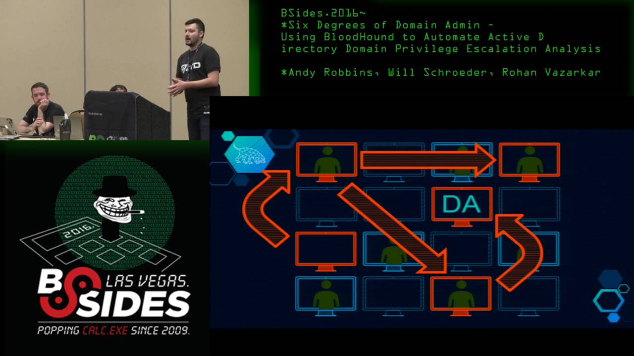 51:51
51:51 32:48
32:48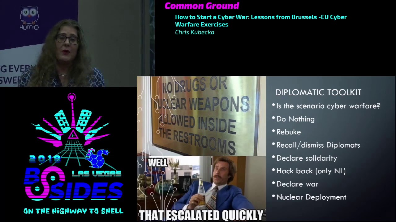 33:48
33:48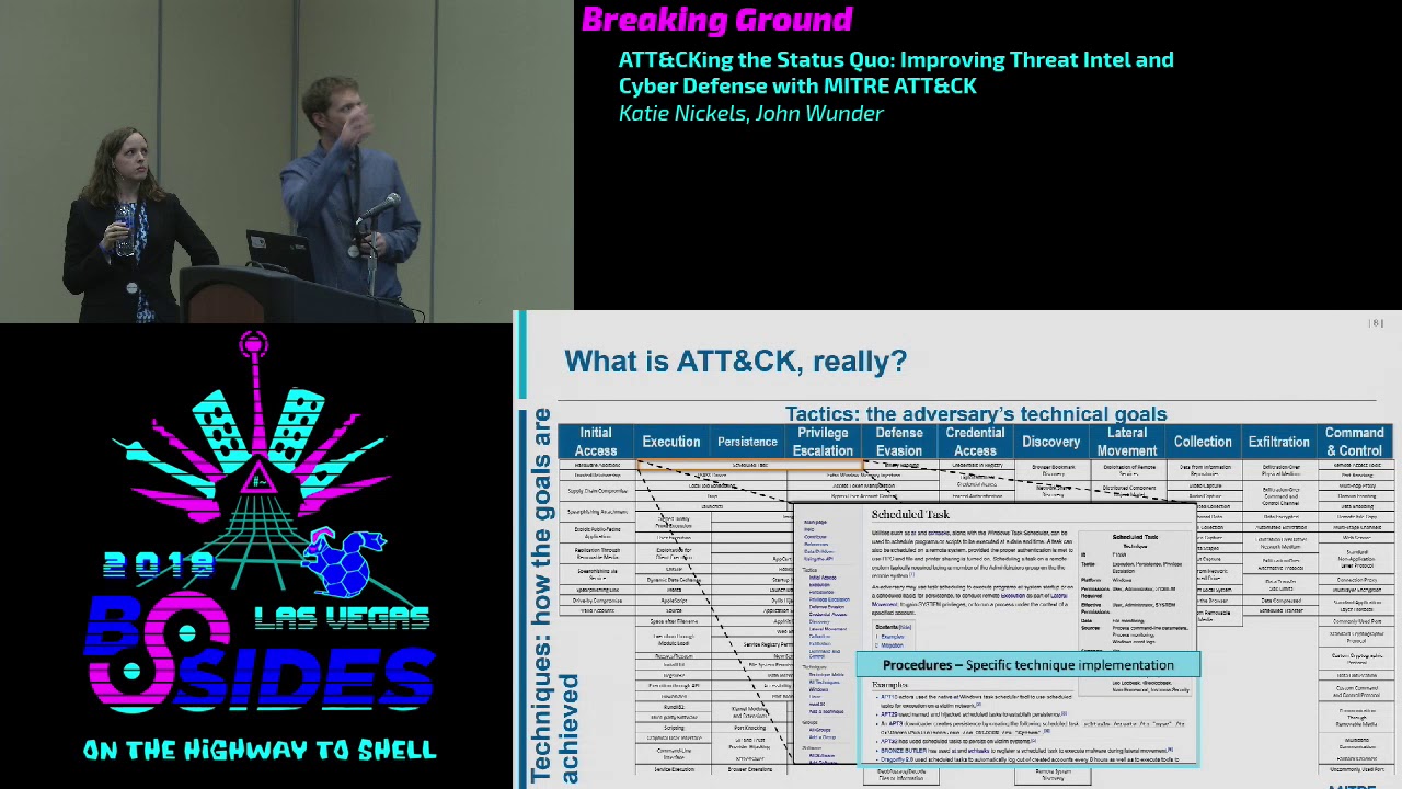 54:33
54:33 31:06
31:06 20:51
20:51