Visualizing Security
Show transcript [en]
thank the room for coming I get the enjoyment of introducing our next speaker just kidding I'm the next speaker my name is Jay Jacobs I am a data scientist and as a way of a bio I put up a bunch of pictures and basically I've been doing a lot of research into security a lot of visualizations and the upper left I spent several years working on the verizon d bi r and the lower-left book called data-driven security that I wrote with Bob Brutus it's been out for a few years now in the top middle we've been doing work with Kenna security talking about prioritization of prediction and we're analyzing a ton of vulnerability data and I'm gonna be talking about some
of those visuals here very code in the upper right looking at application security and all of the code scanning that they do so there's a lot of data a lot of visualizations and what I hope to do is to try and convey some of the core concepts of visualization so that anybody out there can work with any software even Excel to create better than average visualizations and really that's what we're aiming for right just better than average here just trying to up the game a little bit so it's a fun sort of introduction I want to go back several years I actually got a dataset from a guy who stood up from Daniel blander he stood up a bunch of instances
and AWS data centers around the world and he turned on the network interface and captured packets and he did this for about six weeks and he gave me this enormous data dump and said what happened what are we seeing here and so I wanted to take that take advantage of that and create an animation and so this is one of the first cool things that you can do with with especially with time-based data if you treat it like stop motion like claymation right you can create individual plots save them in a directory and put those together like claymation so what I did is I took five minute chunks and I said all right let's look
up the source IP what country is that coming from and what data center is it going to so I created this visual and each balls of five minute chunks the size is the number of packets and I essentially took me a lot longer to create these files and to create these images than what it does in real time but I essentially went through created this going across and all I did was write a script to do this and it's just going across it's going to town and I also created bars if you notice on the two sides there's bars saying where's things coming from how many are there coming bars on the right where are they
going to and remember these are just cloud instances just stood up just turned on the interface and started capturing now something really interesting happens Sunday morning and essentially I created this I had no idea what was in the data and then Sunday morning rolls around and something really strange happens and usually I talk a little bit slower so by this time it's at Sunday morning but so what we're gonna see Sunday morning I think 8 8 a.m. if you watch Vietnam on the bottom there 8 a.m. you start to see this massive spew of packets coming out of Vietnam and this is a really slow scan remember each of those little balls is a 5 minute period
this goes on for roughly 40 hours and then it abruptly stops and so this got me wondering what is going on like this is to understand what's actually going on this is a terrible visualization but it gives you an indication that something is going on right so I created this I broke out the source countries and I put TCP on the right UDP on the left I tried to show the top 200 ports that were being hit and this is a few years ago so you see like 1433 being constantly hit does anybody know what that is offhand what what I couldn't understand sequel and then you also see MySQL there you see our DP 3389 you see a lot of those
lower ports telnet SSH FTP port 81 35 they're lighting up but now watch as we get to Sunday morning again and watch what happens another thing with this view you see port scans is like lines of balls going across and you'll see it a little bit more on the on the UDP side but you can also see like this is just there just nailing these ports over and over again and I remember back in the day we talked about firewall rules and let's just open these up for like a half hour while we do this one thing this is open it to the Internet for a half hour and so visualize a visualization like this
would really help say no we're not going to open it up for a half hour right all right so we're getting to about Sunday morning here comes Vietnam I'm scanning like this
and I thought that was cool oh that's really cool and then I couldn't fit all the ports and now it's hitting this other category at the bottom and then at the end they just scanned two ports over and over and over again no I have no idea what's going on there right but a week later I decided to look a week later see what happens again on Sunday morning because I was watching this this is actually like an eight-minute movie and it gets really boring but if I was watching and I noticed another scan coming not Sunday a little bit later but watch the UDP stuff too you see these like wall of scans coming across like
that there's that scan again coming across it's this other port and stays another but then something else really weird happened I was creating this and the whole screen went blue for a bit and I couldn't figure out what happened so I changed the size of the balls to try and figure out what happened and that happened I have no idea what that is it came out of Germany if you could read the port you could see what it is so basically at this point that was the height of my talk because everything else is gonna be static from here on out but part of what I wanted to say here is that animation is just super fun usually when I make
animations like this I start you know maybe in the afternoon and then by like 4:00 a.m. I realize it's 4:00 a.m. and that I'm still almost unreal II fun practice to play with that all right but databases can be super simple so this is a plot that just has a single line on it and this is actually looking across 300 companies and their vulnerability scans scans from the vulnerability scanner over months and months and months saying how long does it take an average vulnerability how long does it survive alright and this is using data analysis technique called survival analysis or time to event time to failure all the same stuff under the covers but essentially look at how
simple this is it's a line right has two axes and I put some annotations on there to try and communicate messages so you can see in that first one 25% of vulnerabilities are remediated within four weeks half of them are immediate in the first hundred days and then you can start thinking about your SLA s you get some sort of high seven durability or non hai sev what's your SLA for it and so using this this plot I want to cover what we're going to talk about today there's three big things I want to talk about the first thing is the data this plot has two variables it has the percentage of vulnerabilities been remediated it's a continuous variable it
has a range between zero and one and then the bottom one is time also a continuous one time can also be a category because might have months or something like that but we're also going to talk about visual queues in this plot we've got a line which you can think of as a point in motion we're using color a little bit here the line is actually blue and then we've got position on a common scale those scales are gonna create a visual cue that will we'll cover and lastly I'm going to talk about those scales and coordinate systems all right let's get into the data so there there are two types of data as big generalizations okay there's
going to be quantitative or continuous count data and that's going to be things like if you're measuring bandwidth if you're counting vulnerabilities counting attacks counting types of attacks looking at loss amounts anything that has some sort of number some sort of counting associated with it it's going to be a continuous or quantitative variable then you've got categorical or discrete data and this is going to be categories buckets any lists could be ordered could have inheritance so like an IP address even though it's a number it could be represented numerically do not treat it as a number this is one of the first things that people kind of screw up with when they're dealing with this malware family itself is a category
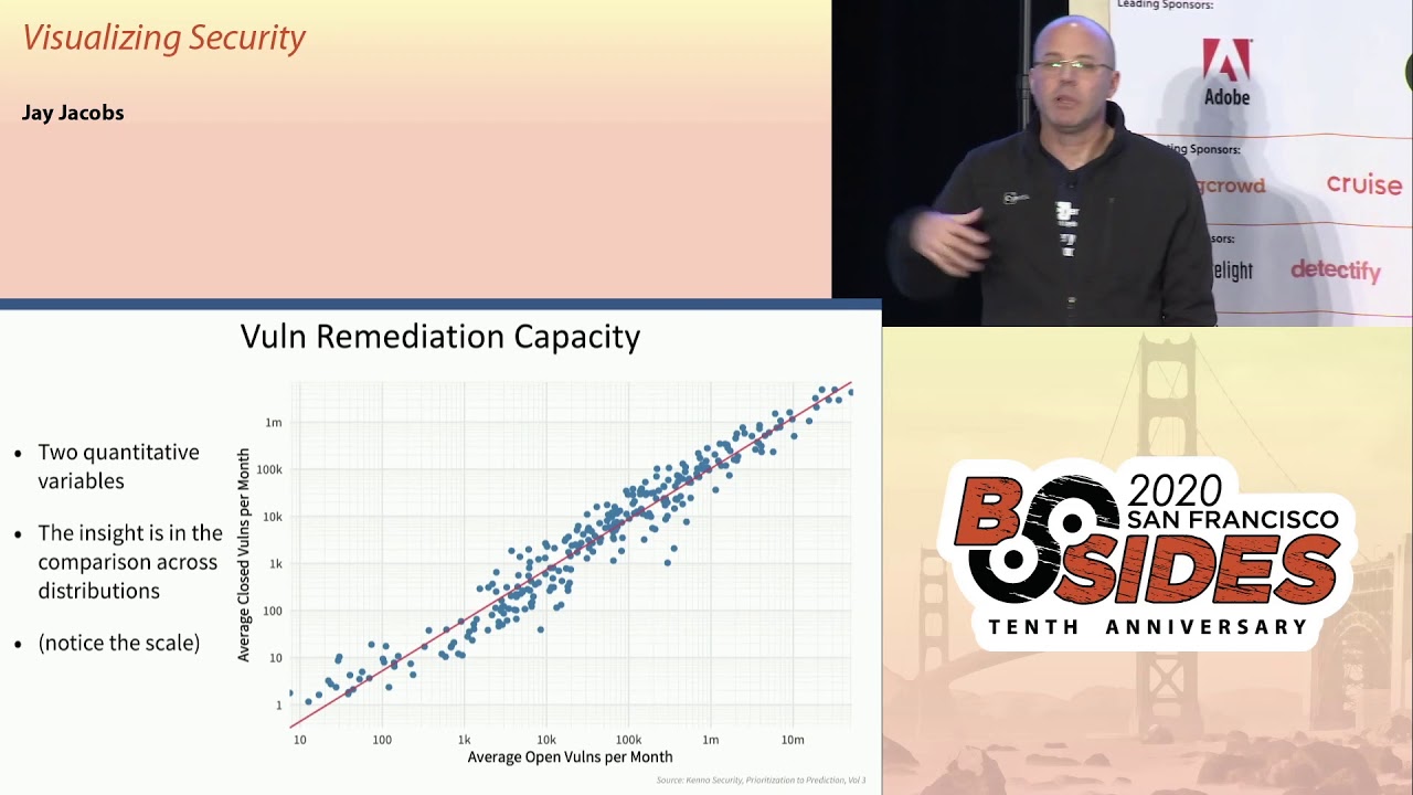
it might be related to a larger family might be a very cwe's that also has an inheritance to it but it's a category things like that things that you can put into a category so let's take a look at some plots here so this is looking again through kena security we're able to see how fast companies can remediate so I created two quantitative variables you know the the horizontal here is looking at the average open vulnerabilities per month and then the vertical is looking at another quantitative variable how many closed per month right now the insight here is looking across this whole distribution and what's really cool is that these things cluster about ten percent so we can see by plotting it
like this we can see that on average companies are able to remediate about 10 percent of their open vulnerabilities per month so when you get people to say why don't companies just patch everything Ron they just fix every look at this is over 300 companies right and you get up into that upper right you are talking well over a million 10 million vulnerabilities that some of these vulnerability scanners are finding this is a really really tough problem the other thing to note is the scale and I'm gonna try and nail this point home for everybody this is a log scale and I remember starting out and people would say don't use a log scale it's not
intuitive right it's nobody can actually think in terms of a log scale and that's somewhat true I've gotten pretty used to dealing with log scales but the data itself is in a log space okay you cannot view this and a linear thing and I'll have some examples on that later on let's talk about some data here we did a survey where we talked to CISOs and security leadership and we talked to board level executives and we asked them various questions about security topics and how much they want to hear about that and then we asked them what do they actually get so we've got three quantitative things here we've got what the CEO said what the board says and
what they actually get right and then the bars here are encoding it's a visual cue we're encoding those quantities separated by color and position is going to group those together but the content here is super interesting if you look at that second one risk posture the board really wants to hear about risk the CISOs and the security leadership really don't want to tell them about risk because it's a really tough topic and they're getting more than the CSIs want to give but less than what the board wants with that gray bar look at the one above it system vulnerabilities they both want more than what they're getting right and so this is a very simple
visualization just some bars grouped color showing length on the same scale and you can communicate a whole lot of information in there let's take a look at another one this is from Ford Annette this is called a heat map because when you look at it you can see hot spots right and you can see this is essentially botnet families detected across regions and the prevalence of customers in that region seeing this type of botnet and you can see Andromeda for example is very different it's sticking out out of here otherwise there's not a whole lot of difference across region and that's another thing that you can pick out of these plots you might look for something and say hey we
don't actually see anything here there's nothing actually interesting there now this is another one we're dealing with categorical variables that I have in order to them we're actually showing rank e here and we I don't know if this one has an official name but we call it a worm chart because it seems like things worm through it but essentially we've got two different data sources here this is mainly from ver code and so we were dealing with the OWASP top ten looking at vulnerabilities and source code and that's that first column the flaw prevalence so you can see like data exposure injection failures off failures those are at the top and then with the barcode data we were able to also look
at the fix rate how fast are developers going after these types of things and you can see some shifts going on there you can see though logging jumped from the bottom to the top but it's super hard when you're doing code scanning to detect a lack of logging right because you might be scanning something that shouldn't be logging so to detect something that doesn't exist is really hard which is why it's on the bottom in the first column but then who the f5 went through exploit DB and looked at all of the exploits in exploit DB and said what are these going after what are the OS top ten that they're targeting and that's that third column and then
the fourth column f5 shared then the types of incidents and the root causes that they found in the incidents that they were investigating and then you see the incidents there so you can see things like off top of the incidents third and the flaw prevalence second and the fix rate lower in the exploits but it's the top of the incidents again but you can just follow these and so you've got a category that has an order right all of these fourth four categories have a rank and the OWASP top 10 and the colors are encoding that rank or I mean that it's encoding the OS top 10 so you can track the rank across these different
categories and this one this one's called a waffle plot mainly because it looks like waffles but at the top essentially working with Kenna we're looking at all of the CVEs right these published CVEs at the time I pulled the data there 108,000 I think there's 130,000 now or something but essentially out of all of those CVEs we looked across 300 plus environments found that about 37,000 sea bees we're seen or reported in these environments so if you're going to tackle see bees it's a great news because maybe you don't have to look at 108 thousand you can just focus on 37,000 but then out of those 37,000 only about 5,000 of those have been exploited or have exploits
available in the wild and so you can immediately see this funnel effect and so we're looking at a whole lot of stuff down to a lesser amount down to a lesser amount and part of the reason for a waffle chart is that this is trying to convey using area I'm gonna talk about area but it's a very confusing way and it's not very accurate way to communicate things but the waffle chart breaking up into boxes helps that and make it a little bit easier alright I touched on this a little bit but getting to know distributions is a really really important part of working with data so one of the one of the first things we
always do when we get a new data set is that we simply explore it we just visualize we take individual variables and visualize that if it's a categorical variable we count the categories if it's a continuous variable we'll create something like this I there the bottom one is called a density plot the thing above it is a box plot we'll try to get a feel for what is the range to spread what does it look like that sort of thing because in security you're gonna have a lot of these logarithmic datasets and so this is from Akamai martin mckay did a great job on this and what this is showing is showing DDoS attacks and over a week period so each
vertical there's a bunch of DDoS attacks during that week and then the size of those attacks right so if we think of that data it's continuous we're talking about bandwidth here sustained bandwidth over time and then we've got a time element across the horizontal and then we've got the the coloring here showing a density across that in order to try and hit this point home there's lines going across here that the black one is showing the median the middle so 50% of the attacks are bigger 50% are smaller so if you're trying to think what how much protection should I buy for DDoS what is a typical DDoS attack you can't really say oh the typical DDoS attack
attack is you know one gig per second because it's it's not I mean like you might some companies might see less than 100 somewhat set it might seem more than 100 gay right and so trying to convey that distribution is incredibly important right so I think this does a really really excellent job that was showing all this data over time and again we're dealing with a logarithmic scale here because that's what the data does alright let's talk about visual queues and this is mainly what you use to encode we could be talking about position I talked about position on the common scale using length using direction or slope and lines comparing lines talking about angles and areas
which you'll see in pie charts and then down into density of a single color saturation of a color and then finally color hue colors of the rainbow now in order to figure out what we're going to use for visual cues we have to first understand that data visualization is a communication process right like any communication process there needs to be a message and message is going to be the data and we have to encode that for transmission right I'm up here I'm encoding my message into words the medium is speaking it through the air the message is received and hopefully decoded by everybody and then hopefully that message that is decoded matches what the sender was sending and so with
visualizations we have to understand that right side first we have to understand when people see a visualization how do they decode it how does the brain work how do eyes perceive this right and there's been a lot of studying and the suspicion in the last five years has been really exciting for data visualization but essentially we're gonna use those things we're gonna use position length size color shape so on and so forth to try and communicate and code our message and how we do that is going to be dependent on how people decode it so if we talk about quantitative variables and we want people to look at something and translate it back to that quantity this
is a rough ordering of the the success the accuracy of somebody decoding a quantity so if we're using position on the common scale for example we've got a scatterplot very small people are generally very accurate with that you slide down in two directions slope angle area becomes a little less accurate a little more confusing to try and compare areas you get down into density even color hue it gets really hard to get back to that original quantity now when we look at different types of data we're gonna have different things jump out so when we get to categorical for example all three of these have positioned across the top but some of these things shift around so if we're dealing with
ordinal data we may be able to use like density or saturation where as I'll be very poor when you're talking about a quantitative variable so let's take an example here let's go back to that capacity chart take these two points because they're on a common scale and their their points they're really easy to compare right you can look at those two points and say the one towards the right definitely has more open per month but they're closing roughly the same it's pretty easy to see the one on the left is slightly higher right you can be very very accurate and decoding that quantity so this type of thing is really nice for encoding take a look at
this one again the the positional grouping I'm using the the group here to say all of these three visual elements make up this category and then because they're on the same scale on the same horizontal scale you can very easily compare which one is longer and in this case you can say by how much how much longer alright you get a ratio back to this one you see that we're using that the the color because it's ordinal we're putting it visually in a position that's in order and then we're using color to track the category going across now if you notice back in this chart area is very very low an area is the primary
visual cue when dealing with pie charts and if people have been around date of his people a lot of them get really uppity about pie charts and say don't use pie charts they're terrible I'm in the middle but but here's why here's why people say don't use them take this pie chart and and sort it largest to smallest okay alright wait if you're having problems here I'll try to make it a little easier does this help is that good alright but take a look take a look at this one and take a look at C and F which one is bigger now look at C and F this is drastically different right this is same exact data same exact
representation maybe it's C and F and C and F because you're tilting it you're trying to create a perception things closer have to be bigger things further way have to be smaller and areas the primary way we interpret pie charts I'm gonna take the same data and I'm going to encode it slightly differently tell me sort it now can you tell which the one that has more quantity and less quantity it becomes way easier right you're on a common scale and they even became easier because I actually sorted it visually for you I let's take a look at saturation that is essentially a single color making it lighter or darker across a spectrum and a lot of times you
see these on maps this is a choropleth and so this is looking at I think population you have popery population and logarithmic numbers my world country's 2013 so with try to compare any country to another right and you might be able to do it if they're next to each other you can say this is has more population than that one but try to compare to in two different areas of the map try to try to pick out any quantity at all like this scale is absolutely worthless like what is the population of the US here it's like a medium blue you know that's what the best you can do here here's another one we get
saturation coding and quantity as account of IP origins and an active botnet and again this is a count of something in security that grows exponentially this should be on a log scale that's why you have one country that is extremely dark and everything else is streaming the light this is working in a log space it should be in a log space here is a map where they used diverging color scale using color hue to try and show the least cyber safe countries and you could be able to pick out blue from red you can pick out the extremes right but take a look at some of those yellow countries I don't even know on what side of the middle that
falls right the middle is like a beige where in that color spectrum is yellow it becomes very difficult right this is very difficult to pick out a quantity having to do anything with either color hue or color saturation x' try to avoid doing that people get around this though by putting these in buckets changing that categorical or a quantitative variable into a category you can do that a little bit so if you search for maps like this a lot of them will try and do that alright so again this is sort of the scale this is something that you want to follow try to to adhere to this as you're trying to decide what to use in your visual cues
trying to stall cuz there's cameras up okay scales and coordinates so I'm gonna try expanding something because there was a hard time that I had early on dealing with data and that is in algebra you're Todd when you mess with one side you have to mess with the other right if you multiply by two on one side you have um quite - on the other everything has to be in balance right when we're talking about data and visualizing data that kind of falls out and it's not even like they're not even in the same realm we're not talking about algebra we're talking about data so if you take this data that I've plotted here on the x and y axis we
can transform say the x axis right if I go between those two those plots the points didn't shift at all we're transforming the data right we can do that with the y axis again the data doesn't shift right just the the value is shifting and so we can do that we can do that we'll do that for certain models algorithms things like that clustering often wants you to scale things like that so this is transforming the data but maintaining that same visual relationship now another thing is what you can also change the visual coordinate system but keep the data so this is basic data 0 through 5 we can put this on a log scale this is where
I'm gonna harp on the log scale bed so this doesn't look very good it pushes things in the upper left but I want to take a plot this is taken where we have a coming out where we're looking at breached frequency and losses and one of the things that we're going to take on is this whole notion of cost per record because it is absolute garbage the cost per record is worse than useless okay so this is a plot of the number of records and a breach and the was that the losses reported on the vertical you guys can you see a trend here is a trend coming out this is on the linear scale zeroes
in the corner and it goes out the bottom the number of records goes up by two hundred million increments do you see a pattern anything jumping out let me put both of these on a log scale now we start to see some trends right this is in the log space so first thing you might see some vertical lines on the right one that's because when people report number of records so they go a thousand right they round things off so you see these vertical striations of records not so much on the loss they actual the loss data here was taken from court records and various reports and things like that not somebody saying it's about a million dollars in losses
right we're not seeing it on that aspect but we do see it on the number of records but you can also see that this is not a straight linear relationship if we build a model on this it's going to be a log log model so any sort of simple cost per record metric is going to greatly underestimate the costs of a small one and greatly overestimate cost of a large breach and so this is not going to be a way to approach this you can't just simply say $200 per record all right so this is on a log scale and I've already talked about this chart being on a log scale talking about vulnerabilities and this grows
exponentially and then back to this chart I think this is so fantastic talking about the log scale because I mean you could take any one of these weeks and visualize them as a distribution and you're gonna see this beautiful sort of symmetric hump essentially and so looking at across time we're gonna see shifts and ebbs and flows but those smoothing lines take that across and I think it's just fantastic all right the takeaways that I hope people take away so understand the data first I talked about this notion of exploratory data analysis there was a great guy in the 70s that pioneered exploratory data analysis he wrote a book on it really nice he didn't have
the advantage of Python or R at the time so some of the visuals are a little bit simple but you can still find functions in today's code that are doing what he wrote about in the 70s which is really great and so understand what the data is and also look at relationships creating simple scatter plots can be a really really powerful tool and don't be afraid to use bar charts I think probably 80% of the things that I'll do is a bar chart and just understand the difference between categorical continuous variables ordinal data things like that just understand what that's going to be before you try and visualize it and then talking about visual cues again trying
to understand as you talk about shape size color position things like that they all have meaning to people reading it and trying to take that in and so understanding that it's gonna be really important and then scales and coordinates get used to log scales this industry has so much stuff and log space it's crazy so I highly recommend just trying to understand that looking at long-tailed data like that and there's just so much of that out there so with that I will open it up for questions and thank you for your time Arun
yes sir his name is John Tukey tuk ey but there's been there's quite a few books right now if you research Amazon for data visualization there's a ton of really good books out there Nathan Yau Kauai yeah Kairo Albert Cairo has just came out with another great book about data visualizations and lies Albert Cairo CAIR oh yes sir [Music]
causation so the question is what how do you talk about causation and and visualizing causation so causation there's a there's a guy by the name of judea pearl who has been studying causation and data analysis things like that and and i've been trying to get through his book but it's really dry i'm sorry for this stream or peopre life and i know it's pretty dry but essentially a lot of this statistics and data analysis that we have right now does not deal with causation it's all correlation basically and when we get to causation it's because people look at it and apply their expertise and say of course a comes before B right and so a
lot of that causation comes that way but once you start to get that relationship basically you could think of it as inheritance or an order or something like that so you know you think of like the attack framework you get or the kill chain you get these things happen you know so you think of like a graph type system or something where you get this order to it oh boy any any good open data sets to play with that the question was are there any good open data sets to play with to play around with and there are and I'm trying to think of it's like SEC repo calm what's that SEC are EPO calm did I get that right I hope
that's right but that has a lot of datasets out there did that work okay yeah SEC repo there's a lot of datasets there but I think a lot of this stuff I mean like if you're at a company just start collecting stuff and hopefully you get permission or ask people for data I find that if you just ask the the biggest hardest thing in any sort of data analysis project is getting the that is by far the hardest thing analyzing it visualizing it that's you know that'll take time you can do it but getting the data is always the hardest thing but if you ask you start asking around you you should be able to get
something right and a lot of people try to anonymize it make it safe things like that and that's fine take what you get and work with what you got yes sir
time yes so we've collected data on time to remediate and we do have data on time to exploit but it's super hard when you're talking about vulnerabilities because essentially you can look there's two main sources of being x three three main sources of exploitation with vulnerabilities one somebody will publish code which isn't technically exploiting anything but the code is out there and that's a you can get that date really solid but then there is malware reverse engineering malware that says this vulnerability is used in this malware and hopefully you can trace back dates on that but then the third one is IDs and IPS systems and so the challenge there is that you can you can we have a
bunch of ids/ips data that we use and you'll see a first date but then the question is when was the signature generated that would capture that right and a lot of the companies that we've been working with basically say oh we don't track that you know we throw it in there or a lot of these are automatically generated there's a hundred hundred and fifty of them for this one CVE and we can tell you the last time was updated but we don't know exactly when you know so some of these things aren't being tracked and they're really hard to get that specific date of when it was first attacked but I mean like that to me that's one of those
golden areas to study because that's how we're gonna talk about the disclosure debate right let's look at the effect of different disclosure methods when they're exploited do we see any correlation between different disclosure techniques and the amount of exploitation and the speed of exploitation at this point I have no idea right so we're seeing it how do we measure that better and how do we start to address it from from through science yes sir the animations you can do anything I used are I do everything everything I do is on the language called R which is R - project org it's a it's a language developed by statisticians to do data analysis but a lot of people use Python
which is a development language that got applied to statistics so it's a lot more general-purpose and they're both fabulous and they both have really great visualization libraries I'm not going to promote one over the other but I do do are all the time and so with that that animation it's just creating a plot' and saving it off and i think i used like ffmpeg or something in the command line just to take like you know thousands of images in a director and turn that into a movie so it's a really fun technique yeah right so we're gonna push something on that there's a there's so many complexities talking about the losses from a breach and there's a huge
variation so like to say hey it's gonna be you know hey if you had this breach it's gonna be 1.2 million like that is absurd it's gonna be like oh you had this breach well it's gonna be somewhere between 500,000 and 300 million and you know that's I mean like that's what the data is going to be able to allow us to say we can say we might expect it to be here it will never be there but it'll be around here right and so it's gonna be some type of a model like that and it's going to be having to get ok with uncertainty like that because that's exactly what the world is all right well
thank you very much everyone
Related talks
 28:29
28:29 29:24
29:24 32:13
32:13 30:17
30:17 38:53
38:53 32:39
32:39